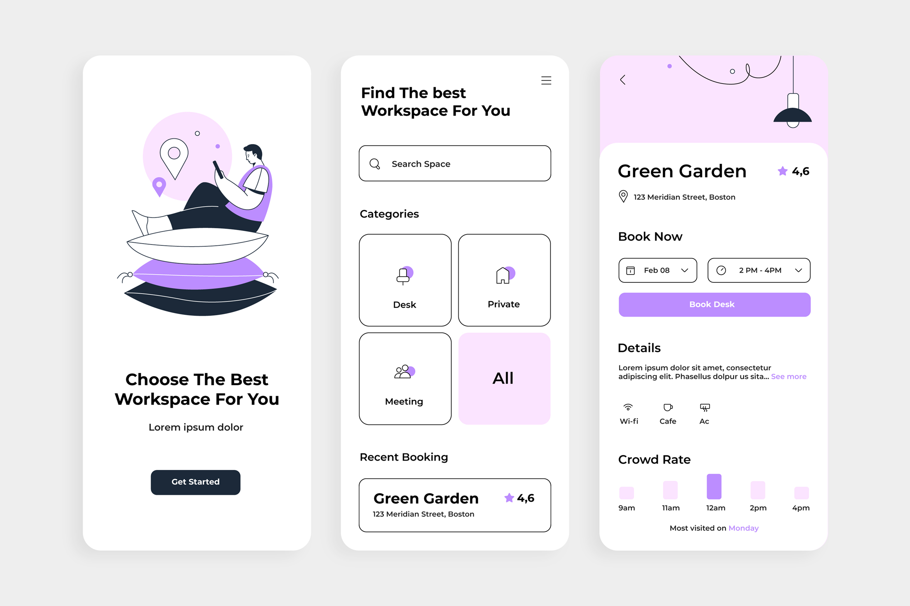

Building inclusive experiences from the start saves time and reaches more users.
There's a misconception I encounter regularly in design conversations: that accessibility is something you handle in the last sprint, after the interface is built. A box to tick. A set of technical requirements bolted onto a finished product. A compliance obligation dressed up as design philosophy.
I've watched this play out countless times. Teams build something, iterate it, ship it. Then, somewhere near launch, someone flags WCAG 2.1 AA standards, and suddenly there's a scramble to retrofit alt text, fix colour contrast, and make sure the keyboard navigation actually works. The work gets done, sometimes. But the entire approach misses something fundamental: accessibility designed in from the start creates better experiences for everyone, not just people with disabilities. And it takes less time than retrofitting later.
The real cost of treating accessibility as an afterthought isn't measured in sprint velocity. It's measured in the people you've already excluded by the time you think about including them.
The myth of the accessibility tax
There's a persistent narrative that accessible design is more expensive, takes longer, and constrains creative possibility. I'd argue the opposite is closer to true, but it requires shifting when you think about accessibility in your process.
Building accessible design from the ground up means making considered choices early about hierarchy, information structure, and interaction patterns. These choices almost always improve the experience for everyone. Clear, well-labelled buttons don't just help someone navigating via keyboard; they help the tired developer at 4 PM trying to find the "confirm" action they need. High-contrast text isn't purely for people with low vision; it makes interfaces readable in sunlight, on older monitors, and on screens people have been staring at for ten straight hours.
The moment you separate accessibility from good design, you've already lost the thread. Accessibility is good design. It's the practice of making intentional, user-centred decisions about how information flows, how people navigate, and what cognitive load you're asking of them. The fact that this benefits people with disabilities isn't a happy byproduct; it's evidence that you've done the thinking properly.
What takes time is retrofitting. What creates friction is the gap between how the interface was built and how people actually need to interact with it. Building with accessibility as a core principle from day one eliminates that friction from the start.
Where the real exclusions happen
I want to be specific about what I mean by accessibility, because it often gets reduced to a narrow technical checklist. Screen reader compatibility is essential. Keyboard navigation is non-negotiable. Colour contrast matters. But the more subtle exclusions happen at the level of information architecture and interaction design.
Consider a form where error messages appear in red. For people with colour blindness, that red conveys nothing. But more broadly, if your error feedback depends entirely on colour, you've made an assumption about your user's perceptual experience that isn't universally true. Add an icon, change the text to be explicit about the error, and suddenly the form works better for everyone, including people scrolling quickly and missing subtle visual changes.
Think about timers that reset without user action. Brilliant for discouraging passive engagement. Terrible for people who read slower, think through decisions differently, or are managing multiple inputs at once. Terrible, frankly, for anyone with actual work to do. Remove the timer or make it generous, and you haven't compromised the design; you've made it work in reality instead of in theory.
Or consider navigation structures that hide critical options behind nested menus to achieve visual simplicity. The interface looks clean. The person navigating with a screen reader, or with cognitive load that makes remembering nested menu structures harder, or with motor control that makes multi-step navigation taxing, they're now doing extra work that the designer compressed away rather than actually solved.
These aren't edge cases. They're common interaction patterns, and they're commonly built without thinking through the assumptions embedded in them.
Cognitive accessibility is where most products fail
Here's something I think gets overlooked in accessibility conversations: the cognitive dimension.
Consistency in language, meaningful sequencing of steps, clarity about what each interaction will do, these are accessibility features. They're also the foundation of good UX. But products fail at this regularly. Instructions that use undefined jargon. Buttons that say "Confirm" when they should say "Send invoice." Workflows that require remembering context from three screens ago because the designer didn't create persistent signposting.
I worked on a healthcare system where the patient intake process asked questions in chronological order of how the development team had added features, not in the order that made cognitive sense for the person filling it out. Patients would answer a symptom question, then jump back eight steps for medication history, then forward again for diagnosis. The information was all there. The questions made sense individually. But the sequence was cognitively exhausting. We restructured it to flow like an actual conversation. Completion rates went up. Support calls went down. And we didn't lose any of the information we were collecting.
This is cognitive accessibility at work. It's not a special feature for a special population. It's the discipline of recognising that human working memory is limited, and designing interfaces that account for that reality.
The business case nobody talks about
Here's something worth sitting with: the business impact of accessibility is frequently understated in design conversations.
The social web has made this visibility sharper. Products that ship with poor accessibility don't just exclude people with disabilities. They exclude people whose disabilities are situational, the parent holding a baby and trying to navigate with one hand, the person in a bright room where screen glare is a practical limitation, the team member with a migraine avoiding bright interfaces, the elderly user who's come to your tool for the first time and finds the interaction patterns unfamiliar.
The addressable market for accessible design isn't small. The WHO estimates over one billion people globally live with some form of disability. Significant portions of developed-market populations are over 55, a demographic where sensory and mobility differences become more common. But beyond that population, there are thousands of situational contexts where accessibility features become essential, a user on a poor internet connection, someone trying to use your product across both mobile and desktop, teams working in suboptimal conditions.
When you design for accessibility, you're not designing for an edge case. You're designing for reality.
And the business metric that matters most: retention. Products that are difficult to use have higher churn. It's not complicated. Build something that's cognitively straightforward, perceptually clear, and interactively flexible, and more people will keep using it. Build something that makes assumptions about how users perceive or interact, and you've already lost a proportion of your potential users before they've really started.
The discipline of asking why
Here's the honest part: designing with accessibility as a core principle requires saying no to things more often, and defending that more rigorously.
A designer suggesting that a decorative animation should be removed because it creates motion sickness for some users will encounter resistance. Someone arguing that a colour palette isn't accessible enough will hear that "it looks fine on my monitor." A team member advocating for simpler language over industry jargon will get push-back about sounding unsophisticated.
What's changed in my approach over time is having a framework for these conversations. It's not about persuasion or conviction. It's about clarity on what you're optimising for and why that matters.
Know your users in their actual context. Not personas you created in a vacuum, but observations of how real people actually navigate your interface. Include people with disabilities in this research, not as an afterthought, but as core to understanding what works. You'll learn things about friction that you wouldn't notice otherwise.
Make accessibility language specific, not abstract. "We need to be more accessible" is difficult to act on. "This interaction requires three separate motor actions that could be done in one" is concrete. "This colour contrast fails WCAG 2.1 AA" is a clear standard. Vague pushes back; precision moves things forward.
Separate "nice to have" from "needed to work." Some accessibility features are enhancements. Others are load-bearing. Keyboard navigation through your entire interface isn't optional. Colour as the sole way to convey information isn't a constraint you work around; it's a design failure. Clear, actionable error messages aren't polish; they're foundational. Being clear about which is which makes the work manageable.
Test with assistive technology. Not just screen readers in theory, but actual users with actual tools. A keyboard-navigable interface that forces users to cycle through sixty invisible elements to reach a button isn't accessible, even if it's technically navigable. Knowing this requires testing.
The compound effect of inclusion
What I've noticed is that the teams that treat accessibility as core don't just ship more inclusive products. They shift how they think about design entirely.
When you regularly ask "does this work for someone navigating with a keyboard?" you become more thoughtful about information architecture. When you design for people with colour blindness, you layer redundant information and become more intentional about visual hierarchy. When you write for clarity, your instructions become better for everyone. When you avoid cognitive load, your interfaces become more powerful for users who are thinking clearly.
Accessibility forces the best discipline out of you as a designer. And the irony is that most teams experience it not as a constraint but as liberation, the constraint was the assumption that you were designing for a single, idealised user. Accessibility is just the practice of designing for users as they actually are.
The products that last, that people choose to use, that have lower support burden and better retention, are almost always the ones where someone fought early and often for simplicity, clarity, and flexibility. Accessibility forces that fight from the beginning.
That's not an obligation. That's an advantage.