
Removing friction matters more than adding features.
There's a particular kind of design challenge that doesn't announce itself loudly. It's not a broken interaction or a missing feature. It's the accumulated friction of a thousand small choices that individually seem reasonable but collectively make a product exhausting to use.
I've watched products with extensive feature sets lose to competitors with half the capability, simply because navigating the complex one felt like work. The user would have been better served by the richer product. They chose the simpler one instead. The difference wasn't the features. It was the friction required to access them.
This is what I mean by simplicity as a design tool. Not oversimplification, that's a different problem entirely. But the ruthless discipline of asking, for every element on a screen, whether it's earning its place or borrowing attention from something that matters.
The feature paradox
Here's something that confounds product teams regularly: more capability doesn't equal better products. In fact, the relationship is often inverse. A tool with fifty features that are each accessible in two seconds is functionally more powerful than a tool with a hundred features where half of them are buried three levels deep.
Power isn't measured in feature count. Power is measured in what users can actually do, quickly and with confidence.
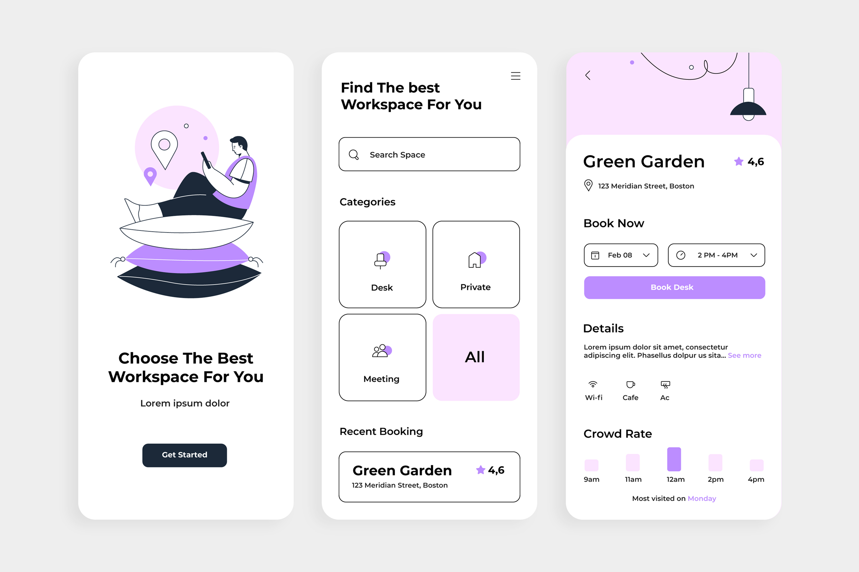
I worked on a workspace-booking product a few years back. The original design was a masterclass in feature density: multiple search filters, category toggles, advanced sorting options, saved preferences, booking history, notification settings, all visible on a single screen. The feature set was genuinely valuable. A user who took time to learn the system had access to a powerful tool.
But the default state was overwhelming. New users arrived at the screen, saw the complexity, and immediately looked for an alternative. The friction of navigating options they didn't need yet was higher than the value of the features they eventually would have used.
The redesign was counterintuitive: we removed almost everything from the initial view. A search box. Category buttons. That's it. The advanced filters still existed, but they lived behind a deliberately placed secondary interaction. Booking history was a single tap away. Settings were there, just not competing for attention on day one.
Adoption went up. Feature discovery went up. Even the use of advanced filters went up, because users who succeeded early, who felt capable in the early moments, were more likely to explore further.
Simplicity in the initial state created more engagement with complexity, not less.
The cost of cognitive overload
What's interesting about this is the neuroscience. Human working memory is limited. Research suggests we can comfortably hold about three to five distinct concepts in active thought at any given moment. Design with more complexity than that available immediately, and you've already lost some of your users, not because they lack capability, but because you're asking them to process more information than human cognition can easily handle.
This is where friction becomes measurable. A user looking at a screen with fifteen interactive elements has to process more options before they can act. Even if the option they need is obvious to someone familiar with the product, it's not obvious to someone encountering it for the first time. They're using cognitive resources just to orient, before they've even begun the actual task.
One of the products I've most respected in recent years is Stripe's dashboard. Not because it has fewer features than competitors—it doesn't—but because the default view is configured around what most users need most frequently. Advanced configuration exists, but it doesn't live on the main screen. The result is that users can accomplish the majority of their tasks without ever encountering friction.
That's simplicity as a strategic choice, not a limitation.
Friction is where complexity hides
Here's what I've learned about friction: it's rarely one thing. Nobody abandons a product because of a single point of resistance. They abandon it because of accumulated resistance. Three extra taps to get to a feature. A setting that's in an unexpected place. A workflow that requires context from a previous screen that isn't persistent. A label that isn't precise.
None of these things, individually, seem significant enough to warrant redesign. Collectively, they create a cumulative sense of effort that drives users toward something simpler.
The discipline of removing friction means auditing a product systematically for these moments. Not the big usability failures, those are obvious. But the small, accumulated frictions that users don't consciously notice but do experience.
I've found a practical framework useful here: for every workflow a user is trying to complete, trace the path from intent to completion. Count the interactions. Note where context shifts. Identify where the user has to remember something from earlier. Every moment they have to do cognitive work, retrieving context, remembering where they are, interpreting an ambiguous label, is friction.
Some of that friction is load-bearing. You can't remove it without removing capability. But much of it is just the artifact of design decisions that made sense locally but add up to something exhausting globally.
When less is more than more
What I've come to believe is that the most valuable design decisions aren't about what to add; they're about what to remove.
A team might spend a sprint adding a new feature. That's visible work, product-portfolio work, something you can point to. But a team that spends a sprint removing unnecessary steps, consolidating options, and making the critical path faster often has more impact on user experience and retention, and it's significantly less visible work.
This creates a bias in product development toward accumulation. Features get added; they rarely get removed. Complexity grows. The product that made sense at version one feels bloated by version three, but the momentum of development points toward continuing to expand, not to contracting.
The teams that break this pattern are usually the ones with a leader, a designer, a founder, a product manager, willing to be ruthlessly opinionated about what doesn't belong.
This is political work. Every feature you choose to hide or remove was championed by someone on the team. Every option you decide isn't worth showing was built by an engineer who believed it was important. Simplicity requires defending these choices with clarity about what you're optimising for: not the broadest possible feature set, but the smoothest possible experience for users trying to get something done.
Simplicity at different scales
There's a subtle distinction worth making here: simplicity in the primary interface is different from simplicity in advanced capabilities.
A powerful tool for power users doesn't need to be simple in every dimension. But the default experience for a new user needs to be dramatically simpler than the full capability set. This is where most products get it wrong, they build one interface that tries to serve both the new user and the power user, and end up serving neither particularly well.
The products that nail this have clarity about their layers. The initial experience is ruthlessly simplified, one or two jobs you can accomplish with minimal friction. Advanced users can find deeper capability, but it doesn't clutter the primary interface.
This isn't hiding features. It's respecting different user states. A new user has different needs than someone who's used the product for six months. Acknowledging that in your design, building different experiences for different moments in the user journey, is more sophisticated than forcing a single, complex interface to somehow work for everyone.
The discipline of subtraction
What makes simplicity hard to execute is that it requires continuous defence.
A new feature request arrives. It's valuable for a segment of users. Why not include it? A stakeholder wants more flexibility. Why not add another option? Each decision, in isolation, makes the product more capable. The difficulty is that somebody has to be willing to say no, or more precisely, to say "yes, but not on the critical path."
This is where I think design leadership matters. Not in the form of dictating what should be removed, but in consistently asking the question: does this earn its place? Is this friction we can eliminate, or is it load-bearing friction that enables capability? What are we optimising for, and does this serve that?
The answer isn't always "remove it." Sometimes the answer is "move it," or "hide it behind an interaction that doesn't clutter the default state." But the question needs to be asked.
And it needs to be asked not just at the feature level, but at the interaction level. Every button, every label, every decision point is a candidate for scrutiny. The discipline is to keep asking whether it serves the user's primary task or whether it's just there because it was built.
The outcome is capability without effort
What I've noticed in products with genuine simplicity, not oversimplification, but thoughtful reduction, is that users consistently say they feel more capable, not less.
A user of a simple product can accomplish more without friction. They get early wins. They feel confident. That confidence drives exploration. A user of a complex product, even one with greater capability, often feels overwhelmed before they feel empowered.
The irony of good simplicity is that it often enables more use of advanced features, not less. Because users who feel successful early are more likely to explore further. They have the confidence to dig deeper. The product that welcomed them with complexity would have lost them before they got there.
Simplicity isn't about limiting capability. It's about sequencing it. Arranging it so that new users can succeed immediately, and power users can find the complexity they need without it obstructing the path for everyone else.
That requires discipline. It requires saying no. It requires defending the empty space on a screen as vigorously as defending the element you kept. But the products that master it, that treat simplicity as a tool rather than a constraint are the ones that win, consistently, on retention, satisfaction, and what we'd call stickiness.
The strongest design tool isn't a feature. It's the friction you removed.