
How constraint and simplicity improve user outcomes in Healthcare and SaaS.
There's a particular kind of design failure that doesn't announce itself. No error states, no broken flows, no scathing reviews. Just a slow erosion of confidence as people quietly learn to distrust the tool in front of them. They click the wrong thing, pause at decisions they shouldn't need to think about, or develop workarounds the product team never knew existed. Eventually they stop exploring. They find the two or three paths they know work, and they stick to them.
I've seen this in healthcare systems where clinicians have essentially memorised routes through interfaces that should be intuitive. I've seen it in SaaS products that get abandoned not because they're bad, but because they're exhausting. The users didn't complain loudly. They just quietly checked out.
What's interesting is that in both cases, the problem usually isn't missing features.It's too many of them, shown all at once, to everyone, regardless of what they actually came to do.
The feature trap
Here's something worth sitting with: complexity in software almost never gets designed in deliberately. It accumulates. A new feature ships each sprint. A stake holder asks for one more option. A dataset gets exposed because it's technically available. None of these decisions seem unreasonable on their own, and yet the cumulative effect is an interface that asks users to navigate a city they've never visited without a map, every single time they log in.
The instinct to surface more is understandable, especially in SaaS where features are often the primary selling point during procurement. The buyer wants to see capability.The problem is that the buyer is rarely the person who has to use the product every day. That person, the one actually doing the job, doesn't need a demonstration of everything the system can do. They need to get one thing done, correctly, without hesitation, probably while someone is waiting on them.
Power and usability aren't the same thing, and treating them as if they are costs real users real time. In healthcare, it costs considerably more than that.
When interface design becomes a clinical issue
I want to be specific about something, because I think the healthcare context gets generalised too easily. Alert fatigue is a well-documented phenomenon in clinical settings, and it is, at its core, a design failure. When a critical drug interaction warning sits in the same visual tier as a routine reminder to update a patient's contact details, clinicians learn to dismiss both. The hierarchy breaks. And when hierarchy breaks in an interface that supports life-critical decisions, the consequences aren't a bad review or a support ticket.
Most EHR systems I've encountered carry years of this accumulation. They weren't designed badly so much as they were designed incrementally, by committees, with competing priorities, and the result is interfaces that feel less like decision support tools and more like filing systems that occasionally ask for your input.
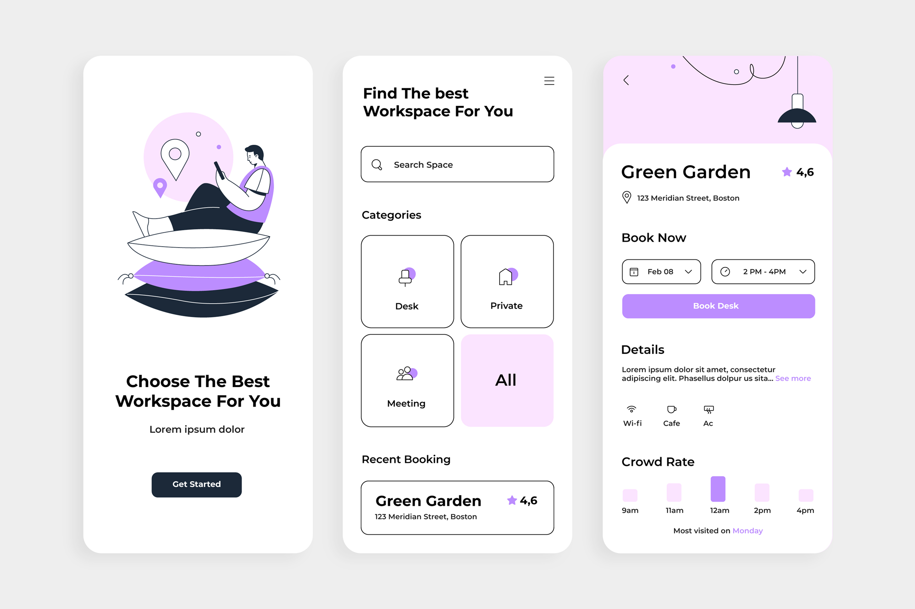
What clarity looks like in this environment is worth thinking about carefully. It's a medication review screen that puts contraindication information in your eye line before you've committed to a decision, not two screens later in a tab you'd have to actively seek out. It's vitals presented with visual deviation indicators so a nurse can glance and orient, not a table of raw numbers that requires mental processing at the worst possible moment. It's an interface that understands a surgical nurse and an attending physician have fundamentally different jobs, and doesn't make them share the same view simply because they're accessing the same record.
SaaS has the same problem, just with different stakes
The dynamics in SaaS aren't as stark, but the pattern is identical. Products accumulate features, interfaces grow, and somewhere along the way the experience stops feeling like a tool and starts feeling like a system you have to manage alongside the actual work you came to do.
What I find fascinating is how this plays out in churn conversations. Teams look at the data and frame it as an engagement problem, a marketing problem, sometimes even a pricing problem. Rarely a clarity problem. But users don't typically articulate that an interface is confusing; they just stop using it, or they use it far less than they could. The friction doesn't announce itself any more than the design failure that caused it did.
The productsI've worked on that genuinely nail this share something in common: they're ruthlessly disciplined about what the default experience asks of a new user. Onboarding doesn't try to demonstrate the full surface area of the product. It finds the one or two things that deliver immediate, tangible value and creates a clear path to them. Everything else exists, is accessible, but isn't competing for attention on day one. The underlying logic is that a user who succeeds early will explore further. A user who's overwhelmed early won't comeback.
The same thinking applies to dashboards, which are where I see this tension play outmost visibly. A dashboard that shows every available metric is, functionally, showing none of them. Data only informs decisions when it's been curated to answer the specific questions the user is actually asking. Everything else is noise, and the eye will eventually stop trying to find signal in it.
Why simplicity is the harder argument to make
Here's something I don't think gets said enough in these conversations: designing for clarity is often the most politically difficult thing a designer can do.
Removing a feature, or relegating it out of the primary view, means having a direct conversation with the person who championed it. Arguing that a screen should show less when a stakeholder has just asked for more requires a level of conviction most design processes don't create space for. And because the harmof complexity is diffuse and cumulative rather than sudden and visible, it's genuinely hard to make the case in a sprint review.
Constraint isn't a design philosophy you can just decide to adopt. It has to be defended, often repeatedly, with evidence and clarity about what you're optimising for. That means knowing your users well enough to describe exactly what they're doing when they hit a wall. It means having the data, or the research, or the usability sessions that show what actually happens versus what stakeholders assumed would happen.
Some of the most practical ways I've found to hold the line:
Protect defaults fiercely. A settings panel with sixteen options isn't a problem if most users never open it. The problem is when those options live on the primary screen in the name of flexibility. Pre-configured, sensible defaults with an accessible advanced mode preserve capability without imposing cognitive cost on everyone who just wants to get the task done.
Treat information hierarchy as a design decision, not a layout decision. What appears most prominently on a screen is a claim about what matters most to the user in that moment. If that claim is wrong, the design is wrong regardless of how well it's laid out. Asking "why is this here?" about every element is not pedantry; it's quality control.
Design for the interrupted user. Nobody in a healthcare environment, and very few people in a busy SaaS workflow, is giving a screen their complete, undivided attention. They're being spoken to, they're switching tabs, they've just come back from a conversation and can't quite remember where they were. An interface that requires sustained orientation will fail these users. Good complex-system design treats reorientation as a core job to be done.
Words are design. Vague labels are a form of complexity that designers often overlook because they're not visual. "Actions", "Manage", "Settings" make the user do interpretive work before they've even started the actual task. Precision in labelling is the difference between a door that says "push" and one that just stands there waiting to be figured out.
The outcomes aren't subtle
EHR usability research has linked poor information architecture directly to medication errors, delayed diagnoses, and the alert fatigue I mentioned earlier. These aren't edge cases or worst-case scenarios. They're consistent, documented patterns that emerge when interface design doesn't take the cognitive reality of clinical work seriously.
In SaaS the consequences are less acute but no less real for the teams experiencing them. Time to value stretches. Task completion rates dip. Support volume climbs in ways that look like onboarding problems but are actually interface problems.And retention softens in ways that are genuinely difficult to attribute cleanly in any analytics tool, because nobody fills in a cancellation survey that says "your product was too confusing."
Clarity doesn't just make things nicer to use. It changes what people are able to do, and whether they do it at all.
The discipline to subtract
The hardest thing about designing for clarity isn't knowing what good looks like. Most experienced designers know when a screen is asking too much of the person usingit. The hard part is doing something about it, consistently, over time, in organisations where the pressure almost always runs in the opposite direction.
What I've come to believe is that treating user attention as a finite resource is not a design preference; it's a professional responsibility. Every element that doesn't earnits place on a screen is borrowing from the attention that should be going to the elements that matter. In healthcare, that borrowing has a human cost. In SaaS, it has a business one. In both cases, the work is the same: decide what this screen is actually for, build ruthlessly toward that, and be honest about the difference between capability the user needs and capability that just exists.
Simpler interfaces are almost always harder to design. That's not a paradox; it's the point.