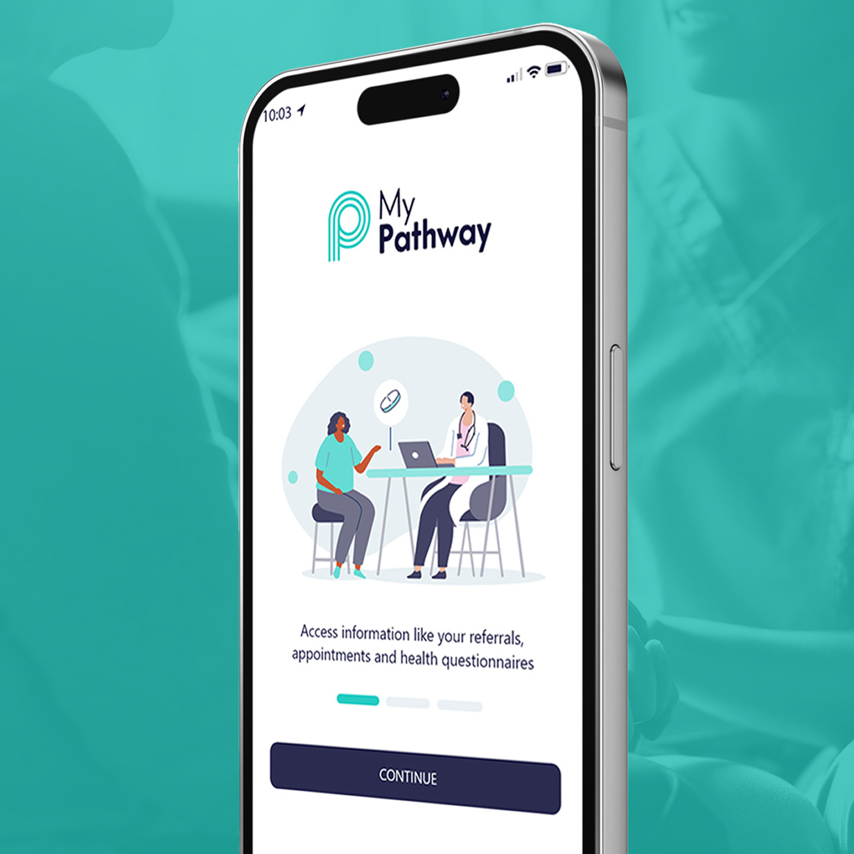
Specialist Recruitment SaaS

Oriel manages the recruitment, validation, tracking and matching of individuals to roles and the ongoing certification of the professional workforce.

A confusing UI
Healthcare professionals and administrative teams were required to manage complex recruitment, reporting, and pathway workflows through a legacy system that was functionally powerful but experientially weak. The original interface (as shown in the legacy Oriel dashboards) relied on dense icon grids, technical terminology, and static layouts that:
• Overwhelmed users with too many equal-priority options
• Required prior system knowledge to navigate effectively
• Offered limited visual hierarchy or contextual guidance
• Increased cognitive load for time-critical tasks
• Made reporting and data extraction feel slow and error-prone
As a result, users were spending more time learning the system than completing their actual work, leading to frustration, inefficiencies, and inconsistent adoption across organisations.
Rebuild from scratch
The challenge was to transform a highly complex, compliance-driven healthcare platform into a modern, intuitive, and scalable digital experience, without sacrificing the depth of functionality required by NHS and other healthcare environments. Specifically, the product needed to:
• Replace feature-driven navigation with workflow-led user journeys
• Reduce cognitive load while supporting complex, multi-step processes
• Support multiple user roles (administrators, clinicians, patients) within a single coherent interface
• Modernise the visual language to meet contemporary accessibility and usability standards
• Enable faster decision-making through clearer presentation of data and system feedback
• Provide a foundation that could evolve alongside future digital healthcare initiatives
Oriel needed to shift the experience from “managing a system” to “progressing a pathway”, ensuring users could confidently complete tasks with minimal friction, even in high-pressure healthcare environments.
UX Audit
& Outcome
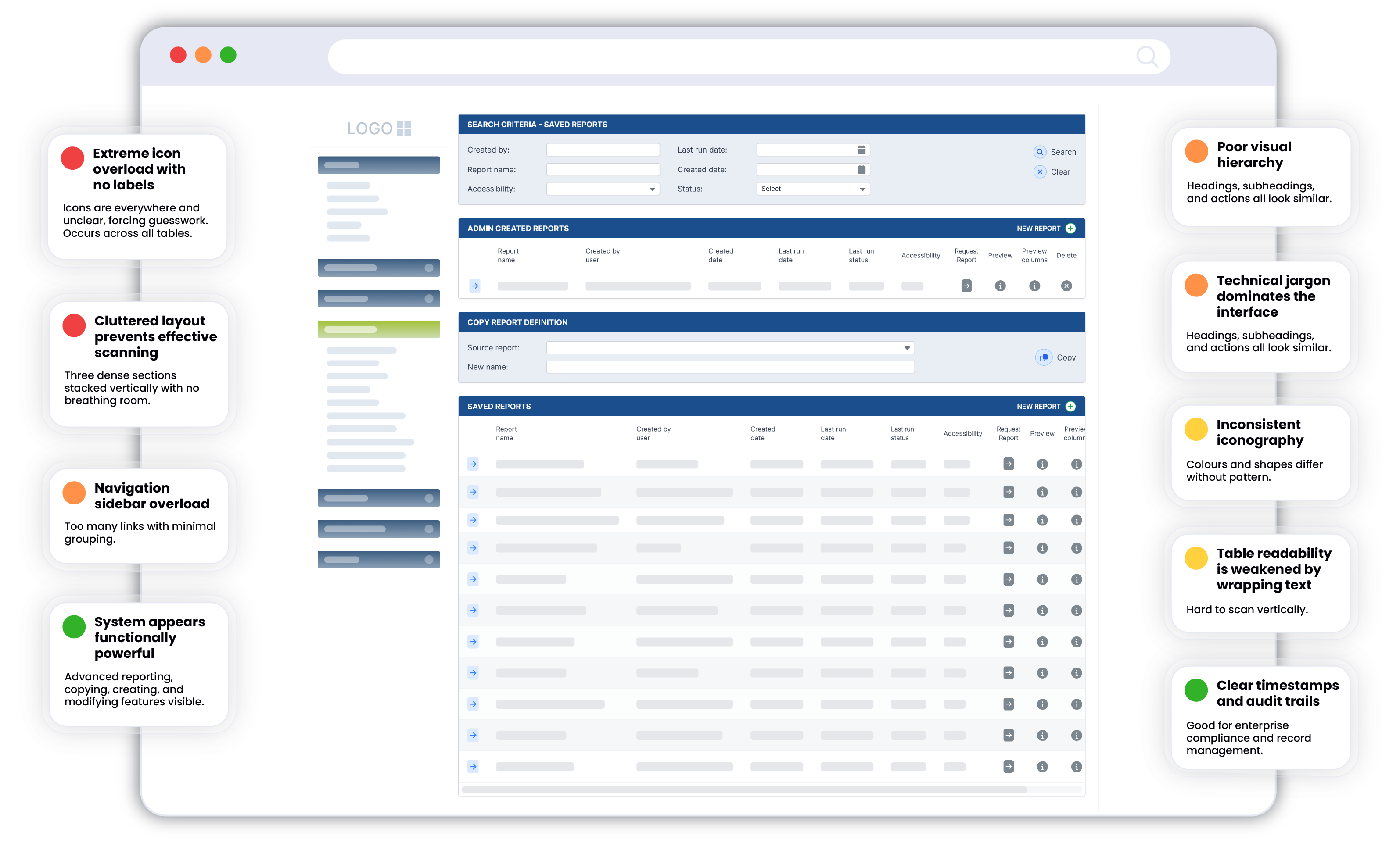
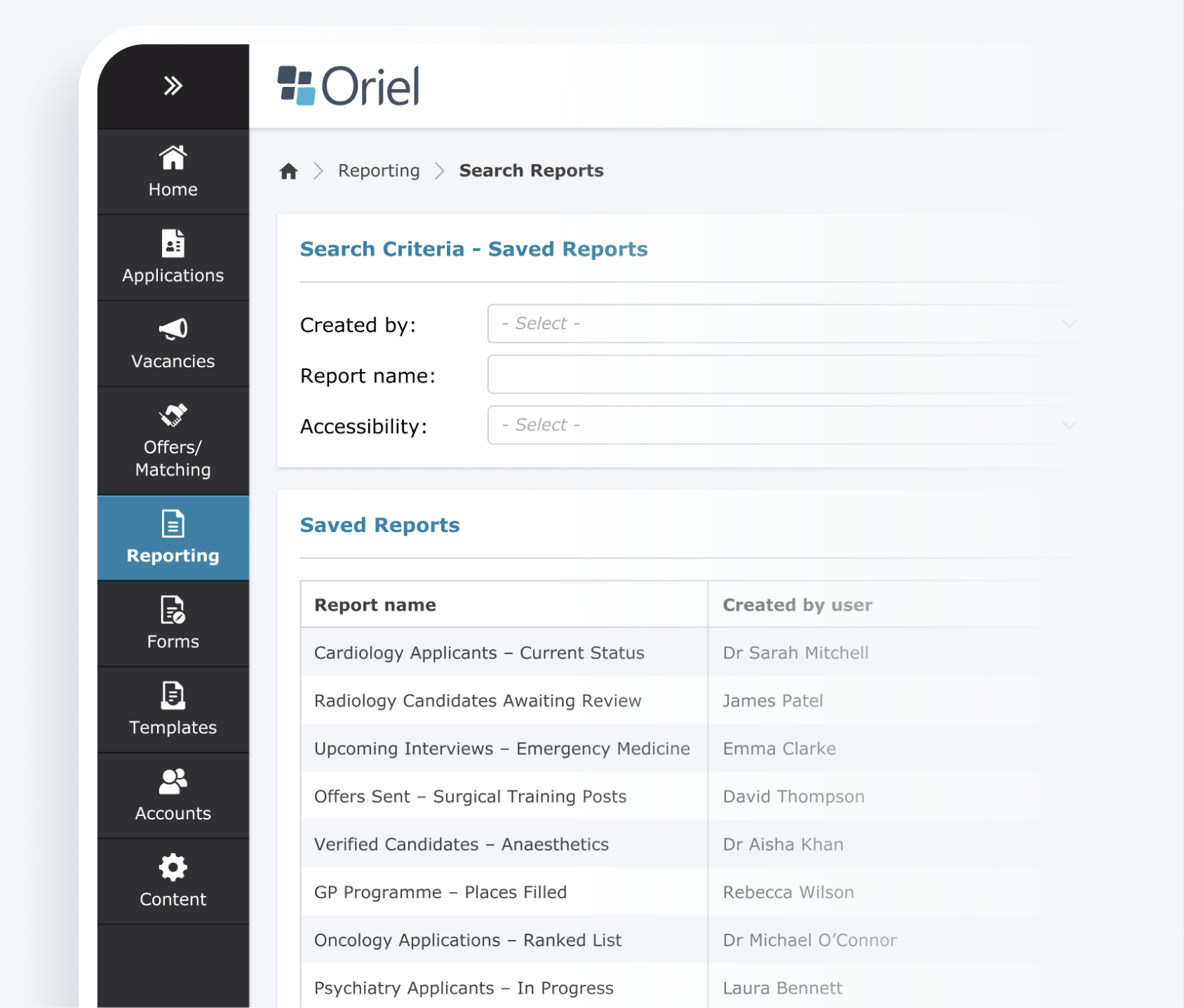
The screen shown below represents the reporting and data management interface used across the Oriel platform. Many of the interaction patterns shown here are repeated throughout the system, making it a useful proxy for assessing systemic usability and accessibility maturity.
Risk & Error Issues
Cognitive Load & Hierachy
Accessibility & Readability
Strengths
• Increased cognitive strain for administrative users
• Elevated risk of mis-click errors in data-sensitive workflows
• Reduced onboarding efficiency for new users
• Potential accessibility non-compliance (WCAG 2.1 AA risk)
• Slower task completion in high-volume reporting scenarios
• Very low contrast for some text and icons
• Icons rely solely on colour not accessible for colour-blind users
• No visible keyboard navigation indicators
• Extremely dense layout makes it difficult for users with visual
or cognitive impairments
• Icon set is inconsistent in shape, size, colour, and meaning
• Spacing and alignment vary between sections
• Tables and headings lack consistent visual hierarchy
• Navigation panel left is long, non-grouped, and overwhelming
• Multiple report sections on one page create confusion
• It’s unclear which actions apply to which table row or section
• Labels are technical, not user-centered
• No explanatory text or tooltips
• Data labels inside tables wrap excessively and are hard to read

Audit Insights
The legacy interface prioritised functional density over clarity. While powerful for experienced administrators, the system introduced elevated cognitive load, increased error risk, and potential accessibility compliance gaps. These findings informed the definition of core redesign principles focused on clarity, task-orientation, progressive disclosure, and WCAG-aligned accessibility standards.
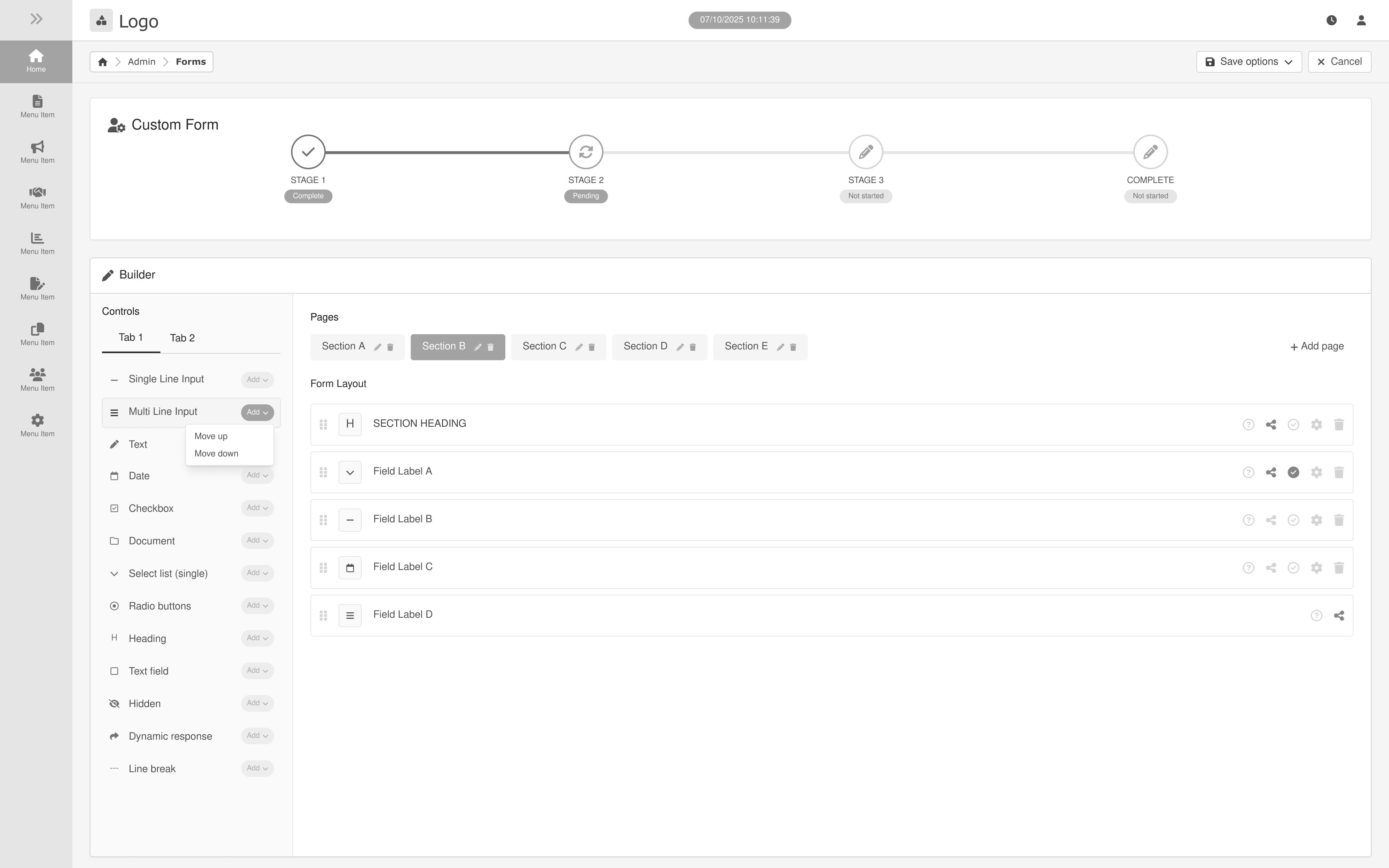
Wireframe
Exploration
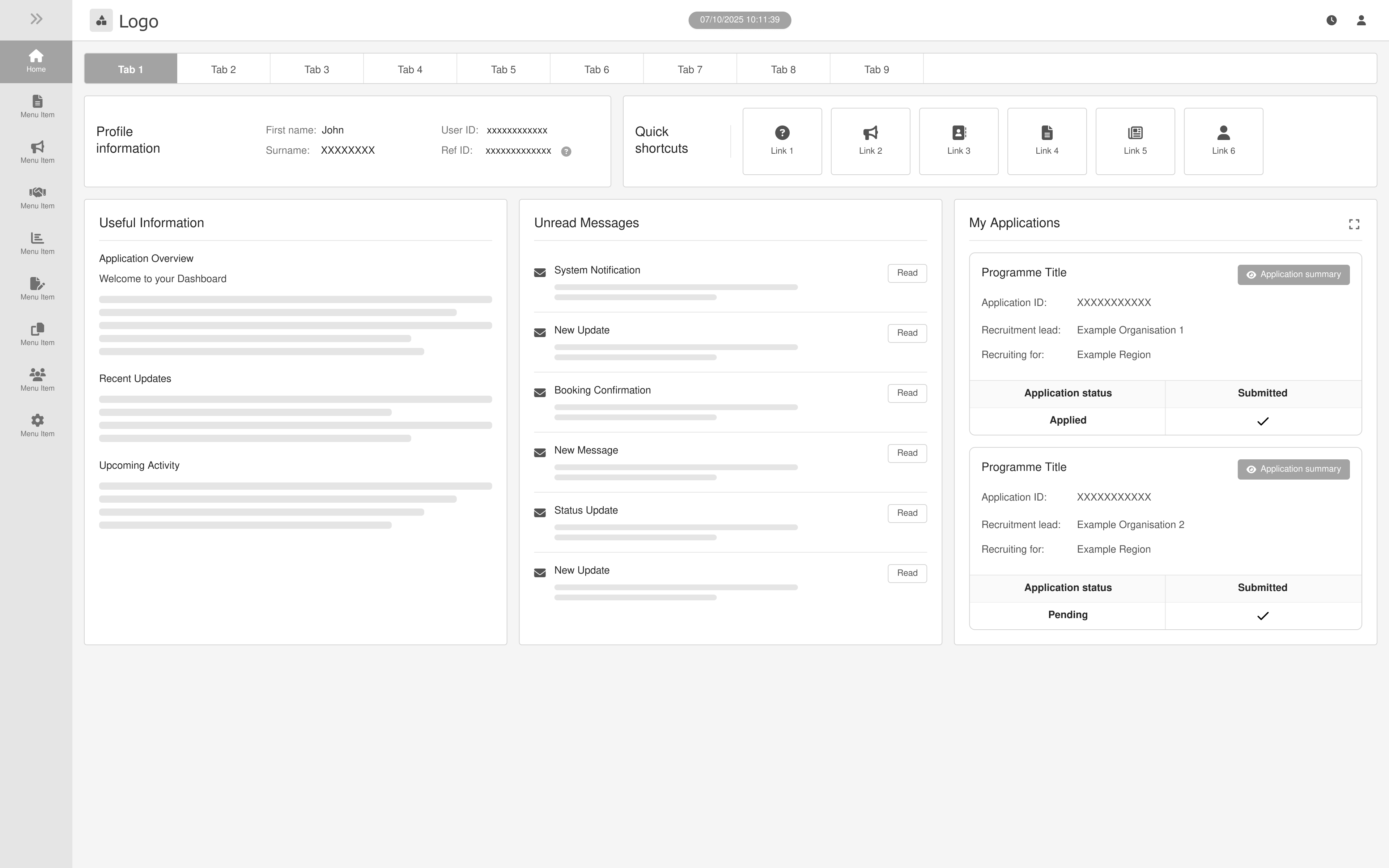
Following the initial UX audit, low-fidelity wireframes were created to explore improvements to the platform’s layout, hierarchy, and workflow efficiency.
The goal was to simplify complex recruitment workflows, improve data visibility, and ensure key actions were easily accessible for administrators managing high volumes of applications.
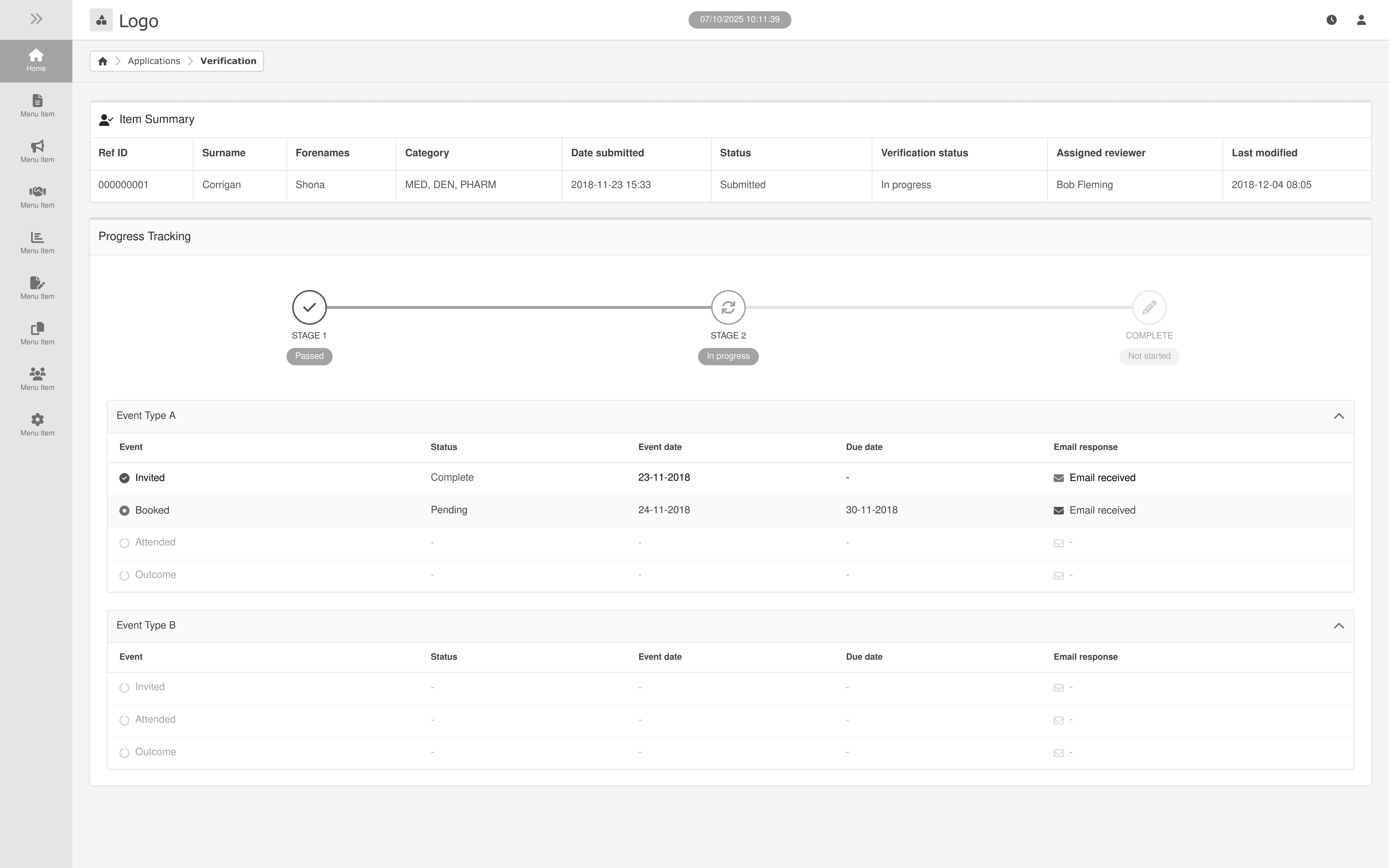
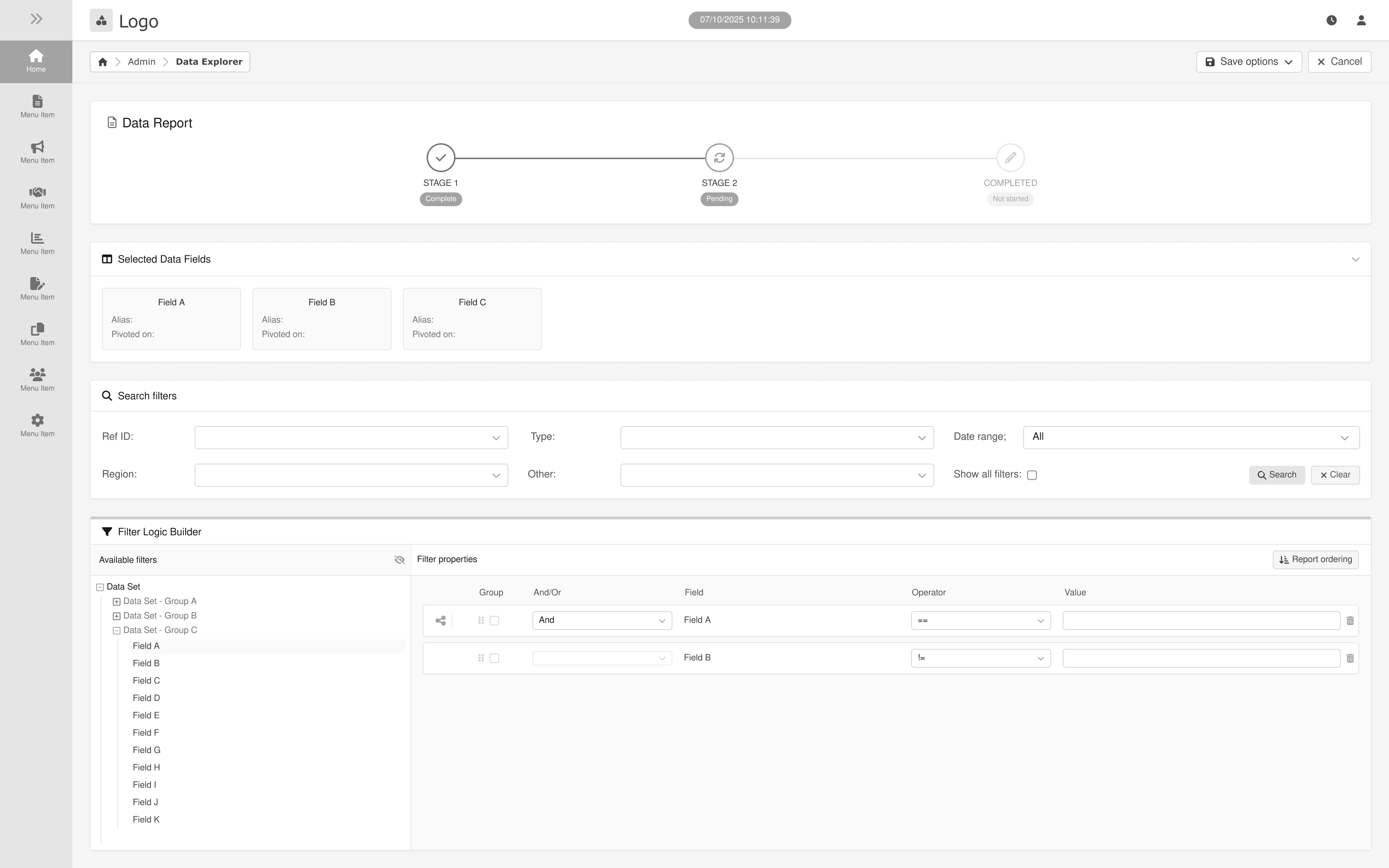
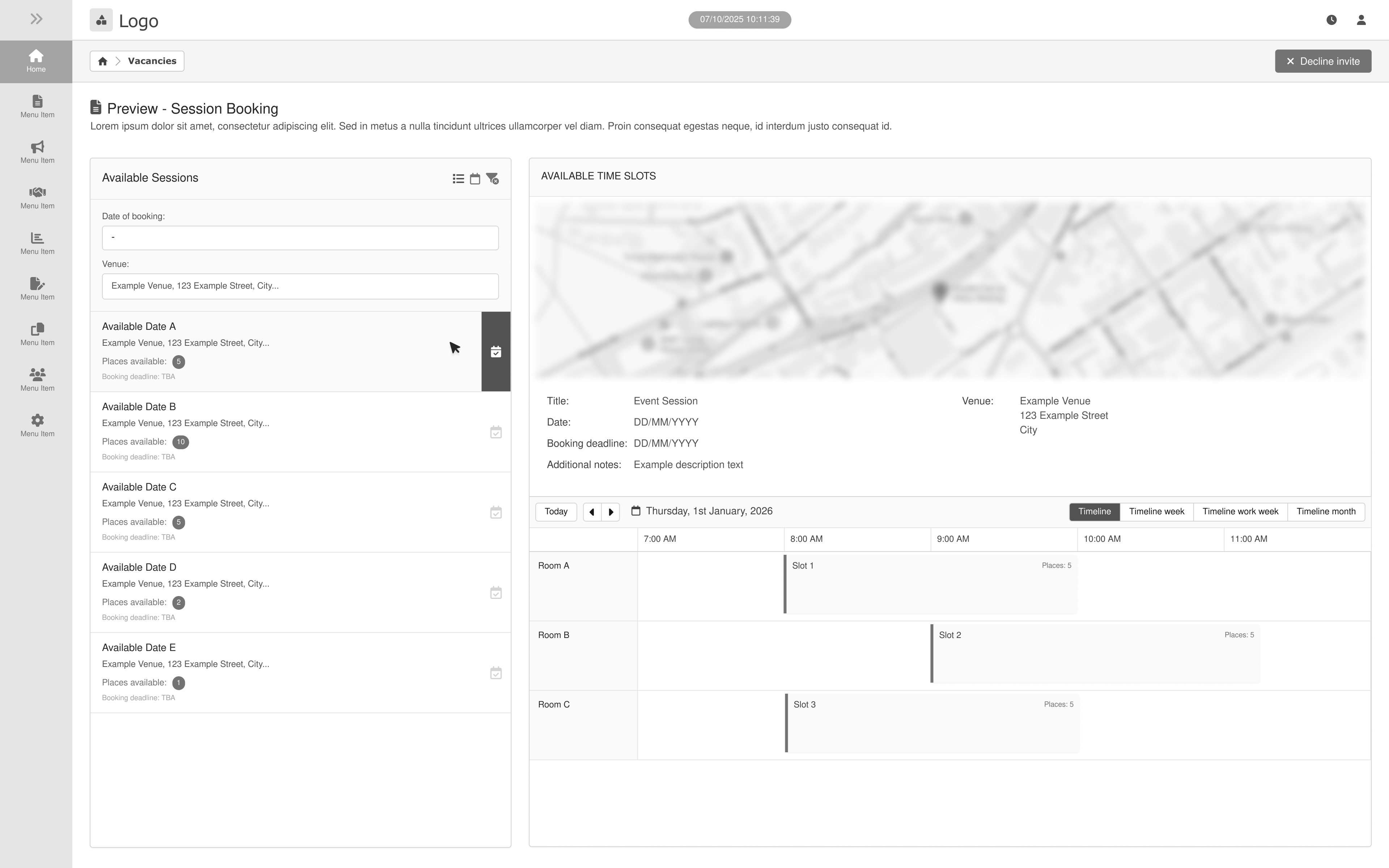
Dashboard

Applications
Form Builder
Credentialing
Reporting
Session Booking
Structural Improvements Implemented
Simplified Information Hierarchy
• Reduced visual density and icon reliance
• Introduced clearer section grouping
• Applied progressive disclosure for advanced functionality
Improved Interaction Safety
• Increased separation between destructive and non-destructive actions
• Clarified action ownership (row vs. table level)
• Introduced clearer primary and secondary button states
Standardised Interface Patterns
• Unified iconography and button hierarchy
• Established consistent spacing and alignment rules
• Improved table structure and readability
Accessibility Considerations
• Reduced reliance on colour-only indicators
• Improved contrast and legibility
• Considered keyboard navigation and structured data layouts
Brand Integration
& Logo design
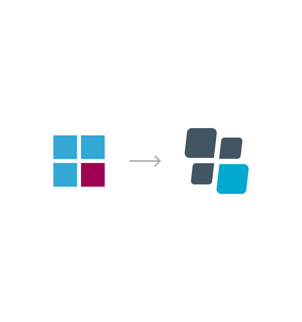
During the early exploration phase, several geometric approaches were considered based around a four-tile structure. Initial concepts focused on simple square forms arranged in a grid, allowing the icon to communicate balance, structure and consistency.
Sketches explored variations in spacing, alignment, proportion and corner radius to identify a visual language that felt both structured and distinctive. The goal was to retain the clarity of the grid from the original icon while introducing subtle visual character that would make the icon more recognisable as part of the platform's identity.

.jpg)
From Static Grid to Dynamic Symbol
The final icon evolves the original grid into a more expressive and modern symbol. The rotated forms introduce a sense of motion and progression, while the rounded geometry creates a more contemporary and approachable aesthetic.
Despite these refinements, the icon retains the underlying four-part structure of the original concept, ensuring continuity with
the initial design intent while improving visual distinction and scalability across digital products.
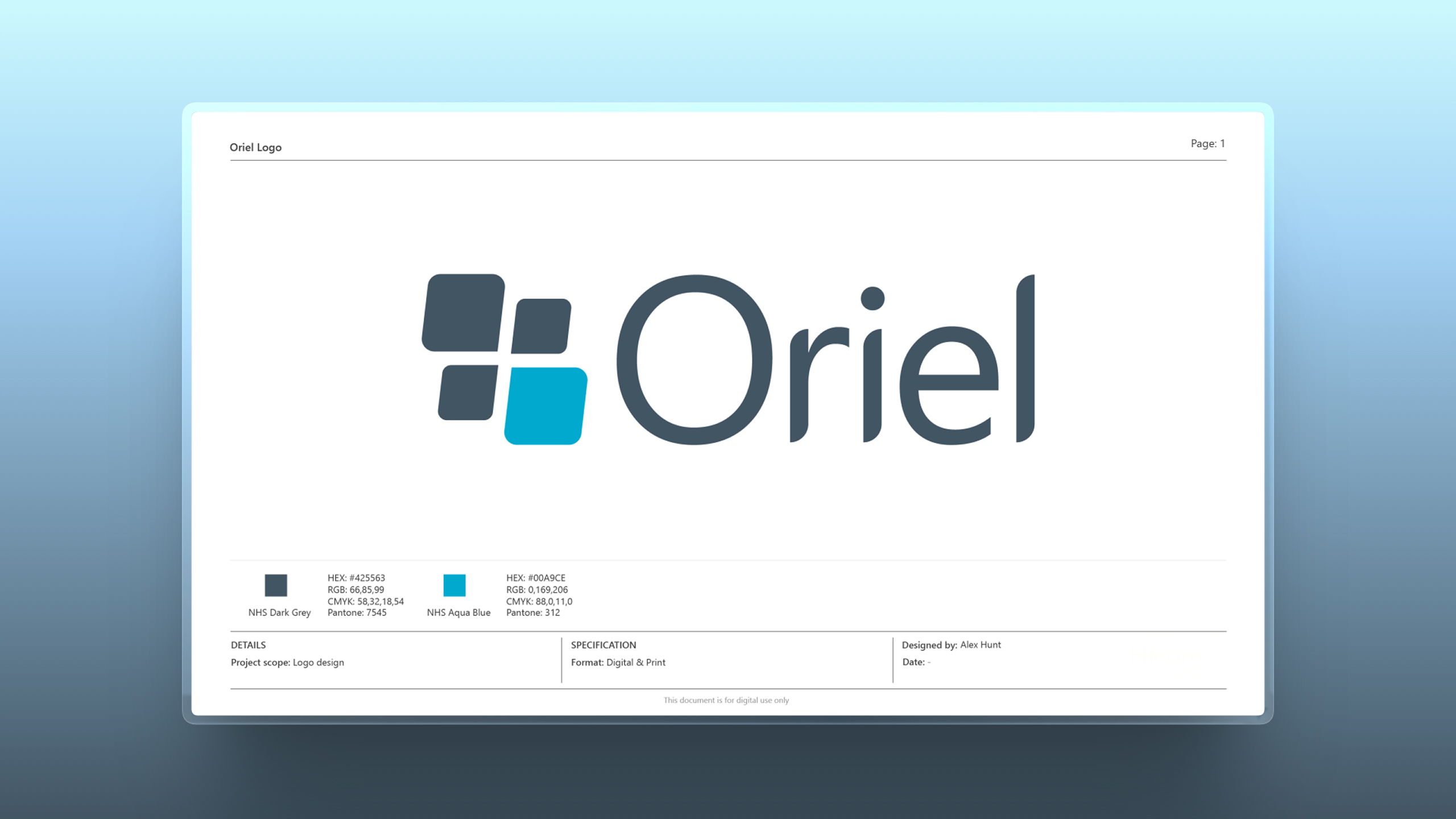
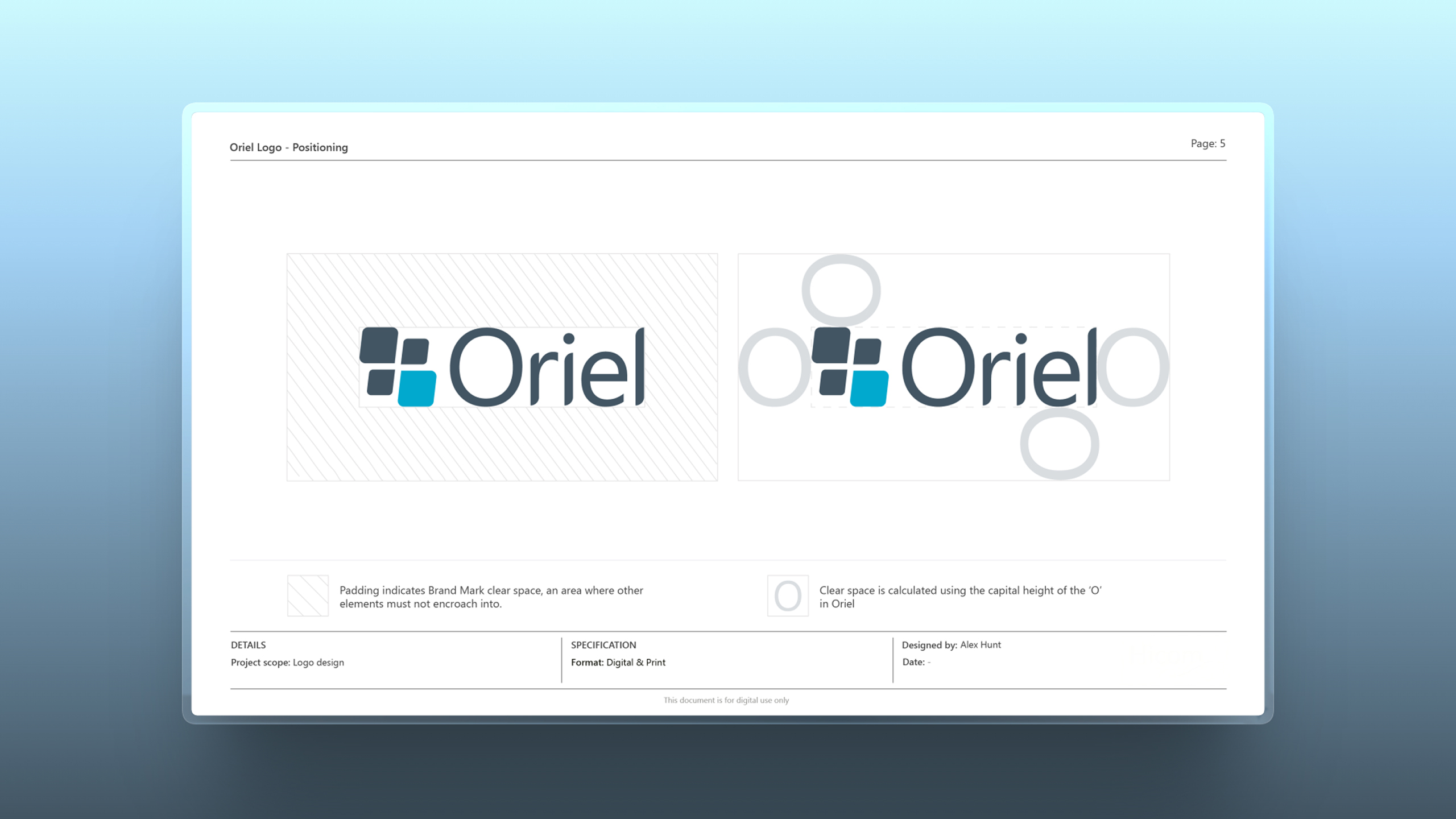
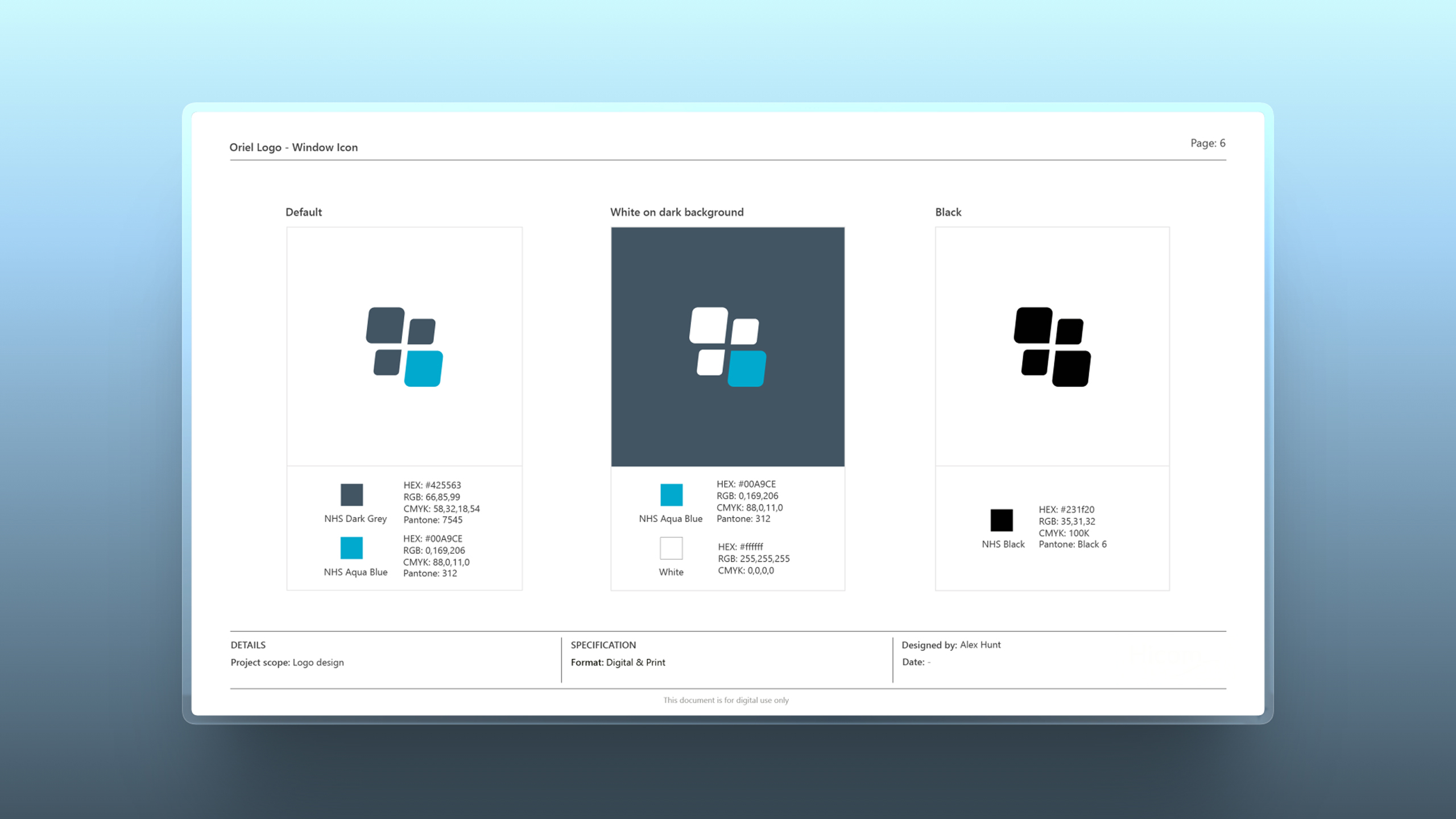
Brand Guidelines
A structured set of brand guidelines was created to support consistent implementation of the Oriel identity across the platform. The documentation outlines the logo system, colour palette, typography and usage principles to ensure clarity, accessibility and visual consistency.
UI Design
With the underlying architecture established, the interface was developed through
a component-driven design system, enabling scalable, consistent UI across
a complex healthcare platform.
This timelapse below illustrates how individual screens are assembled using
pre-defined patterns and components, reducing design friction and
accelerating delivery. The approach ensures clarity for users, while supporting
the operational demands of high-volume recruitment environments.
Design System
To support the complexity and scale of the platform, a robust design system was established as a single source of truth for UI and interaction patterns.
The system defines visual foundations and codifies reusable components, from form controls and data tables to navigation and workflow patterns, all aligned to accessibility standards and clinical usability requirements.
By standardising how interfaces are built, the system improves design quality, accelerates development, and ensures consistency across a rapidly evolving product.
Despite these refinements, the icon retains the underlying four-part structure of the original concept, ensuring continuity with
the initial design intent while improving visual distinction and scalability across digital products.
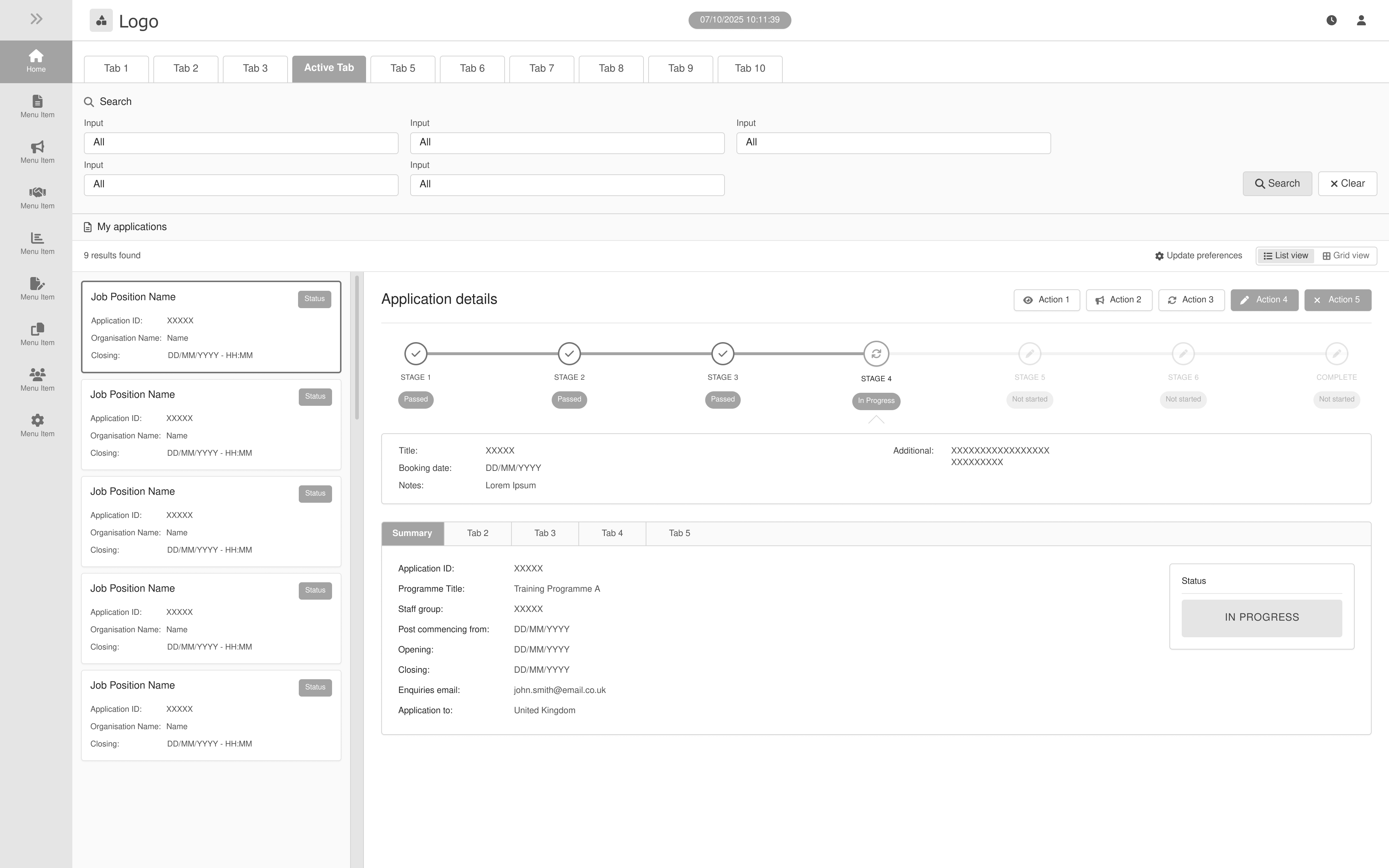
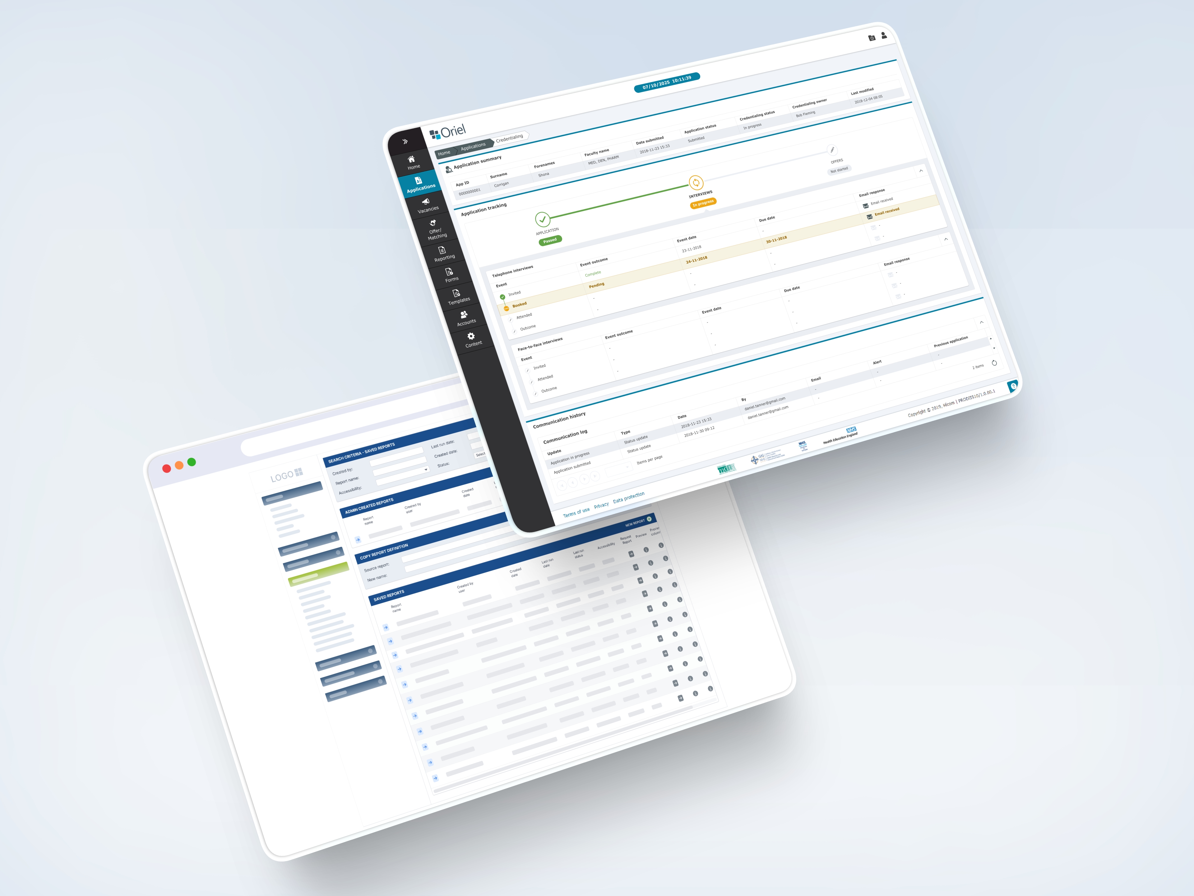
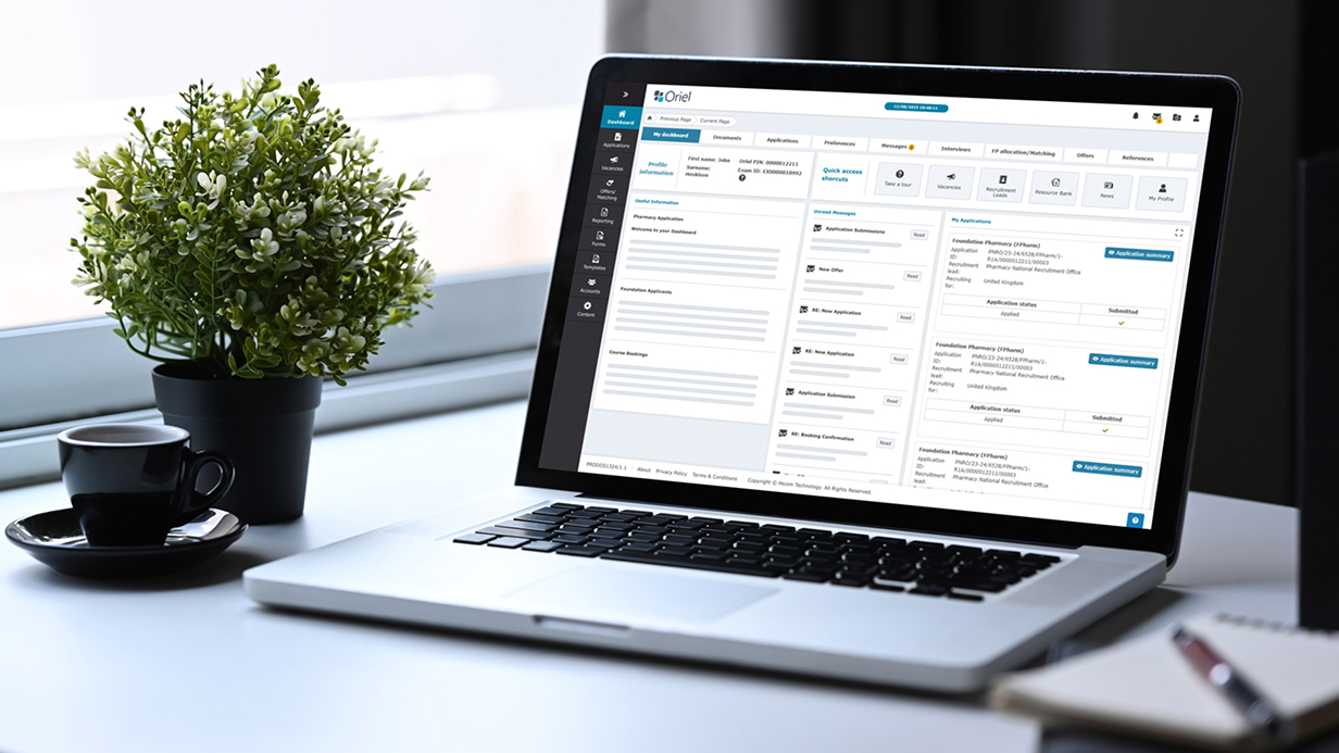
Final Outcome
The redesigned interface introduces a clearer information hierarchy and improved navigation across complex recruitment workflows. By refining the dashboard layout and simplifying the presentation of application data, administrators can more efficiently review candidate information and manage high-volume recruitment activity.
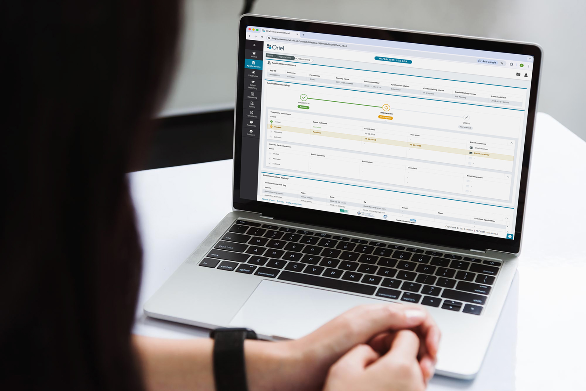
Outcome & Impact
The redesign introduced a clearer information hierarchy and improved visibility across complex recruitment workflows. By restructuring the dashboard layout and simplifying the presentation of application data, administrators were able to more easily review candidate information, monitor recruitment progress, and manage high-volume application cycles.
The updated interface provided greater clarity across data tables, navigation, and status indicators, helping reduce cognitive load for users working within complex recruitment systems.
My Contribution
This project was completed while working as a designer at Hicom Technology (now part of VitalHub).
My role focused on improving the usability and structure of the Oriel platform interface.
Key contributions included:
• UX evaluation of the existing interface
• Redesign of dashboard layout and data hierarchy
• Wireframe exploration for improved workflows
• Integration of product branding within the interface
• UI design for key screens and navigation components
Design Learnings
Designing for complex administrative systems requires careful attention to information hierarchy and workflow clarity. This project highlighted the importance of structuring dense datasets in a way that allows specialist users to quickly interpret large volumes of information without losing important detail.
Establishing consistent visual patterns and clear hierarchy proved essential in improving the usability of the platform.


Ready to start
building?
Let's talk about your next project and how I can help.