
Patient
Pathway App
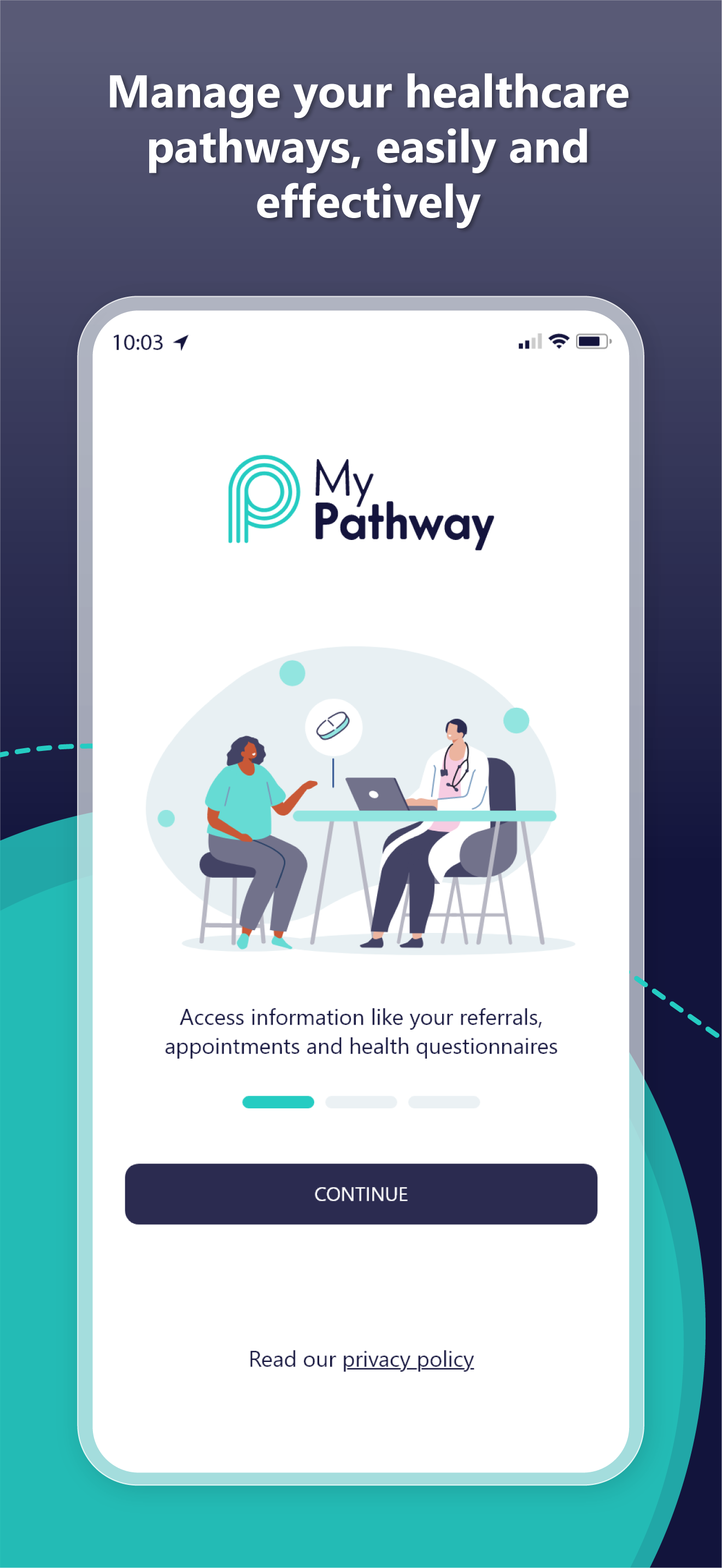
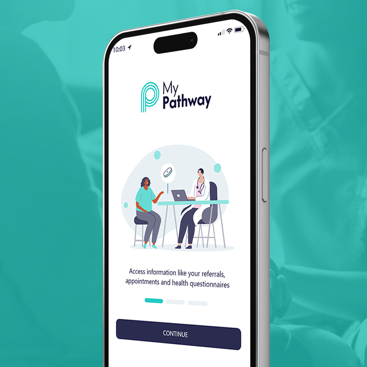
The MyPathway Patient App delivers a personalised, digital interaction between patients and clinicians, placing patients at the centre of their healthcare journey.
A limited patient experience
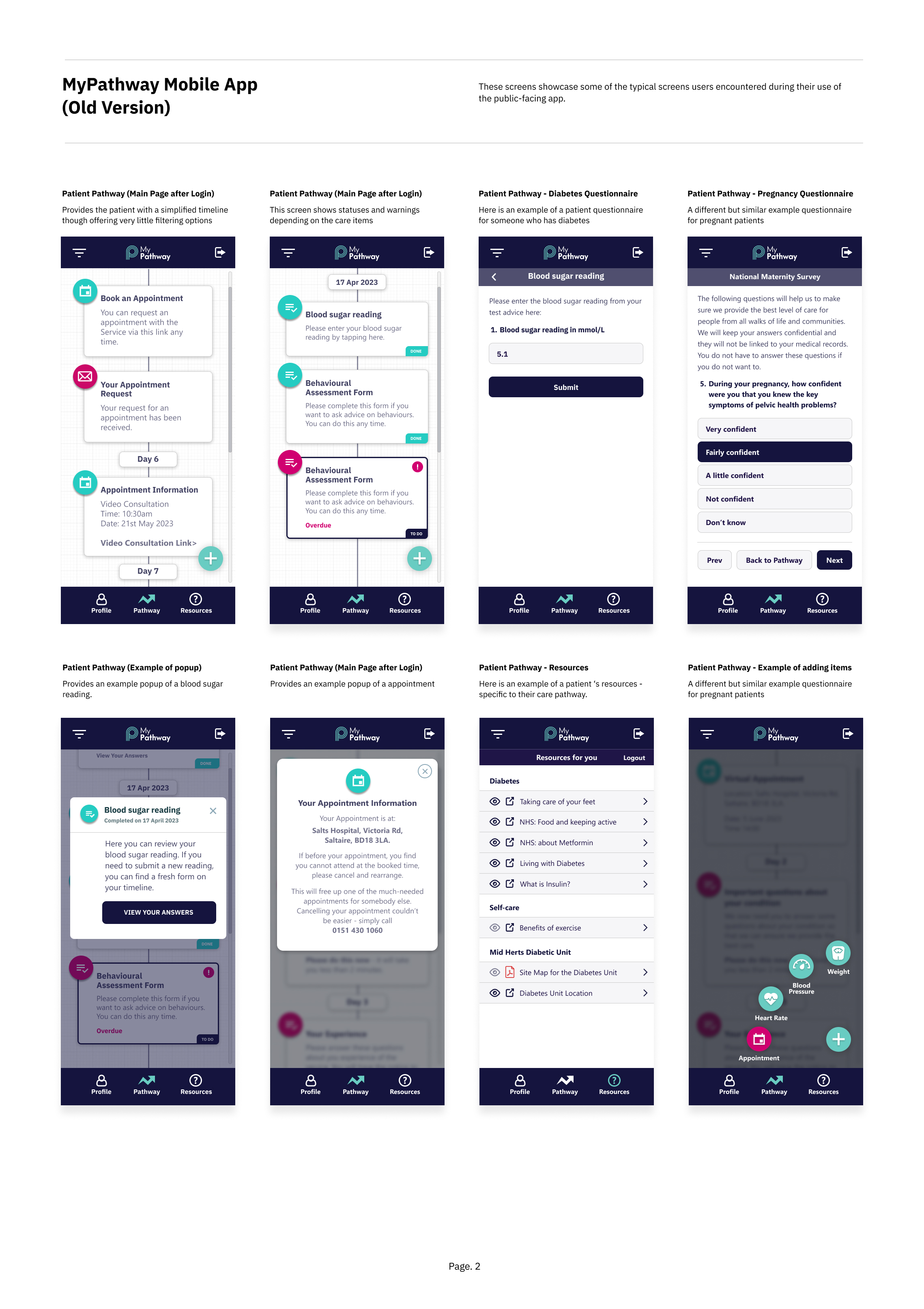
Patients were required to manage aspects of their care pathway through
a mobile application that provided only basic functionality and limited visibility into their ongoing treatment journey. While the platform supported communication between patients and healthcare providers, the overall experience lacked the flexibility and clarity needed for modern patient engagement.
The original interface relied on simple navigation structures and isolated features that did not provide a cohesive overview of a patient's care journey. Key limitations included:
• Limited visibility of a patient’s overall care pathway
• Minimal functionality for managing appointments and health data
• No ability to manage multiple patient profiles within a single account
• Fragmented features that lacked a unified pathway experience
• Limited patient control over monitoring their progress and care activities
As a result, patients had little transparency into their treatment journey and were required to interact with individual features separately rather than through a clear, structured care pathway.
Redesign the patient pathway experience
The challenge was to modernise the MyPathway mobile application and improve how patients interact with their healthcare journey through a digital pathway experience.
MyPathway is designed to connect patients with their clinical care teams, enabling communication, remote monitoring and digital interactions throughout treatment pathways. The redesign needed to enhance patient engagement while providing clearer access to information, tasks and communication with clinicians. Specifically, the redesign aimed to:
• Introduce a clearer patient pathway interface to visualise treatment stages and progress
• Enable multiple patient profiles within a single account
(supporting family members or dependants)
• Improve appointment management and reminders
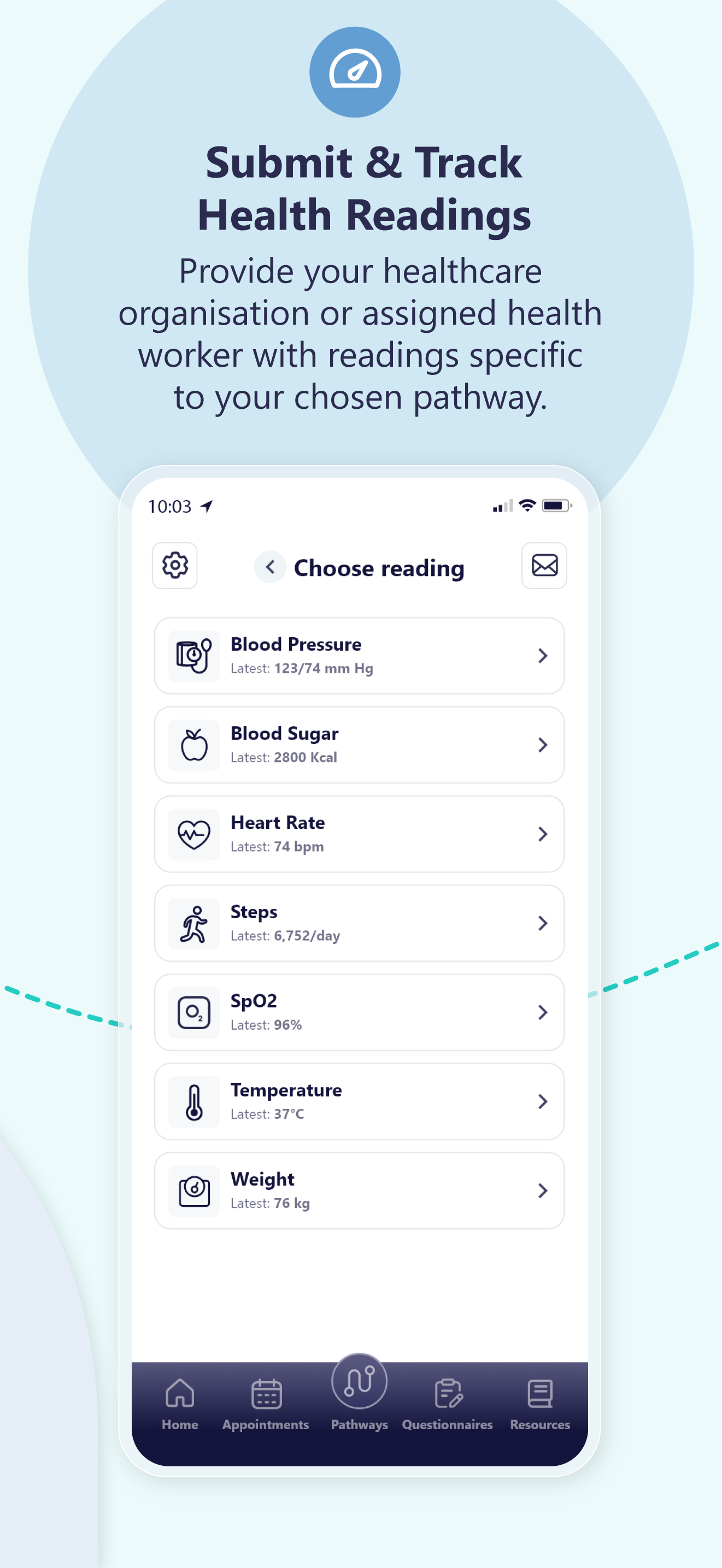
• Enable patients to submit and review health readings remotely
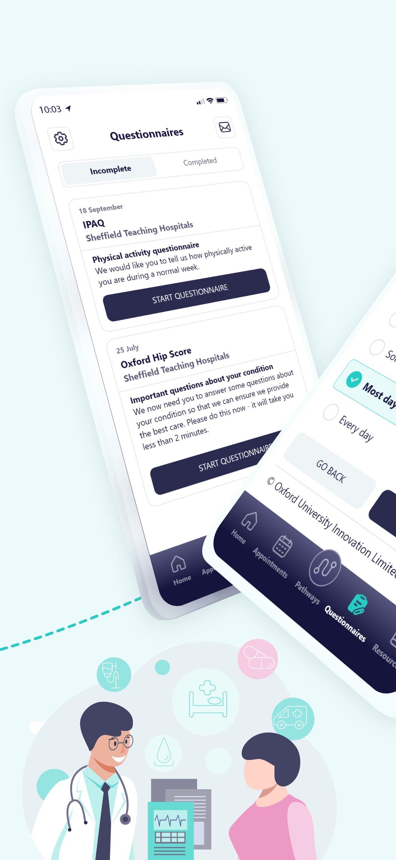
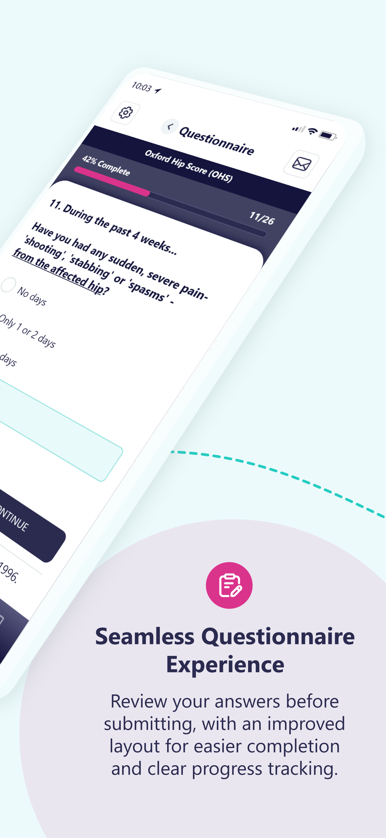
• Support digital questionnaires for assessments and post-treatment feedback
• Provide easy access to educational resources and care information
• Allow patients to view results and key updates related to their treatment
The goal was to transform the app from a simple patient communication tool into a more comprehensive digital pathway experience, empowering patients to stay informed, participate in their care and interact with clinicians outside of traditional hospital appointments.
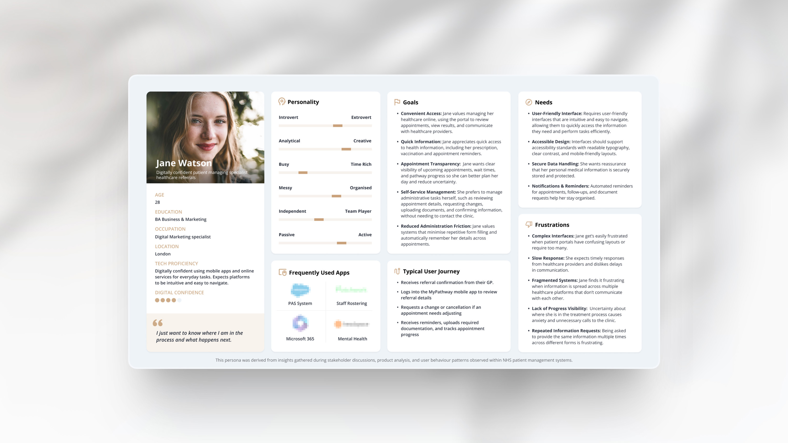
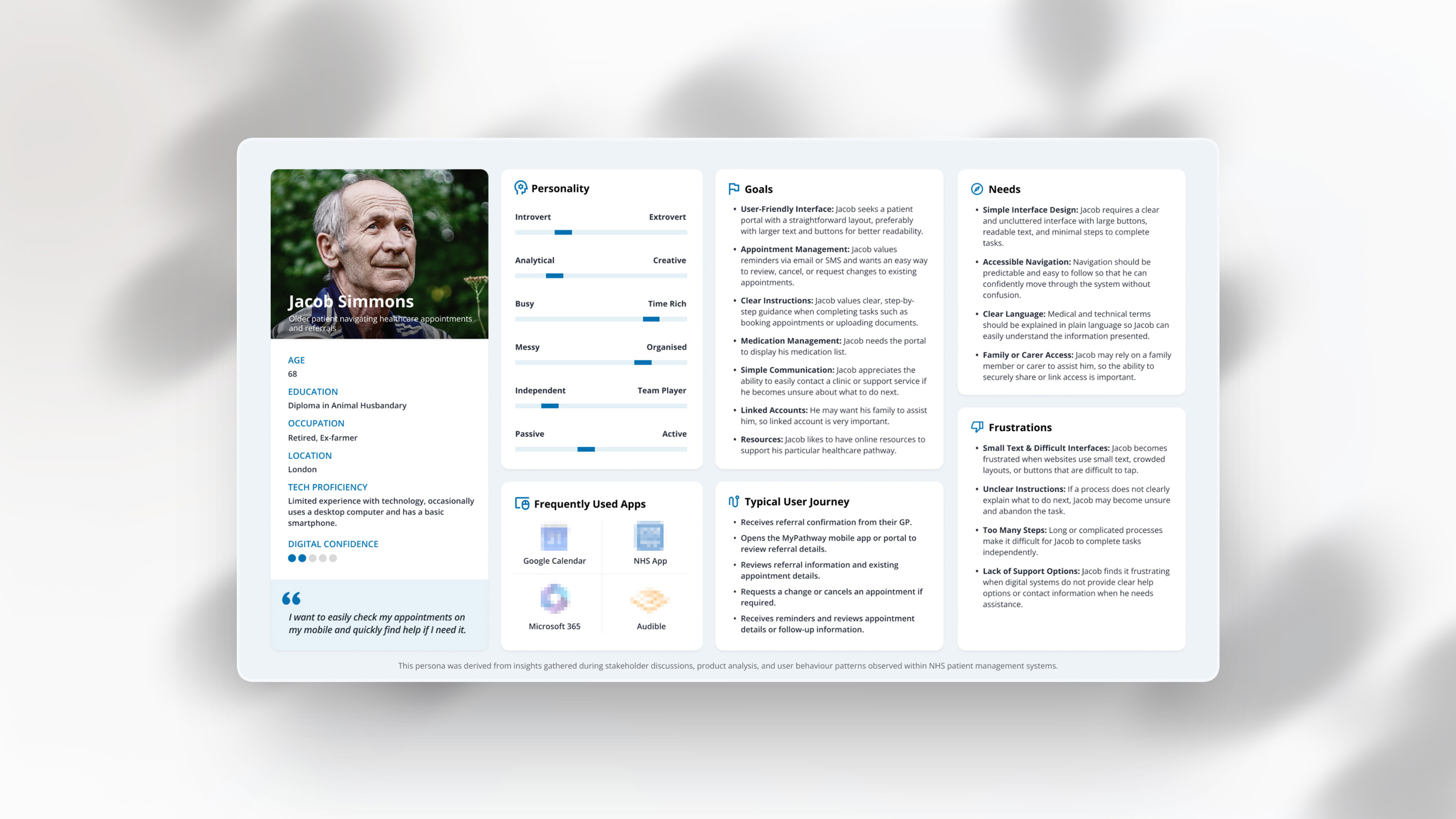
User Personas
To better understand the needs of patients interacting with the MyPathway mobile app, two representative personas were developed to capture different levels of digital confidence and accessibility requirements.
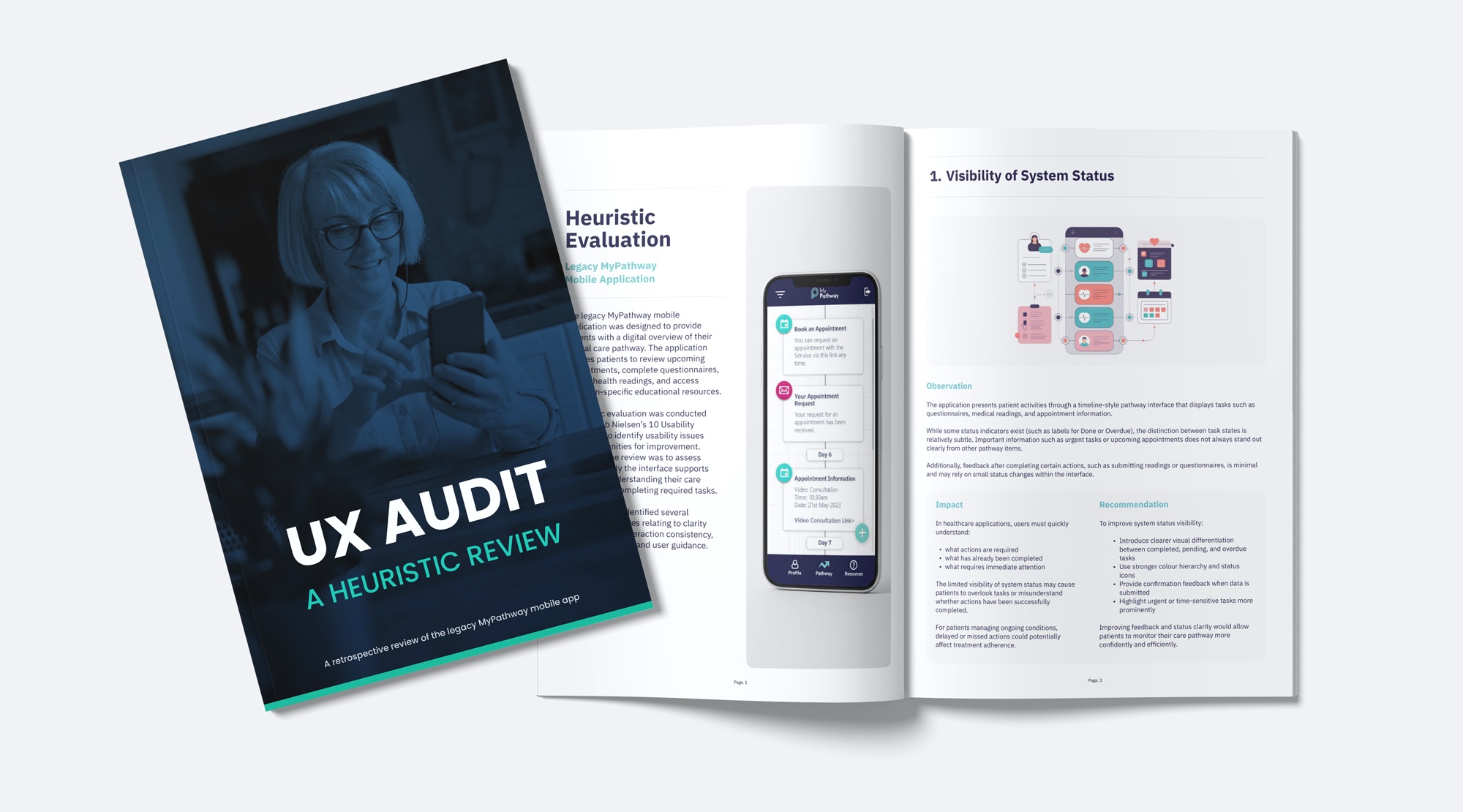
UX Audit
With the platform structure established and to demonstrate the evaluation phase of the redesign process, a retrospective UX audit was conducted on the legacy MyPathway mobile application to assess how effectively it supported patients in managing their care pathway.
Using Jakob Nielsen’s usability heuristics, the review assessed the clarity of information, interaction patterns, and overall usability of the interface. The findings highlighted several opportunities to improve how patients understand their treatment journey and complete key actions within the platform.
Key Insights
The heuristic evaluation of the legacy MyPathway mobile application identified several usability challenges affecting how patients understand and interact with their care pathway.
While the platform successfully centralises appointments, questionnaires, and health readings within a single interface, the review highlighted opportunities to improve clarity, navigation, and interaction consistency.
The following insights summarise the most significant usability themes observed during the evaluation and informed the design considerations explored in the subsequent redesign.
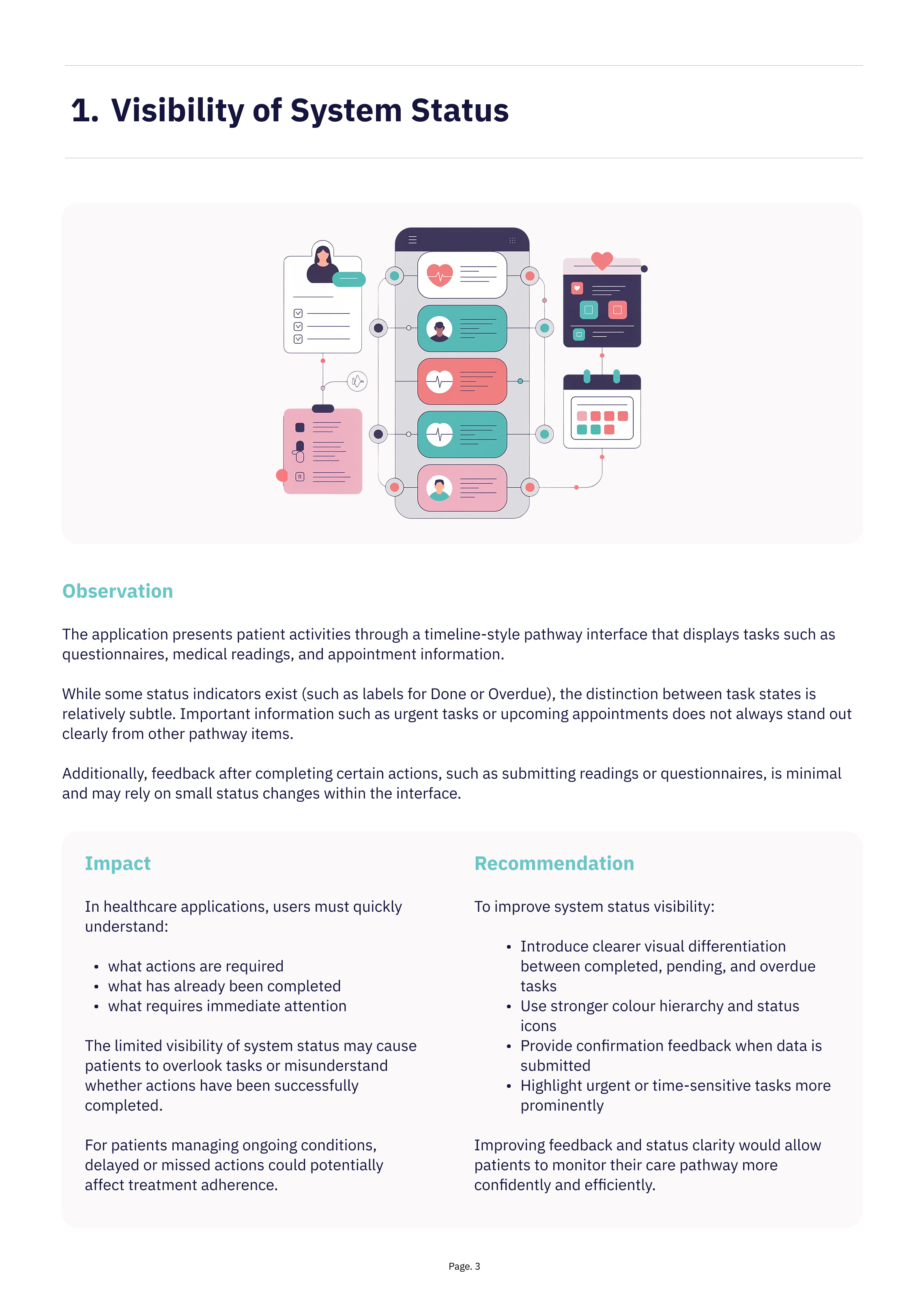
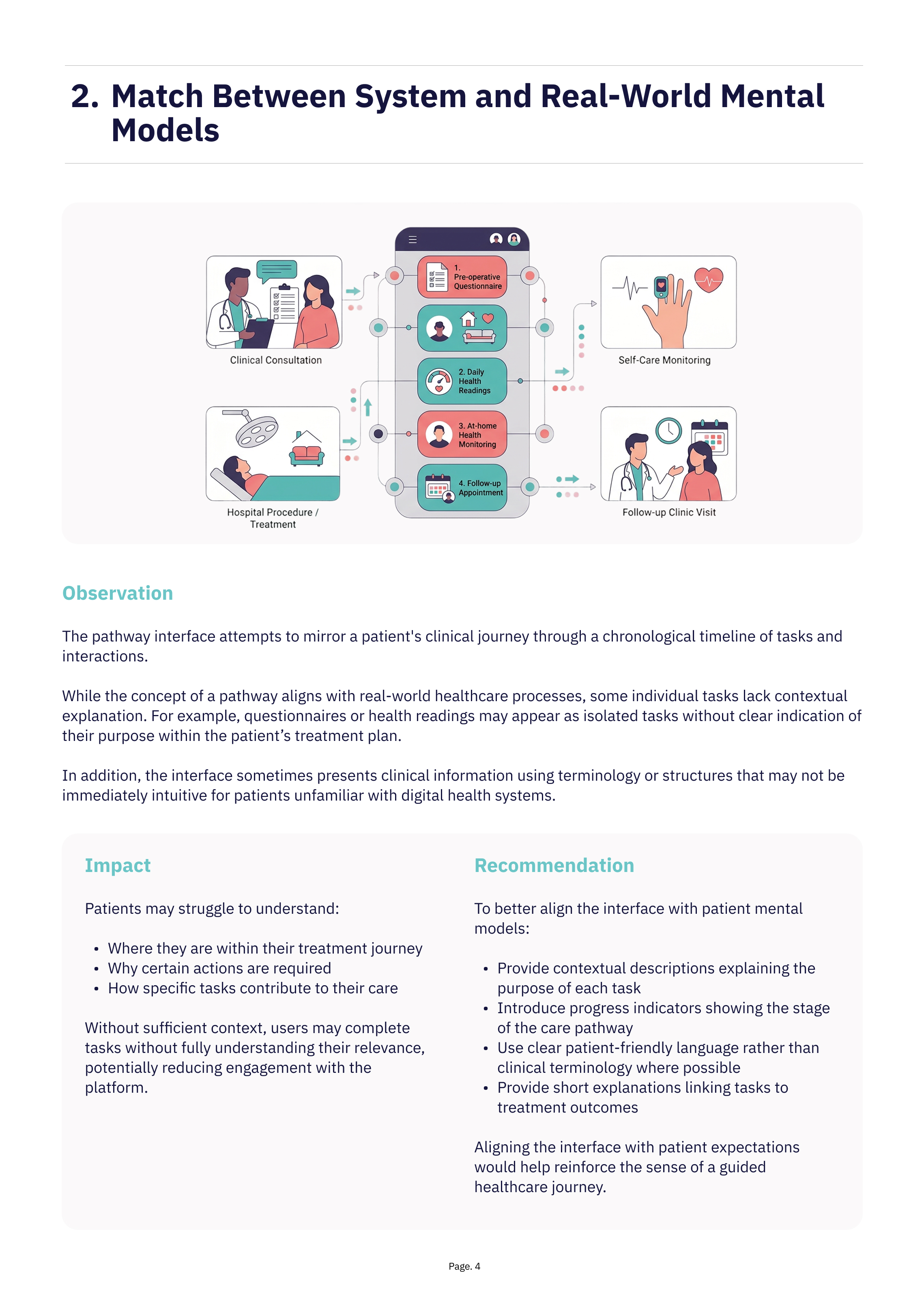
1. Limited Contextual Guidance
Several tasks within the pathway appear without sufficient explanation describing their purpose or how they relate to the patient’s treatment journey. Questionnaires and health readings often appear as isolated activities rather than clearly defined steps within a broader clinical process.
Without contextual guidance, patients may find it difficult to understand why certain tasks are required or how they contribute to their care.
2. Reduced Visibility of Important Information
Although the pathway timeline presents tasks
in chronological order, important information such as overdue questionnaires or upcoming appointments does not always stand out clearly from other pathway items.
The similarity of visual elements and repeated card structures can make it difficult for users
to quickly identify the most critical actions.
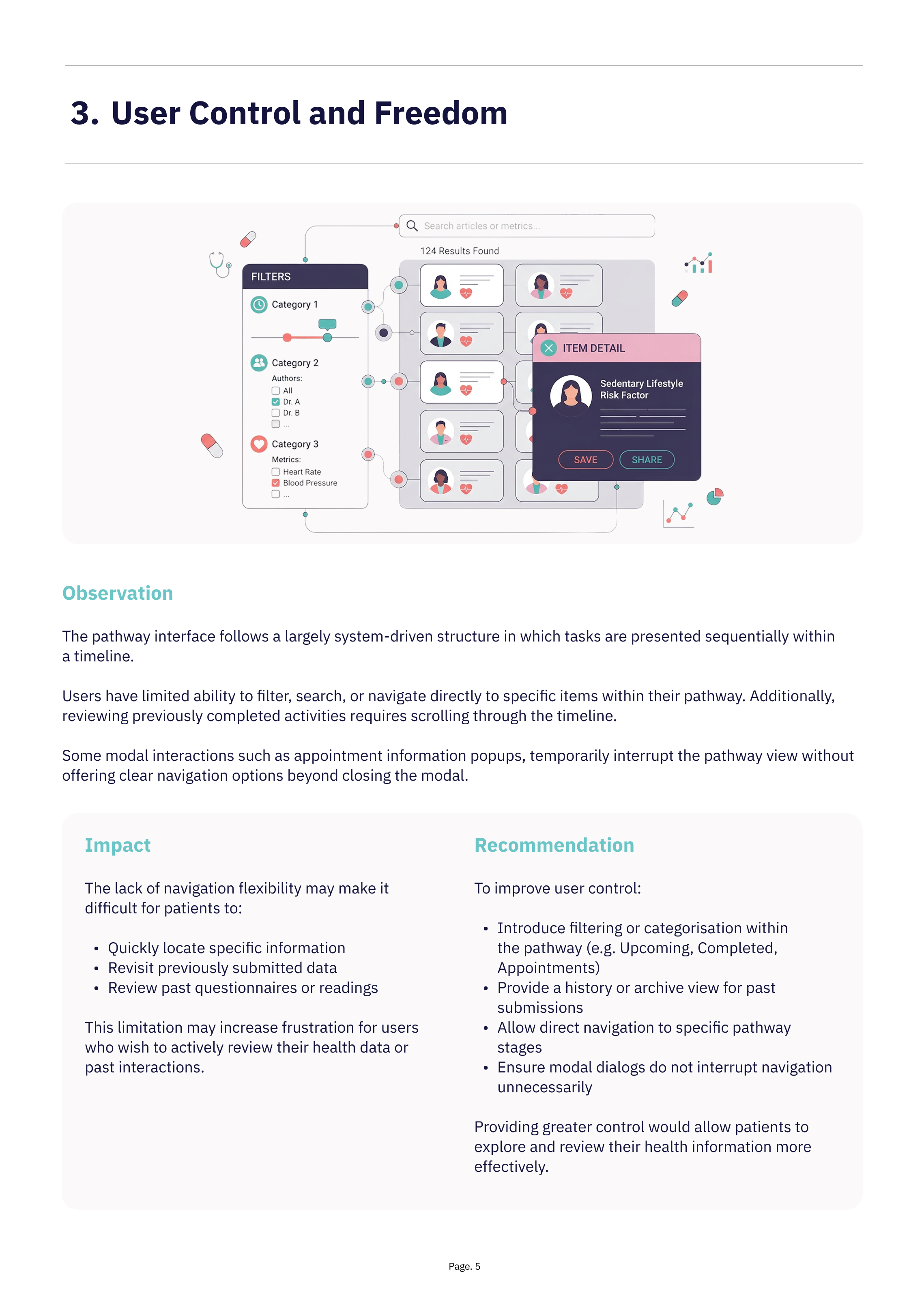
3. Limited Navigation Flexibility
The system relies heavily on a linear timeline structure, which can make it difficult for patients to quickly access specific information or review previous interactions.
Users may need to scroll through multiple pathway items to locate past submissions, resources, or upcoming tasks, reducing efficiency for patients who interact with the application regularly.
4. Inconsistent Interaction Patterns
Some UI components and interaction behaviours vary across different screens,
which may reduce predictability and increase cognitive effort for users.
Consistent patterns and clearer component hierarchy would help create a more cohesive and intuitive user experience.
Wireframe
Exploration
Following the initial UX audit, low-fidelity wireframes were created to explore improvements to the platform’s layout, hierarchy, and workflow efficiency.
The goal was to simplify complex recruitment workflows, improve data visibility, and ensure key actions were easily accessible for administrators managing high volumes of applications.
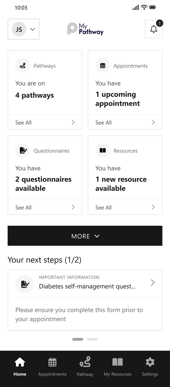
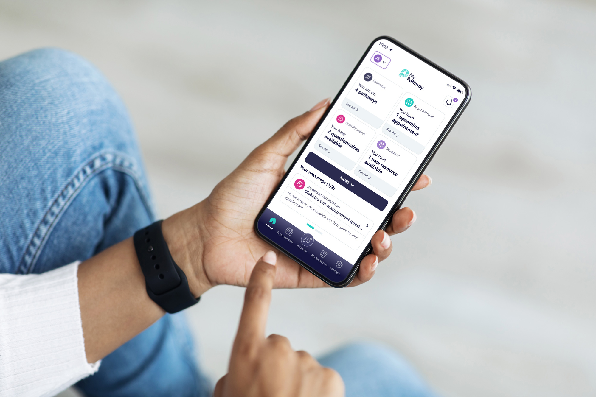
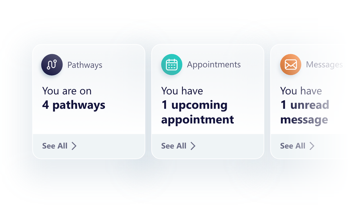
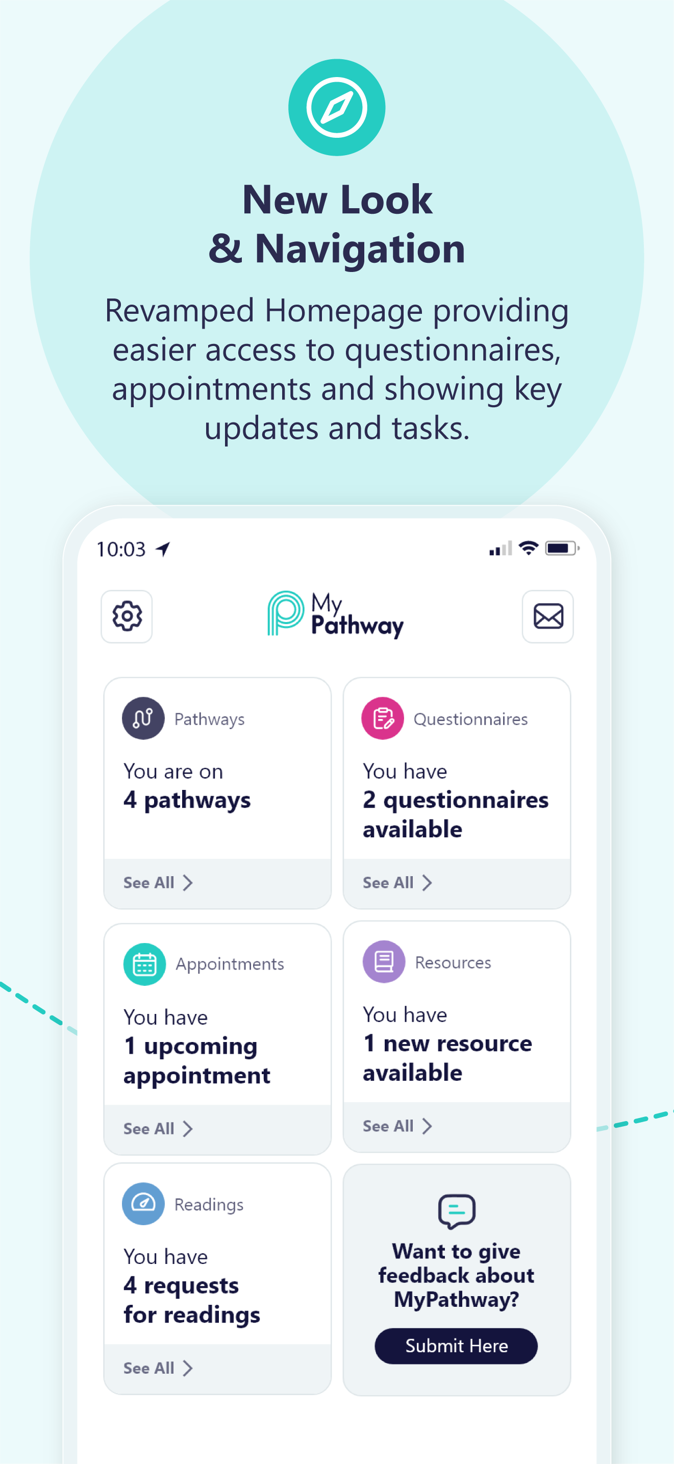
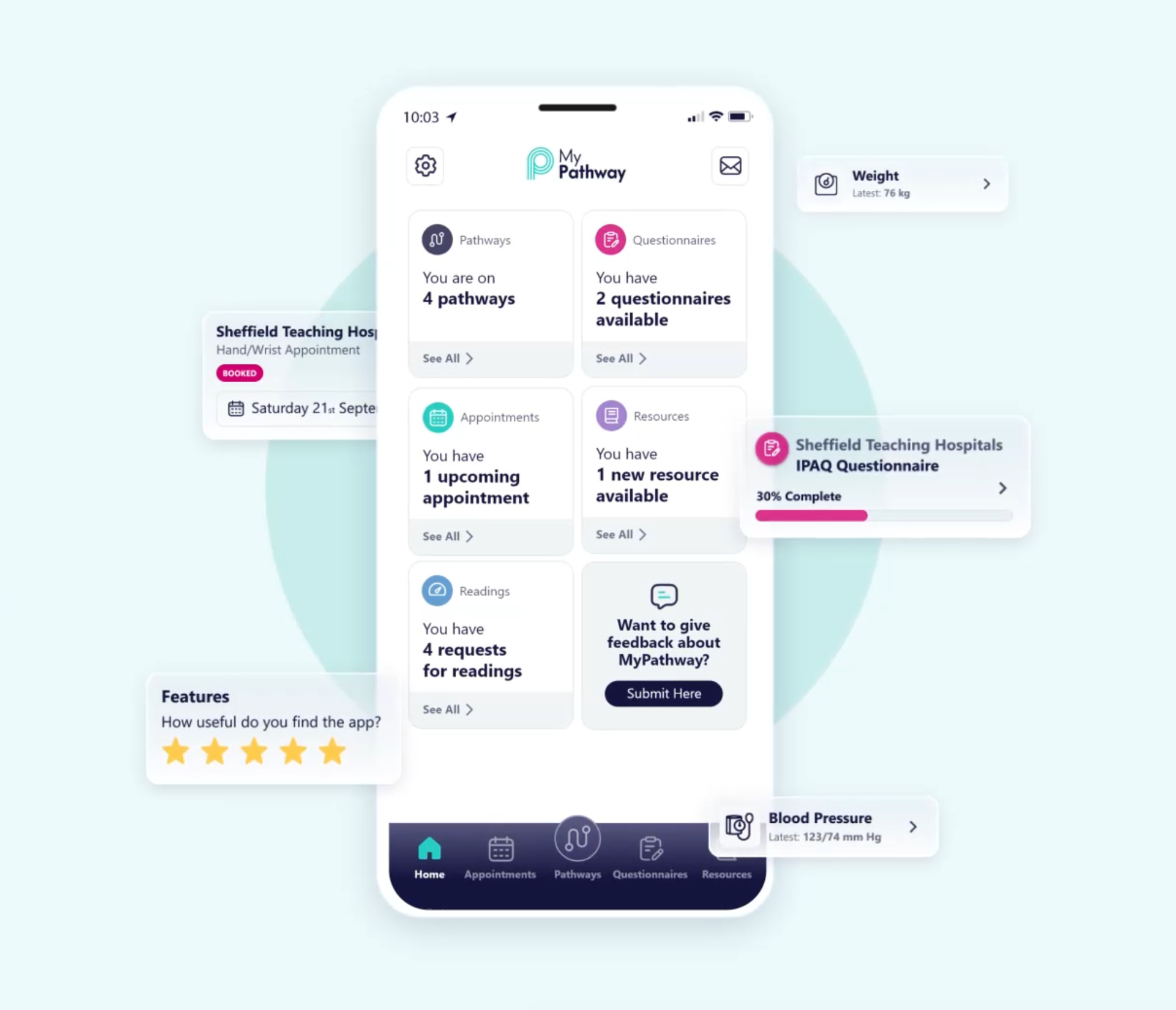
Home
As a central entry point, the dashboard improves visibility of system status, surfacing pathways, appointments, and tasks in a clear, scannable format. This supports recognition over recall and reduces cognitive effort. The “Next Steps” section provides contextual guidance, aligning tasks with the user’s care journey and reinforcing real-world understanding. Consistent components and predictable navigation reinforce usability and create a more cohesive, intuitive experience.
Overall, the redesign shifts the product from a system-led structure to a user-centred model, enabling faster orientation, clearer prioritisation, and more confident navigation.


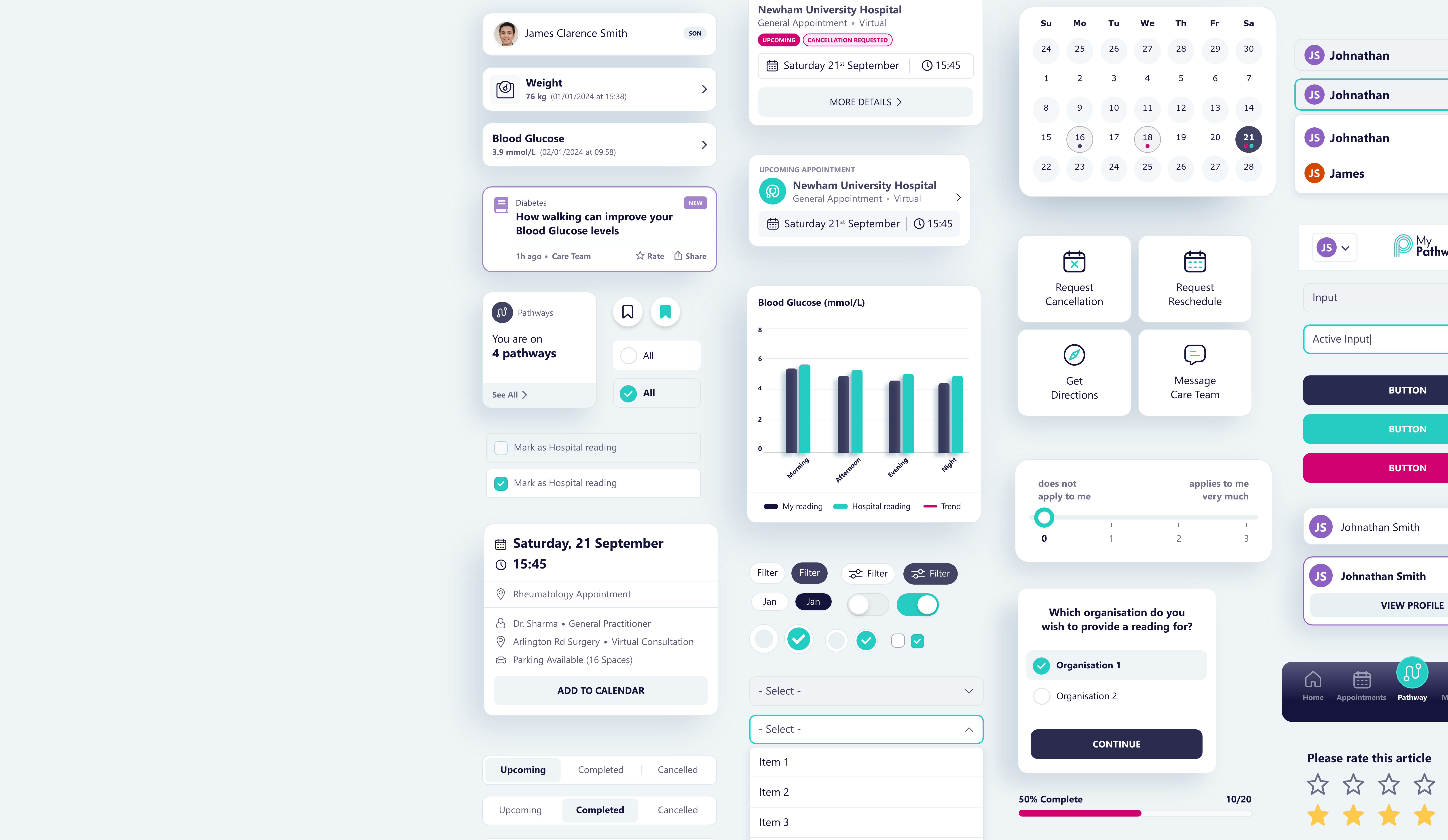
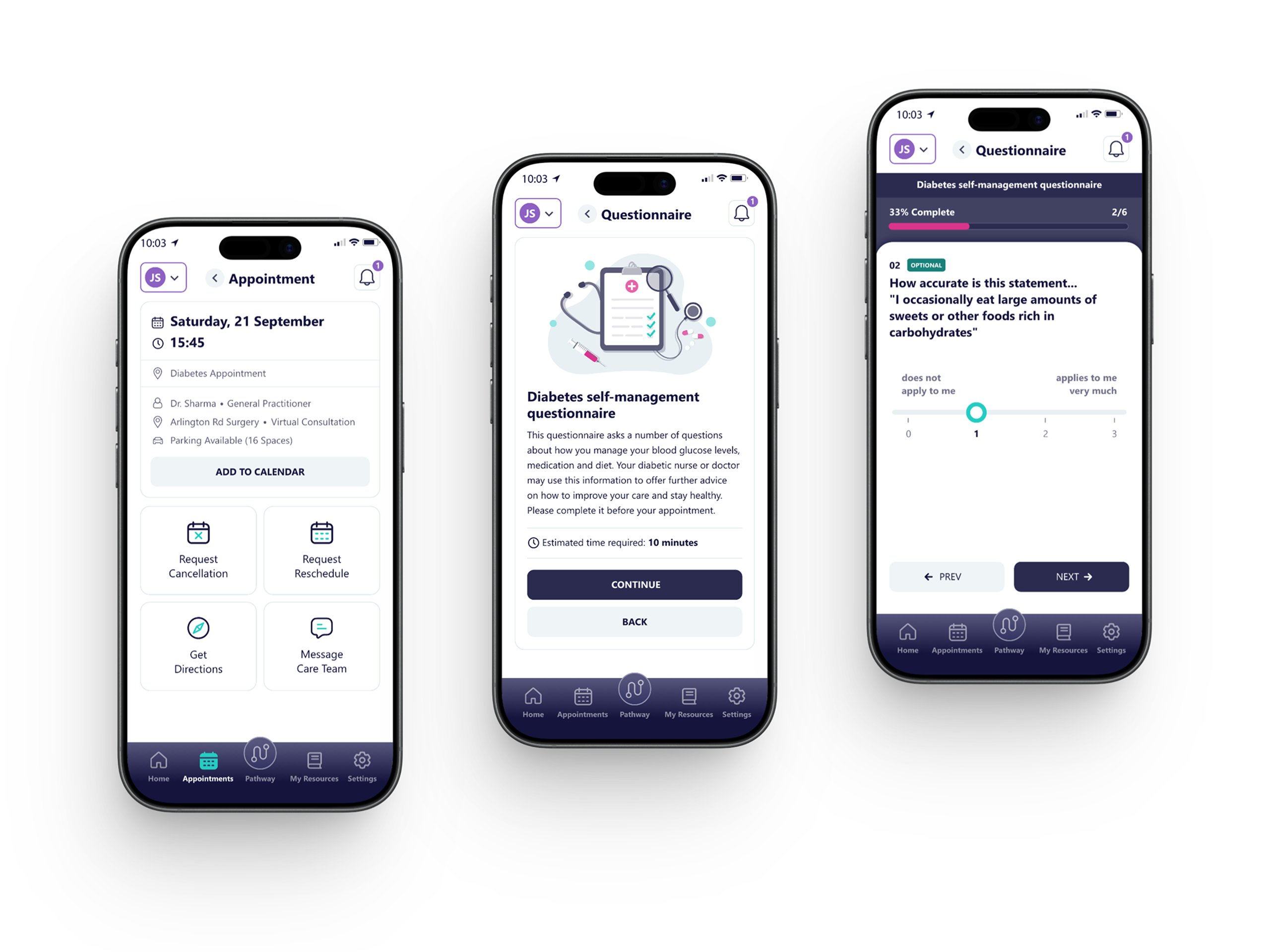
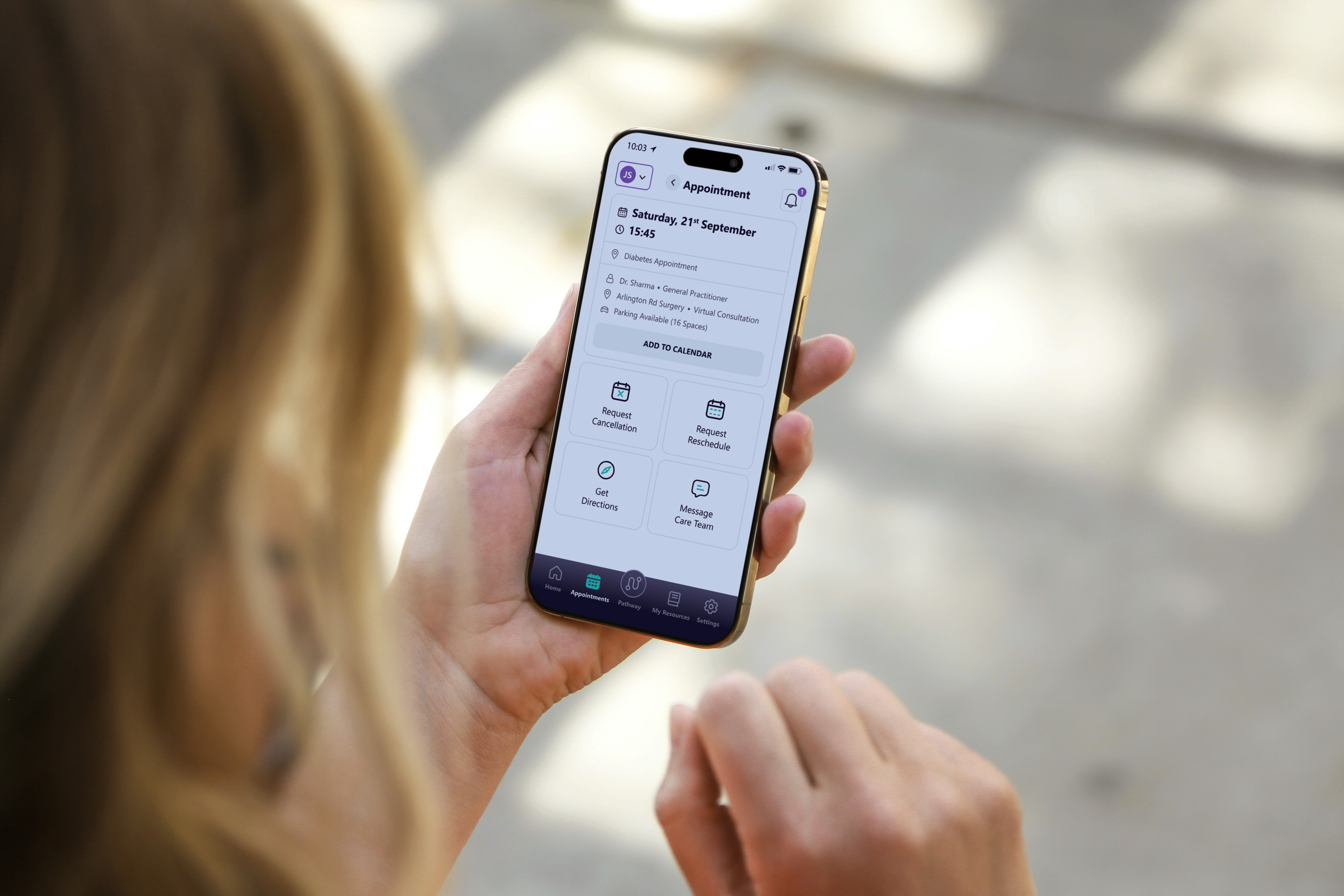
Appointments
Segmenting appointments into Future, Past, and Cancelled supports recognition over recall, allowing users to quickly locate relevant information. Key details such as location, type, date, and time are presented within a consistent, scannable card layout. Clear status indicators, including “Completed” and “Did Not Attend”, enhance visibility of system status and reduce ambiguity around past interactions.
A “More Details” action introduces progressive disclosure, enabling access to additional information without overwhelming the interface. Overall, the redesign provides a more structured and predictable way to manage appointments, reinforcing consistency and standards while enabling clearer navigation and review.
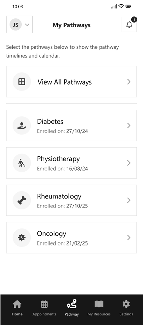
My Pathways
Rather than directing users straight into a linear timeline, this screen introduces a selection layer that allows users to choose the most relevant pathway. This reduces confusion and supports focused navigation, particularly for patients managing multiple conditions. Each pathway is presented in a consistent, scannable list format, with key metadata such as enrolment date providing additional context. The inclusion of a “View All Pathways” option supports broader system access while maintaining a simple and uncluttered interface.
Overall, this approach improves orientation and control, enabling users to navigate complex care structures more efficiently and enter pathways with clearer intent.
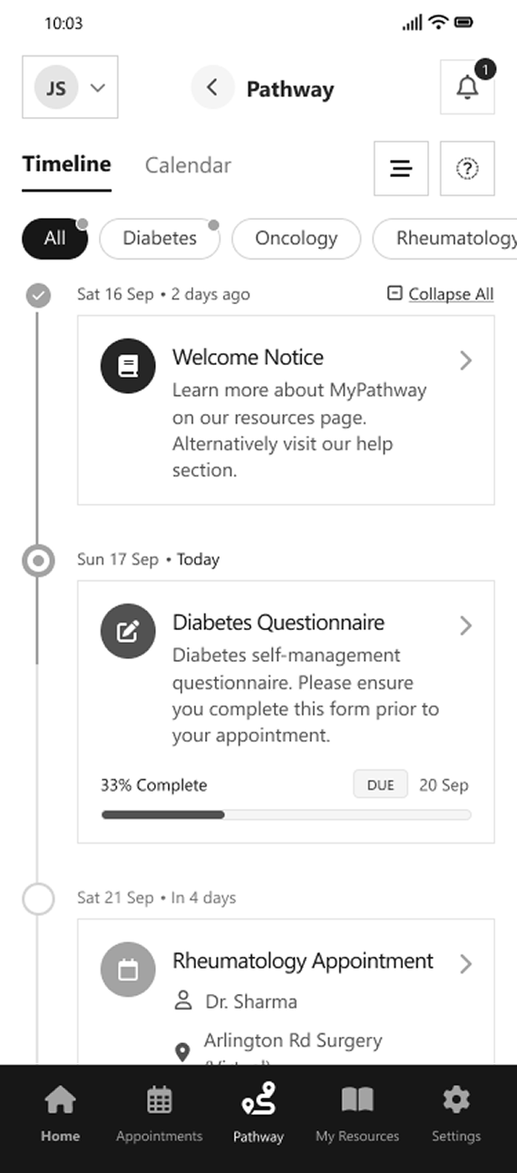
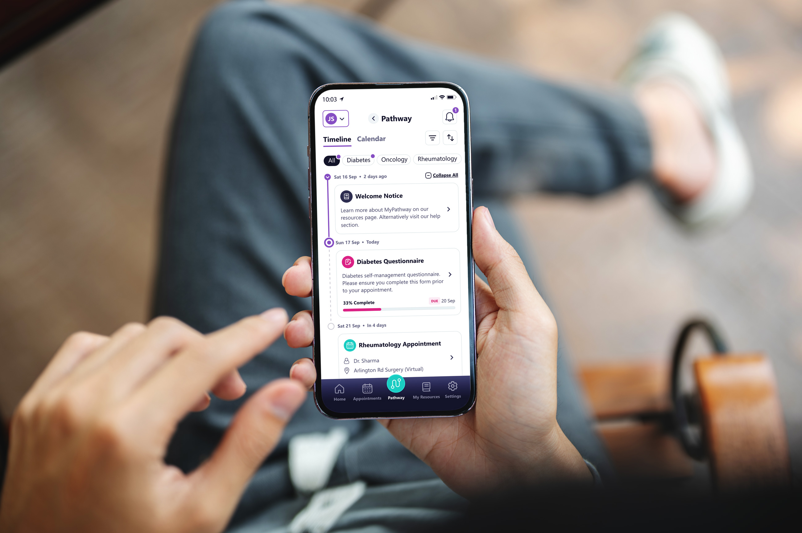
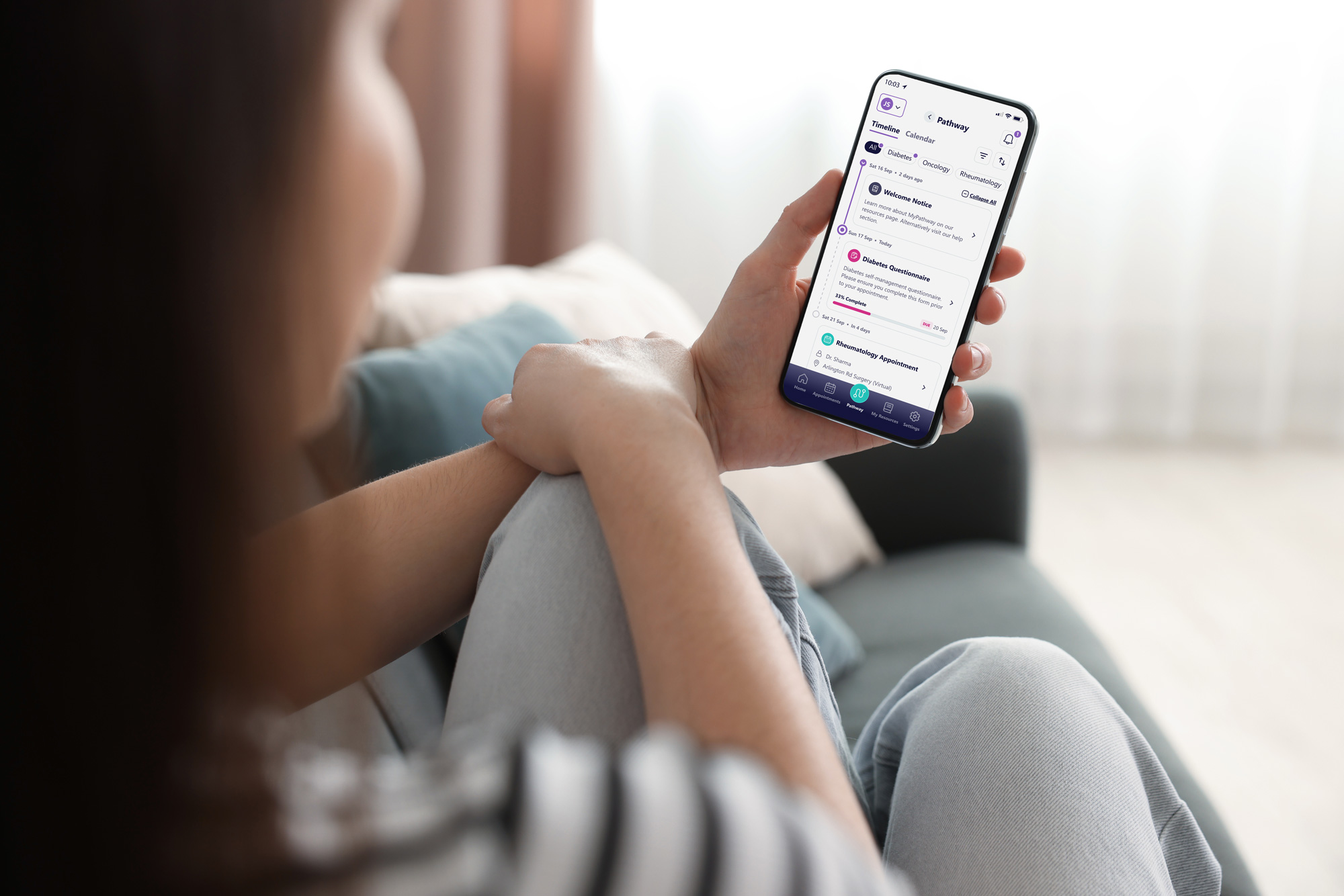
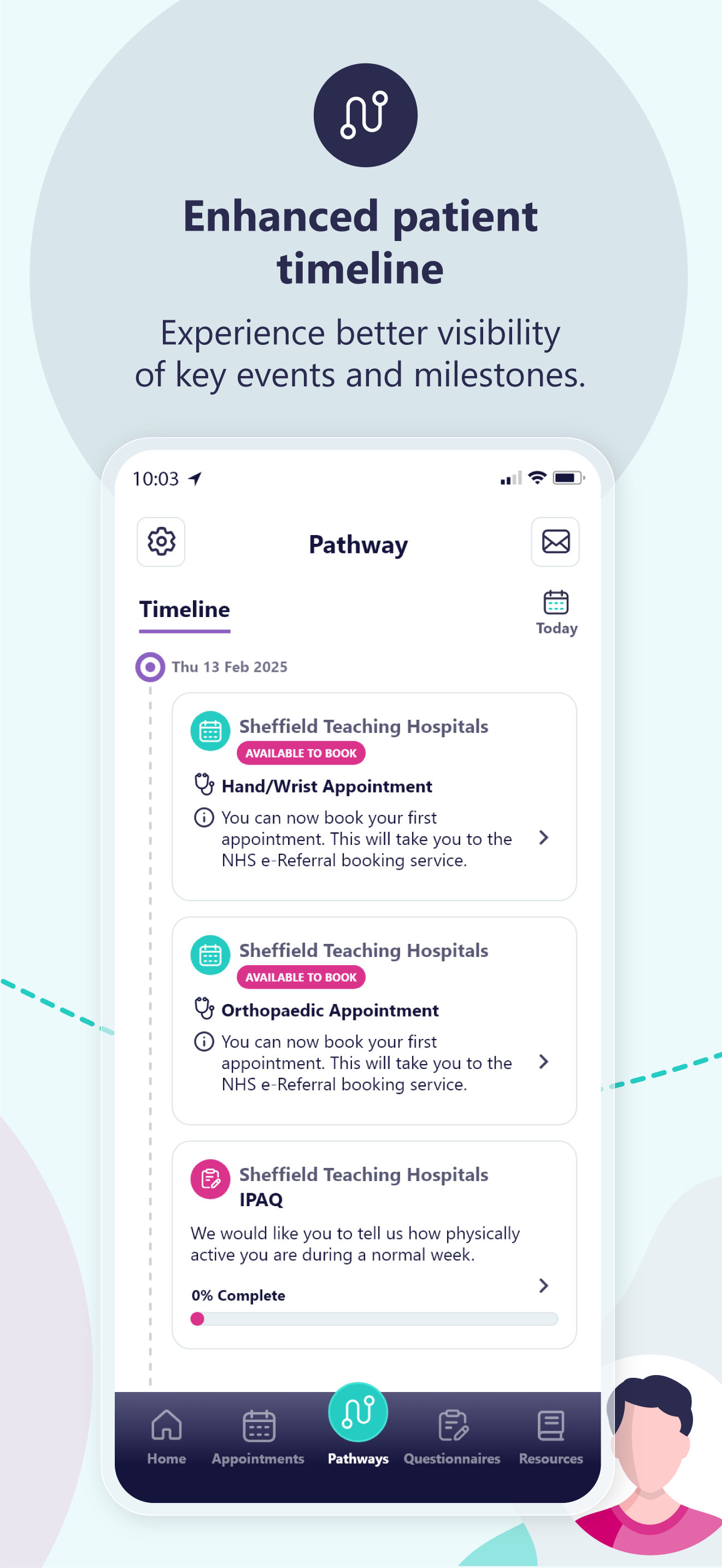
Pathway
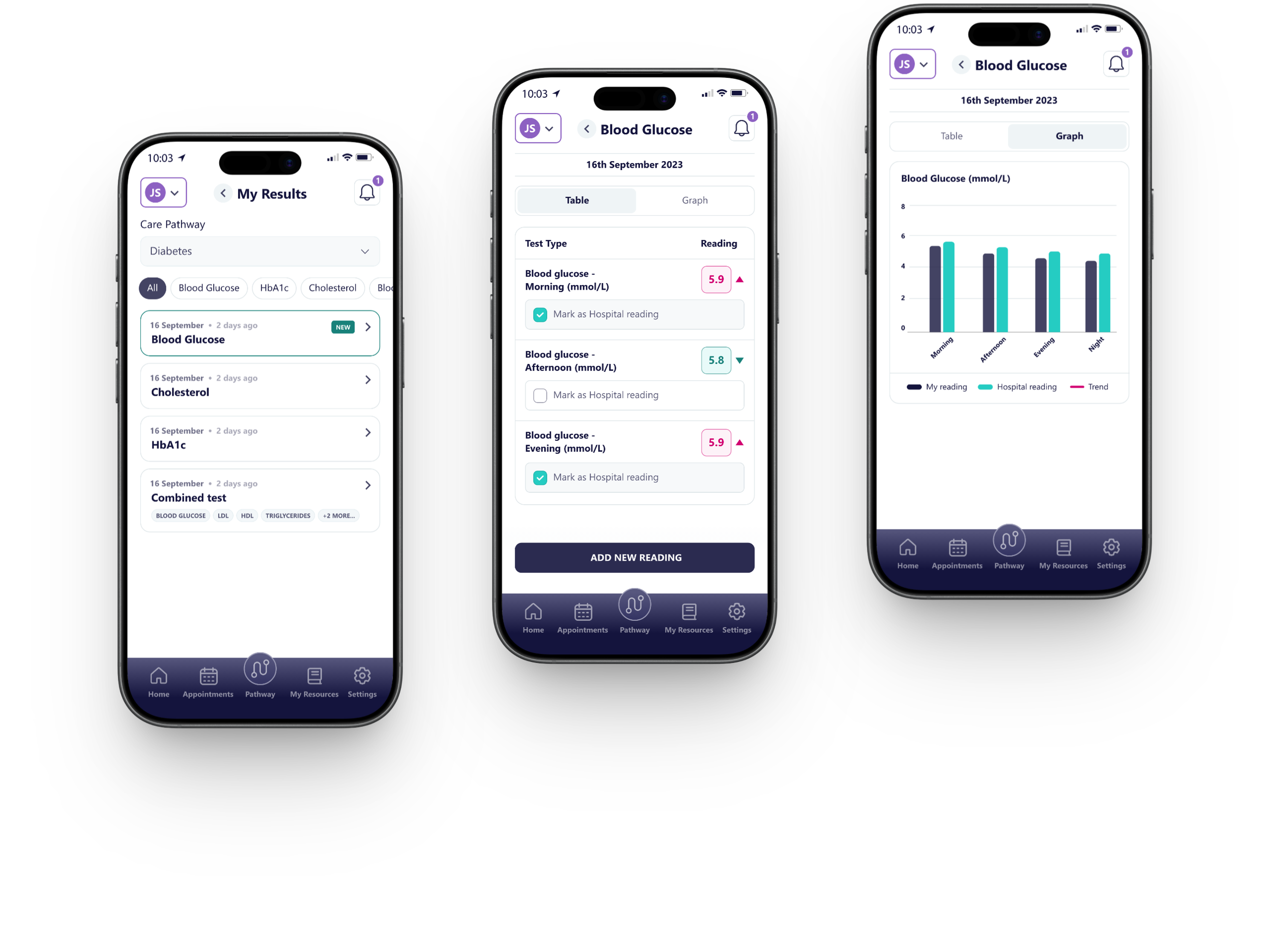
Information is organised chronologically, allowing users to understand past, current, and upcoming activities within a single, unified view. Tasks such as questionnaires, appointments, and resources are presented as distinct, scannable cards, each providing contextual detail and progress indicators where relevant.
The timeline structure supports a stronger connection between individual tasks and the broader care journey, while visual markers and status cues improve clarity around progression and upcoming requirements. Filtering options and alternative calendar views introduce flexibility, enabling users to explore their pathway based on preference and context rather than relying on a strictly linear flow. Overall, the design simplifies a complex system into a more intuitive and navigable experience, improving clarity, engagement, and user confidence throughout the care journey.
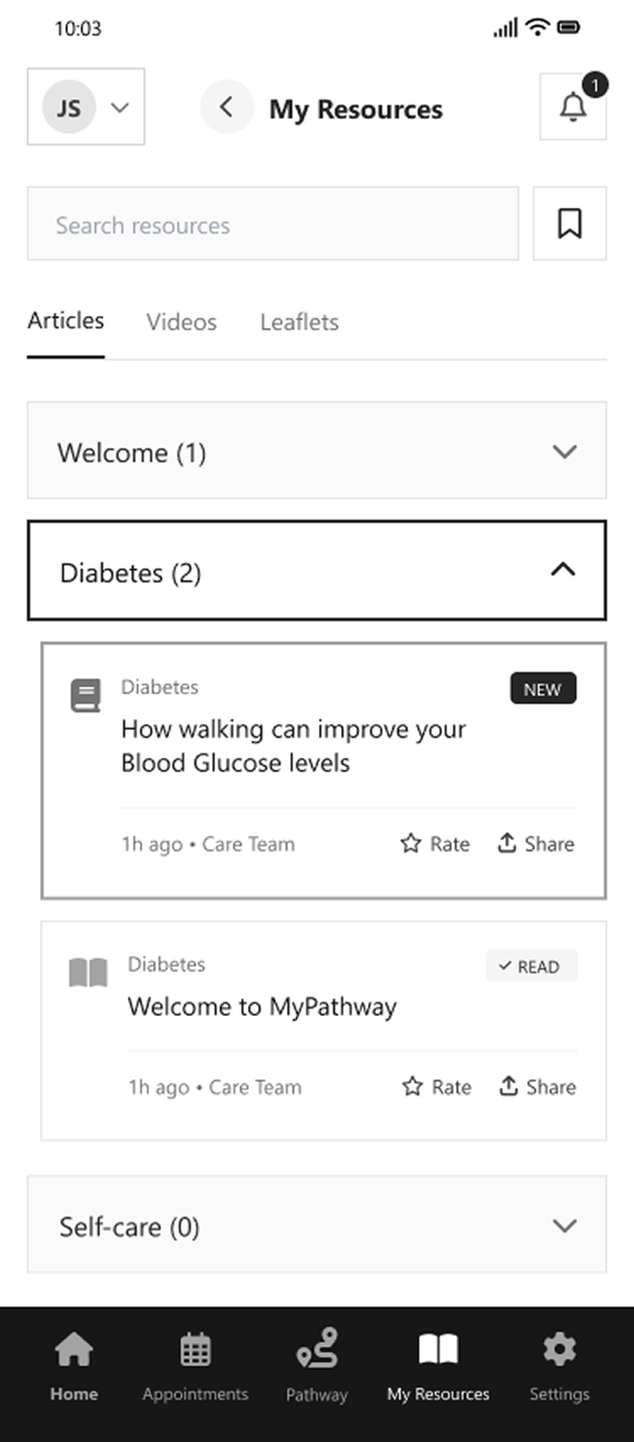
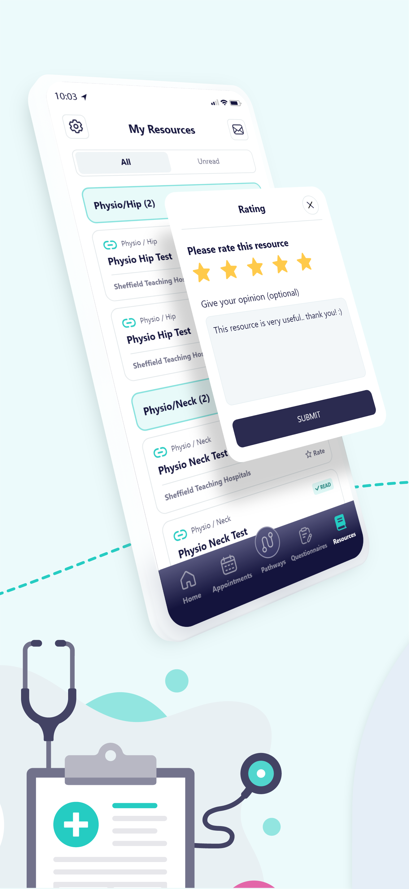
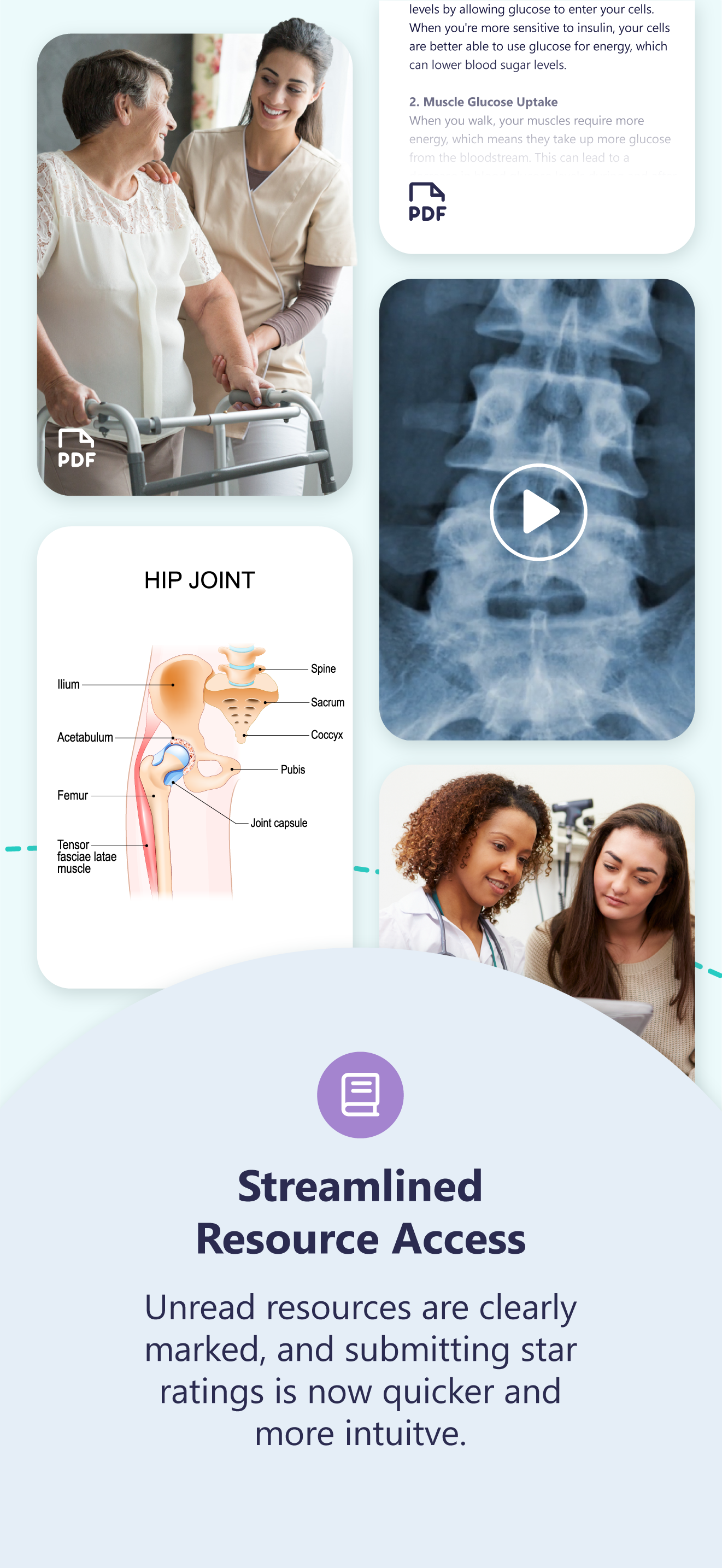
My Resources
Each resource is presented within a consistent card layout, surfacing key information such as title, category, and recency, alongside actions like rate and share. Status indicators such as “New” and “Read” further support content awareness and engagement. Search functionality and filtering options enable users to efficiently navigate a growing library of resources, improving discoverability without overwhelming the interface.
In short, the design supports ongoing learning and engagement, helping users access relevant information at the right time within their care journey.
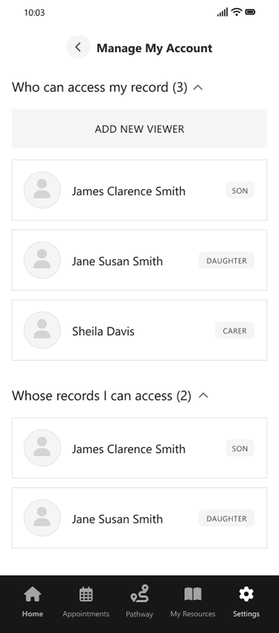
Settings
Access is clearly structured into two distinct groups: users who can view the patient’s record, and records the patient can access on behalf of others. This separation provides clarity around permissions and reduces ambiguity in multi-user contexts.
Each linked account is presented in a consistent, scannable format, with relationship labels such as “Son”, “Daughter”, and “Carer” providing immediate context. The ability to add new viewers supports flexibility while maintaining a simple and controlled interface.
Overall, the design introduces a transparent and manageable approach to account access, enabling users to confidently understand and control how their health information is shared.
Structural Improvements Implemented
Patient-Centred Orientation
• Reduced visual density
and icon reliance
• Introduced clearer section grouping
• Applied progressive disclosure for advanced functionality
Guided Care Progression
• Increased separation between destructive and non-destructive actions
• Clarified action ownership (row vs. table level)
• Introduced clearer primary and secondary button states
Flexible Pathway Navigation
• Unified iconography and button hierarchy
• Established consistent spacing and alignment rules
• Improved table structure and readability
Consistent Interface System
• Reduced reliance on colour-only indicators
• Improved contrast and legibility
• Considered keyboard navigation and structured data layouts
Brand Integration
Building on the UX audit and its findings, the need for a more consistent and scalable visual framework became evident and so a structured brand system was created
to support clearer UI design decisions and more a cohesive implementation.
Although this framework was only partially defined during the project, it has been further developed here to demonstrate how the system could be fully articulated
and applied at scale.
UI Design
In complex healthcare environments, design must prioritise clarity, accuracy, and trust. The MyPathway interface translates intricate clinical processes into clear, structured interactions that support confident decision-making.
A strong emphasis was placed on hierarchy, accessibility, and consistency, ensuring users can easily understand their progress, navigate key tasks, and engage with the system without friction. This foundation enables a scalable and maintainable product experience across both patient
and clinical use cases.
Communicating
the product through motion
As part of the product rollout, a promotional video was developed to articulate the value of the redesigned MyPathway experience.
The video focuses on clarity, flow, and key interactions, bringing the interface to life while reinforcing the underlying design system and visual identity.
Distributed across LinkedIn and digital channels, the content supported product positioning, increased visibility, and helped communicate complex functionality in a simple, accessible format.
App Store Gallery
Final Outcome
The redesigned interface introduces a clearer, more intuitive pathway experience, improving how patients understand their care journey and next steps. By simplifying navigation and structuring key information around tasks, appointments, and resources, users can engage more confidently with their treatment and stay informed throughout their pathway.
Outcome & Impact
The redesign improved clarity and usability across complex patient journeys, making it easier for users to understand their current status and what actions are required.
By restructuring the interface around key touch points, such as pathways, appointments, and communications, patients are better supported in managing their care, while reducing confusion and uncertainty.
The updated experience also introduced stronger hierarchy and clearer visual cues, helping to reduce cognitive load and improve overall accessibility for a diverse patient audience.
My Contribution
This project was completed while working as a designer at VitalHub UK.
My role focused on improving the usability, clarity, and structure of the MyPathway patient interface.
Key contributions included:
• UX evaluation of the existing pathway experience
• Redesign of interface layout and information hierarchy
• Wireframe exploration to simplify patient journeys and workflows
• Establishment of a scalable UI system aligned with product branding
• UI design for key screens, including pathways, appointments, and patient interactions
• Creation of video and social media content to support product communication and engagement
Design Learnings
Designing for healthcare highlighted the importance of clarity, reassurance, and accessibility in every interaction.
Even small ambiguities in language or layout can impact user confidence when dealing with sensitive information.
The project reinforced the value of structured systems and consistent patterns, ensuring the interface remains scalable, maintainable,
and easy to use as the product evolves.


Ready to start
building?
Let's talk about your next project and how I can help.