
Solar Energy Branding
The project required the creation of a compelling brand identity and supporting marketing materials capable of communicating a complex technical proposition to potential investors, partners and early adopters. Although the venture did not progress beyond the funding stage, the work established a strong visual foundation for the business and its market positioning.
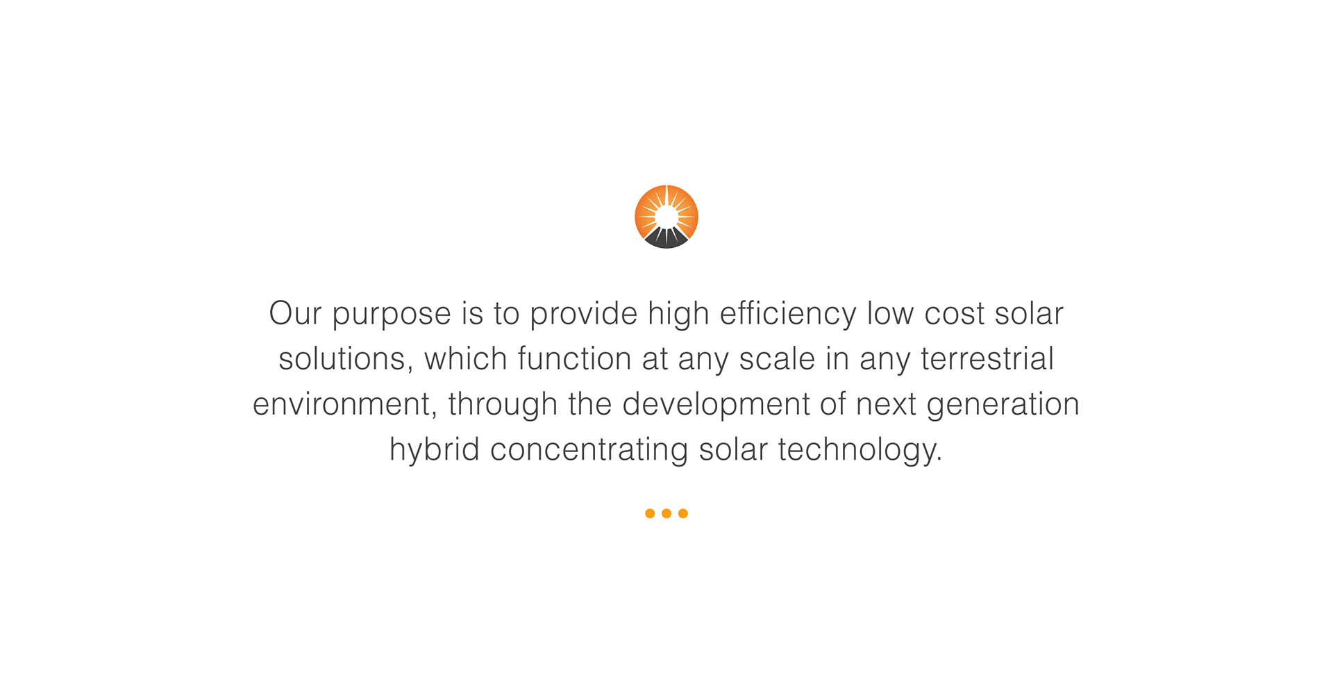
Orenko is a next-generation renewable energy platform built on a revolutionary approach to solar technology. Designed to outperform traditional photovoltaic systems.
A lack of
clear identity
As an early-stage renewable energy startup, Orenko needed to communicate a complex and highly technical solar innovation
to a broad audience of stakeholders and potential investors.
However, there was no defined brand or visual system in place.
The concept lacked clarity, making it difficult to articulate the product’s value, differentiate it from existing solar technologies, and build
confidence with investors.
• Limited visual identity to support investor communication
• Difficulty translating complex technology into accessible messaging
• No clear differentiation from traditional photovoltaic solutions
• Inconsistent or undefined brand presence across materials
• Reduced ability to convey credibility and long-term vision
As a result, the product’s potential was not being fully realised, and key messages were not landing effectively with its intended audience.
Define and position from scratch
The challenge was to create a clear and compelling brand identity that could communicate the value of Orenko’s technology while supporting early-stage investment and future growth.
This required translating a complex technical concept into a cohesive
visual and narrative system that felt both credible and forward-thinking.
Specifically, the work needed to:
• Establish a strong and distinctive visual identity
• Communicate complex solar technology in a clear and accessible way
• Differentiate Orenko from traditional energy platforms
• Build trust and credibility with potential investors
• Create a flexible system that could scale with the product and business
Orenko needed to shift from an undefined concept to a clearly articulated vision, one that could inspire confidence, communicate innovation, and support its journey toward investment and market entry.
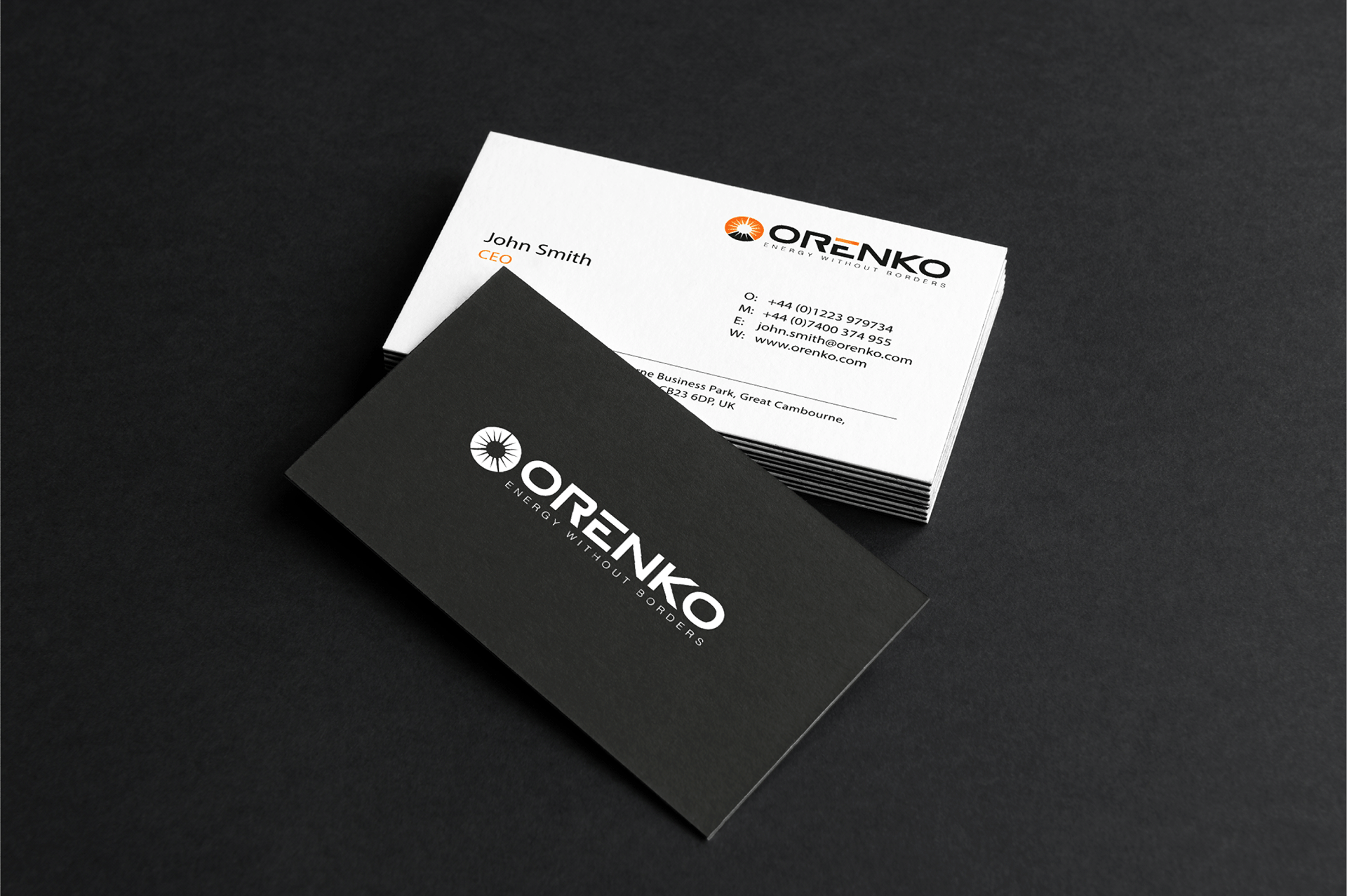
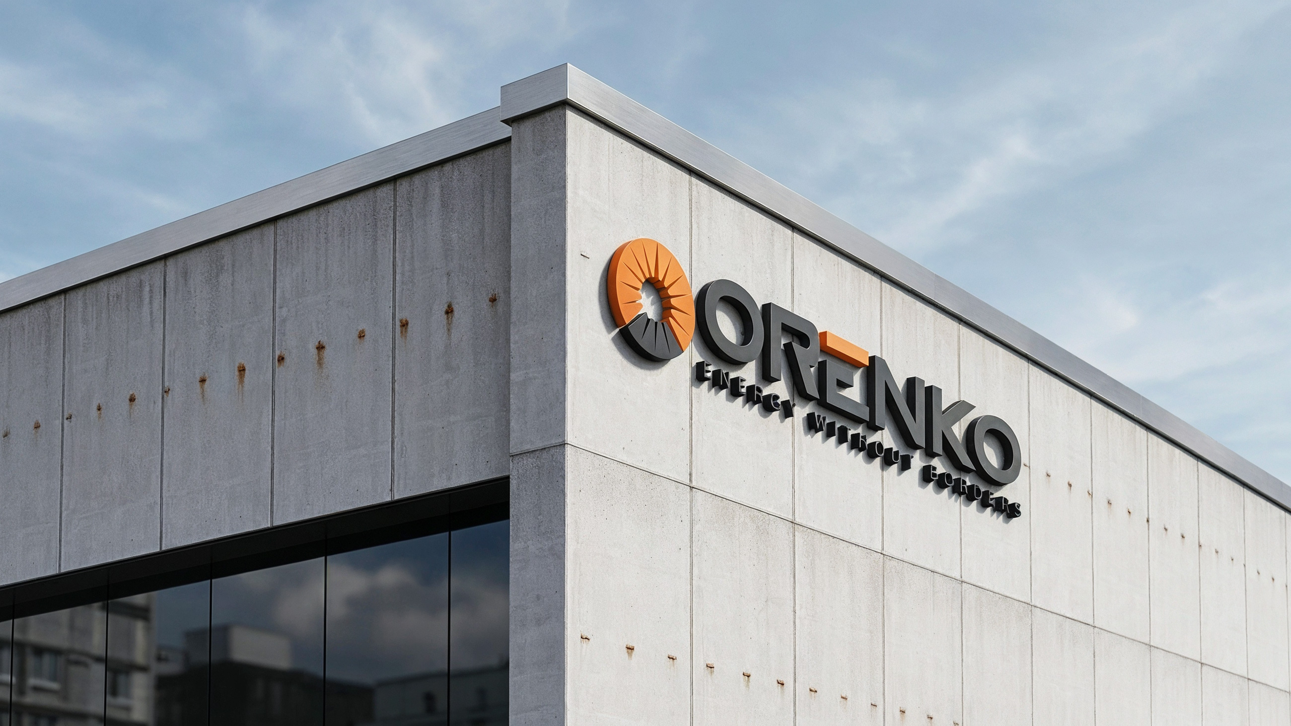
Visual Identity
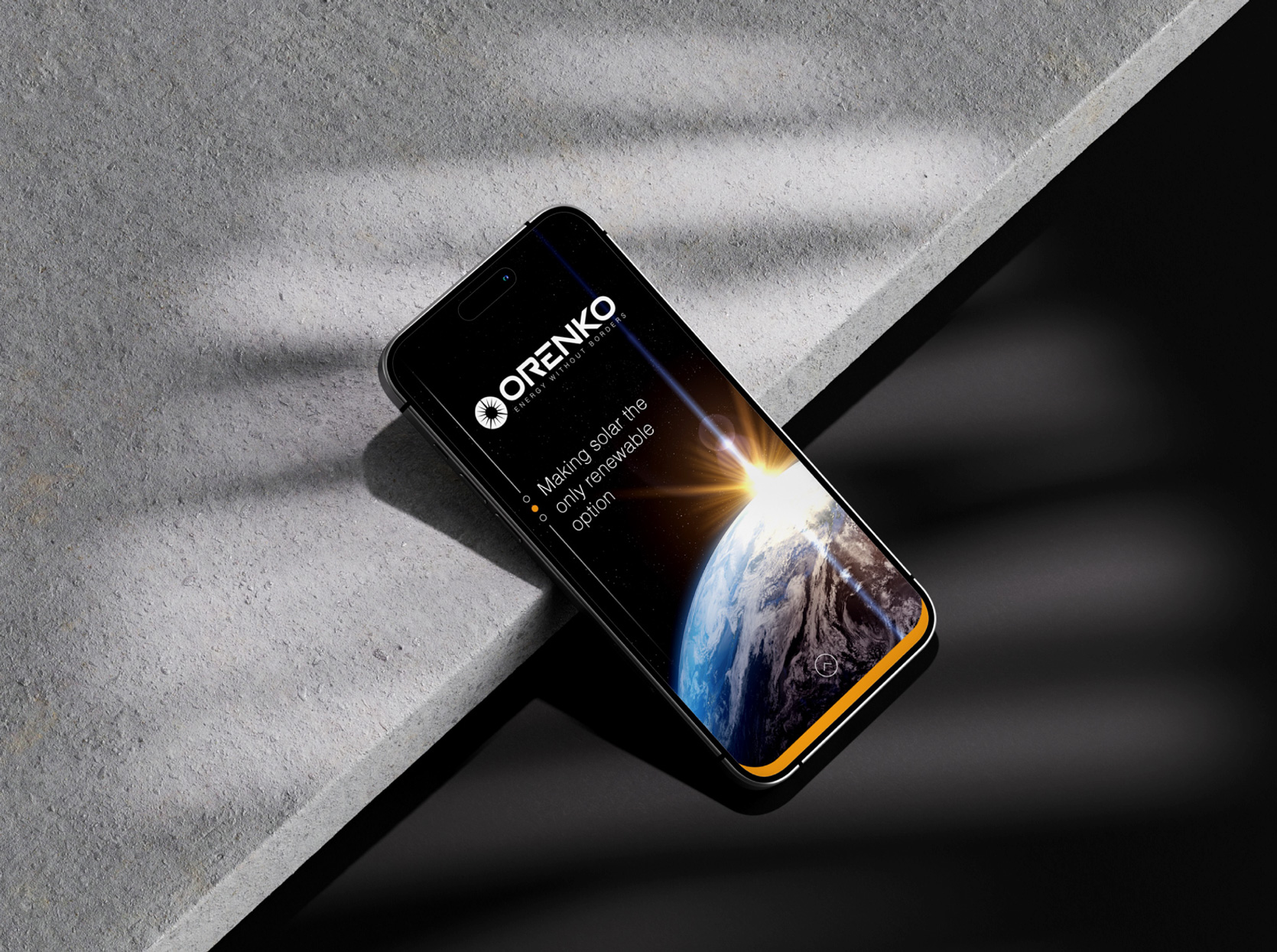
Derived from the Finnish word for Sun ‘Aurinko’ was played with to provide a slightly shortened more visually simplified example of the term. Providing symmetry and balance, coupled with the use of a bold font, this logo helped to represent the company’s mission whose intention was to make great change and evolve the global solar energy sector.
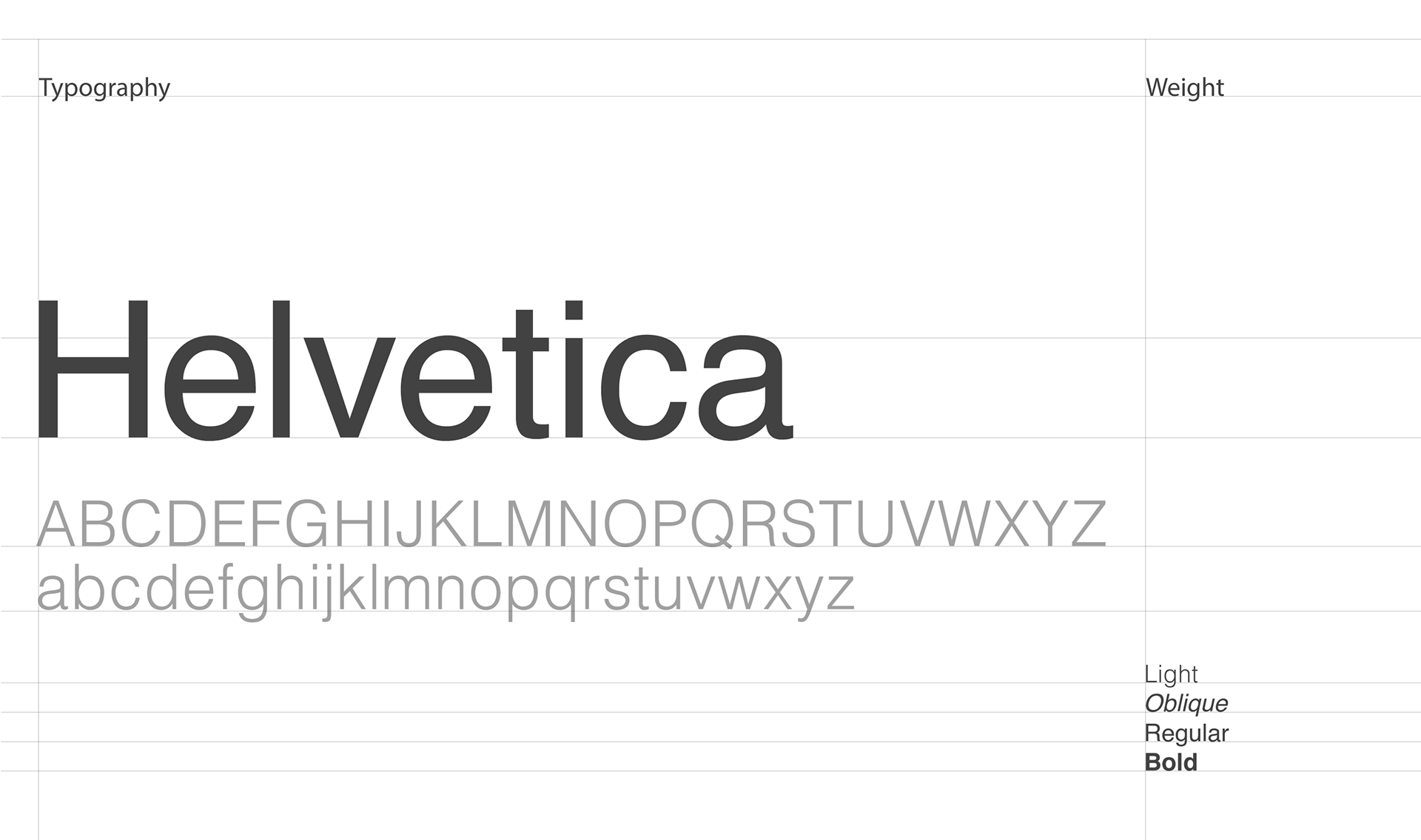
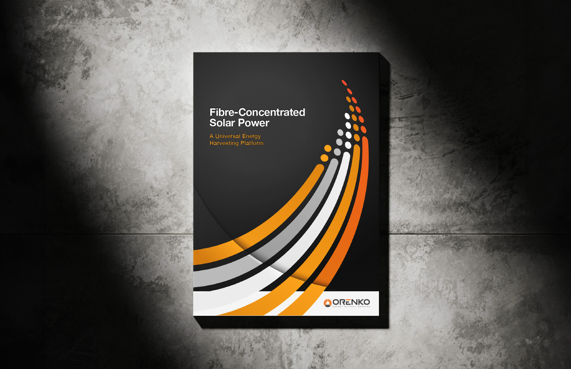
Typography
There is no other font that stands the test of time like the ‘Helvetica’ font family. Notable features of Helvetica as originally designed include a high x-height,
the termination of strokes on horizontal or vertical lines and an unusually tight spacing between letters, which combine to give it a dense, solid appearance.
Its with this solid appearance and available weights that I decided to choose this for the purpose of establishing a clear and professional visual medium, a characteristic synonymous with many large companies around the world.
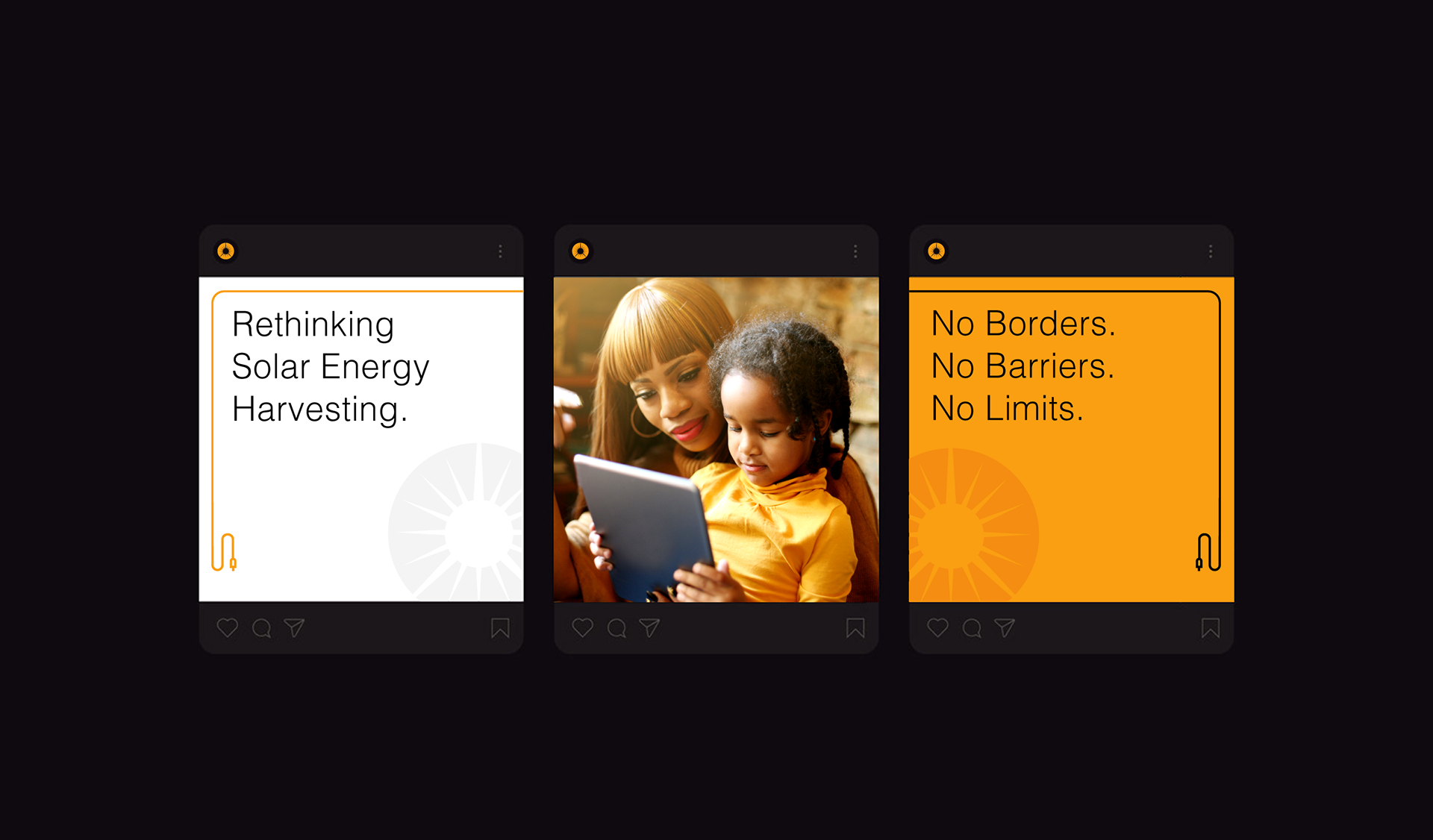
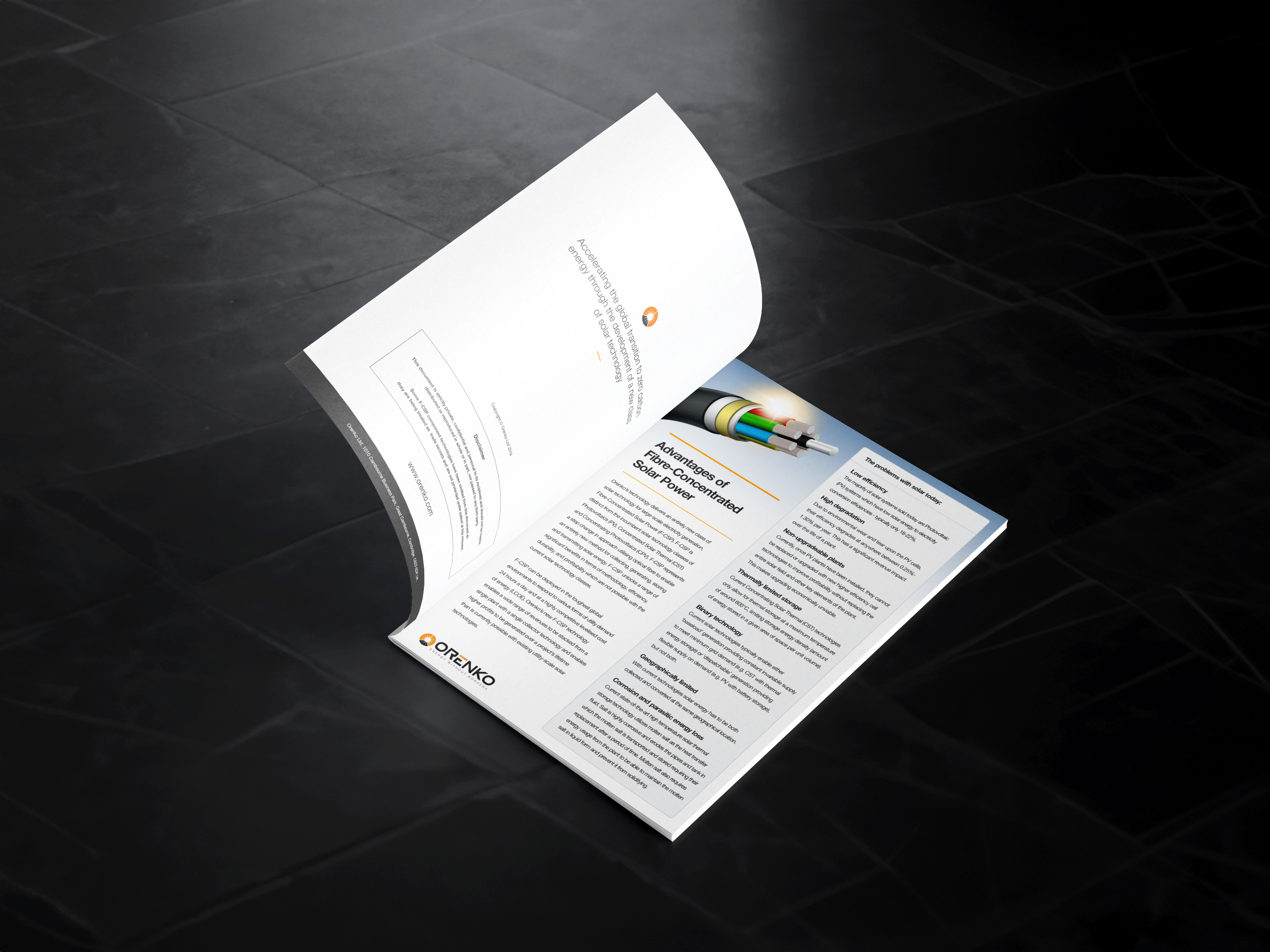
Imagery
Imagery was to be crucial in establishing the visual connection to Orenko’s identity and how it relates to the wider audience. It was suggested that the choice of imagery needed to convey how they will be helping both villages and cities in third-world countries, by bringing energy to their regions and to offer the energy across borders.


Final Outcome
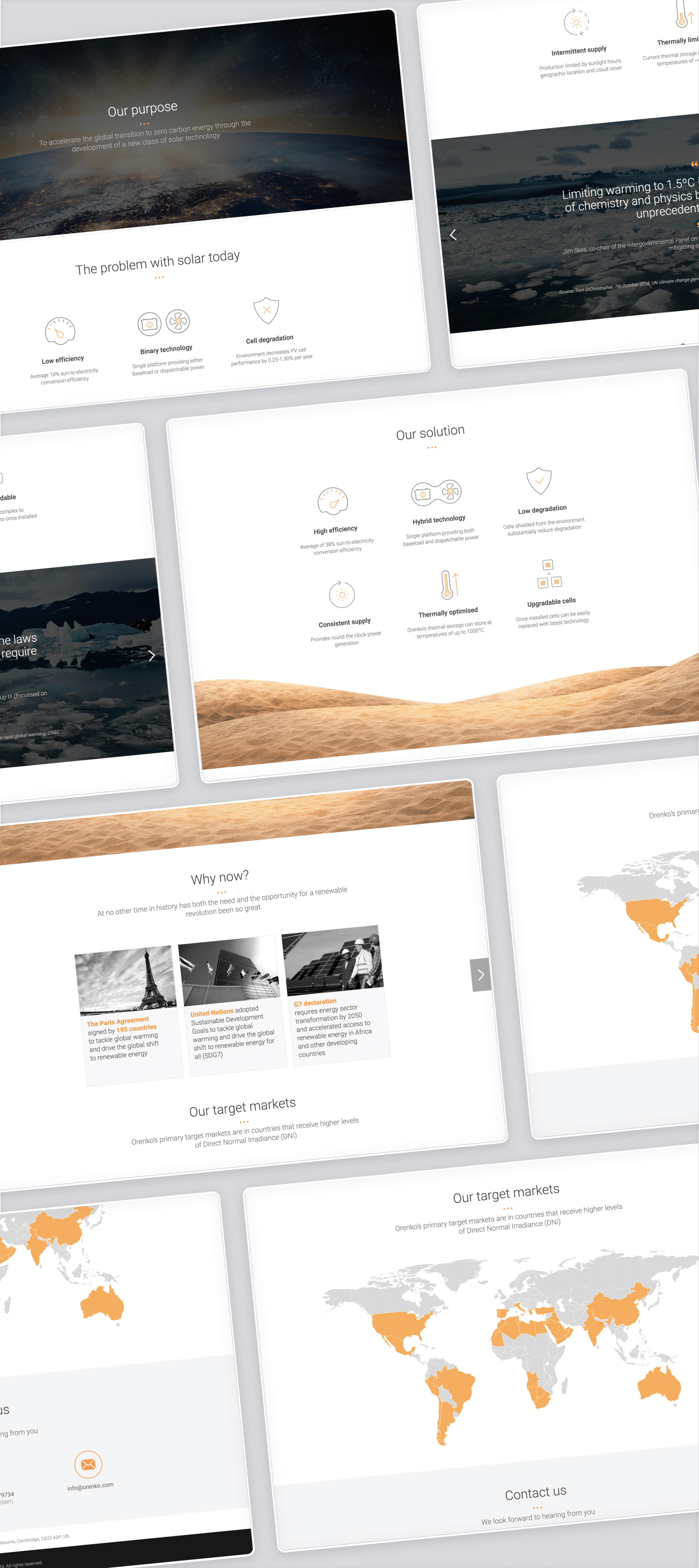
The final outcome established a clear and cohesive brand identity that positioned Orenko as a forward-thinking player within the renewable energy space. By translating complex solar technology into a simple, compelling visual language, the brand provides a strong foundation for communication, investor engagement, and future product development.
Outcome & Impact
The project resulted in a distinctive and modern identity
that communicates both innovation and credibility.
Through a carefully considered visual system, complex technical ideas were translated into clear, accessible messaging that could resonate with a broad audience.
The brand enabled Orenko to present its vision with greater confidence—supporting early-stage conversations with stakeholders and investors, while creating a flexible foundation for future growth and expansion.
My Contribution
This project was completed in a lead design capacity, working closely with stakeholders to define and shape the brand direction for Orenko.
Key contributions included:
• Definition of the overall brand strategy and visual direction
• Creation of a cohesive identity system aligned with product positioning
• Development of visual assets to support investor communication
• Exploration of imagery and composition to convey innovation and impact
• Application of the brand across key touchpoints and presentation materials
Design Learnings
Working within an early-stage environment highlighted the importance of clarity and narrative when communicating complex ideas. A strong visual identity can play a critical role in shaping perception, building trust, and supporting investment conversations.
The project reinforced the value of simplicity, ensuring that even highly technical concepts can be communicated in a way that is both accessible and compelling.


Ready to start
building?
Let's talk about your next project and how I can help.