
Patient
Check-in
Experience
The project focused on creating a consistent and accessible experience across multiple touchpoints, from personal mobile devices to on-site hospital kiosks. Particular emphasis was placed on usability, responsiveness and accessibility to ensure patients could confidently navigate the check-in process in a range of healthcare environments.
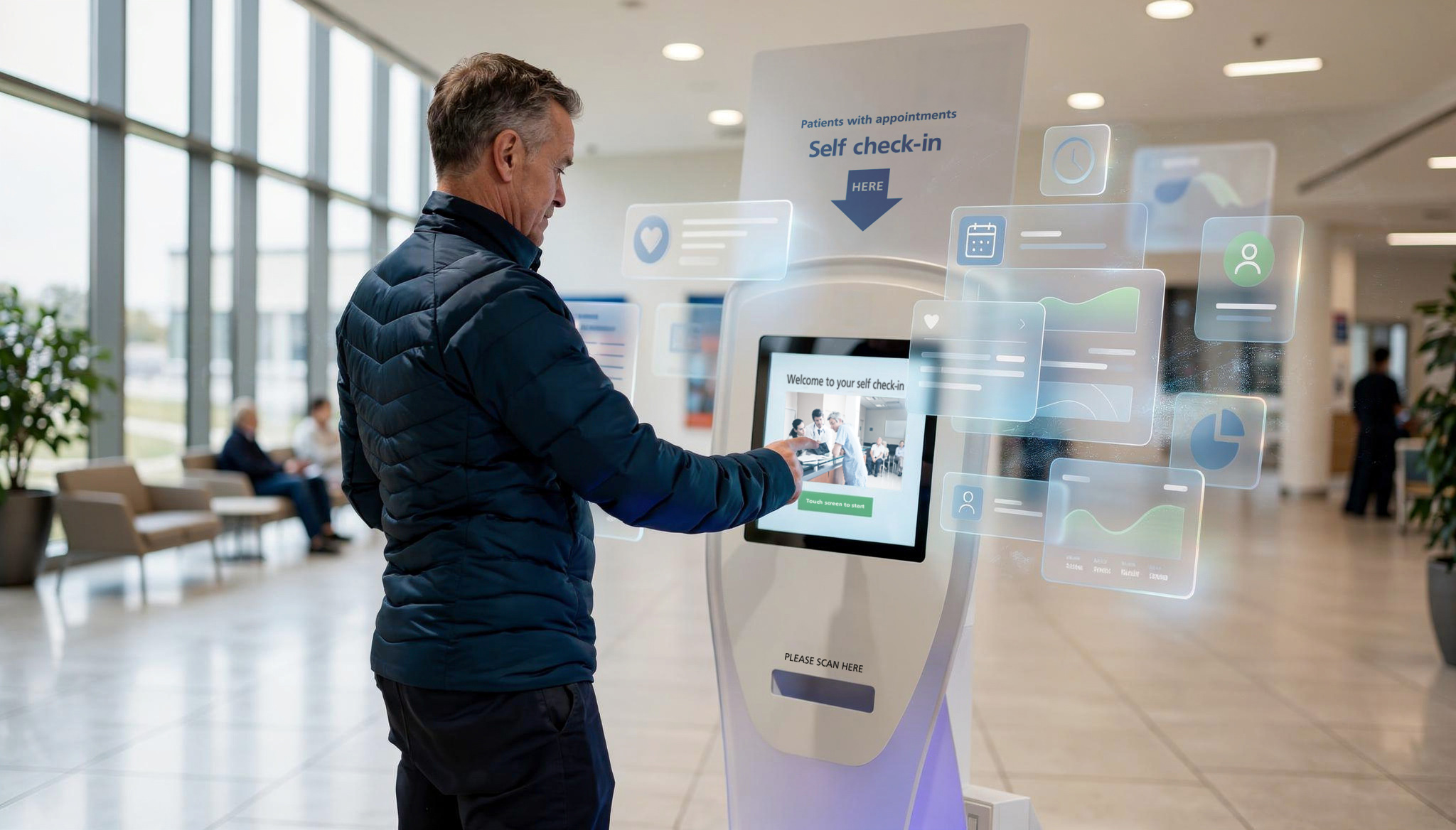
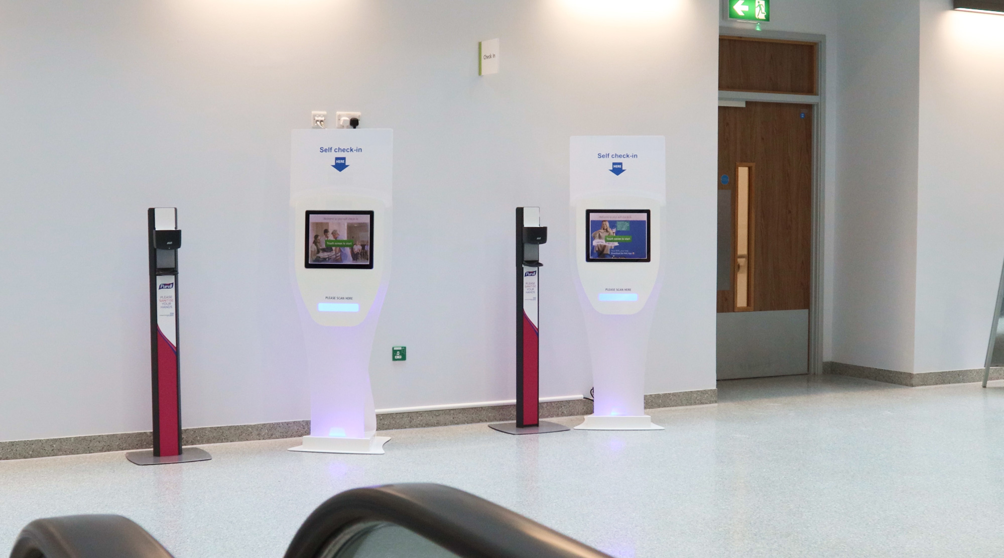
The self check-in solution streamlines patient arrival with a clear, accessible experience across mobile and kiosk devices, reducing queues and improving patient flow.
Inconsistent and fragmented check-in experiences
Across NHS environments, patient check-in processes were often inconsistent, relying on a mix of systems, interfaces, and manual interactions. This created confusion for patients, increased reliance
on staff, and introduced unnecessary friction at the point of arrival.
While digital solutions existed, they lacked a cohesive and accessible experience across devices. Interfaces were not always optimised for different contexts, particularly when transitioning between personal mobile use and shared hospital kiosks.
As a result, patients could experience uncertainty when checking in,
leading to longer queues, inefficiencies in patient flow, and added
pressure on front-of-house staff.
Unify and elevate the experience across devices
The challenge was to redesign the self check-in experience into a clear, accessible, and consistent interface that could seamlessly operate across both mobile devices and hospital kiosks.
This required balancing simplicity with functionality, ensuring the system could support a wide range of users, including those with accessibility needs, while remaining intuitive in high-pressure, real-world environments.
Specifically, the work needed to:
• Create a unified visual and interaction system across mobile
and kiosk interfaces
• Ensure accessibility standards were met across all touch points
• Simplify the check-in process to reduce cognitive load and user error
• Improve clarity of key actions and system feedback
• Support efficient patient flow while reducing dependency on staff assistance
The goal was to deliver a streamlined, inclusive experience that enables patients to check in quickly and confidently, while supporting operational efficiency within NHS settings.
UX Audit
& Outcome
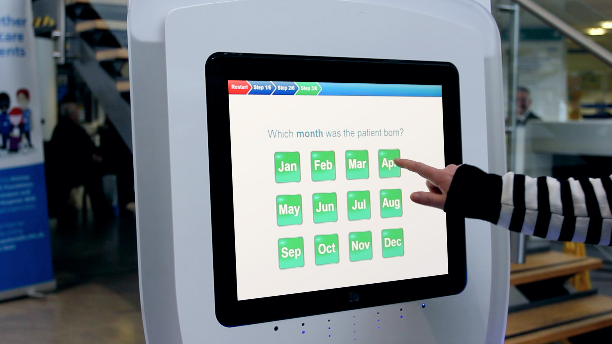
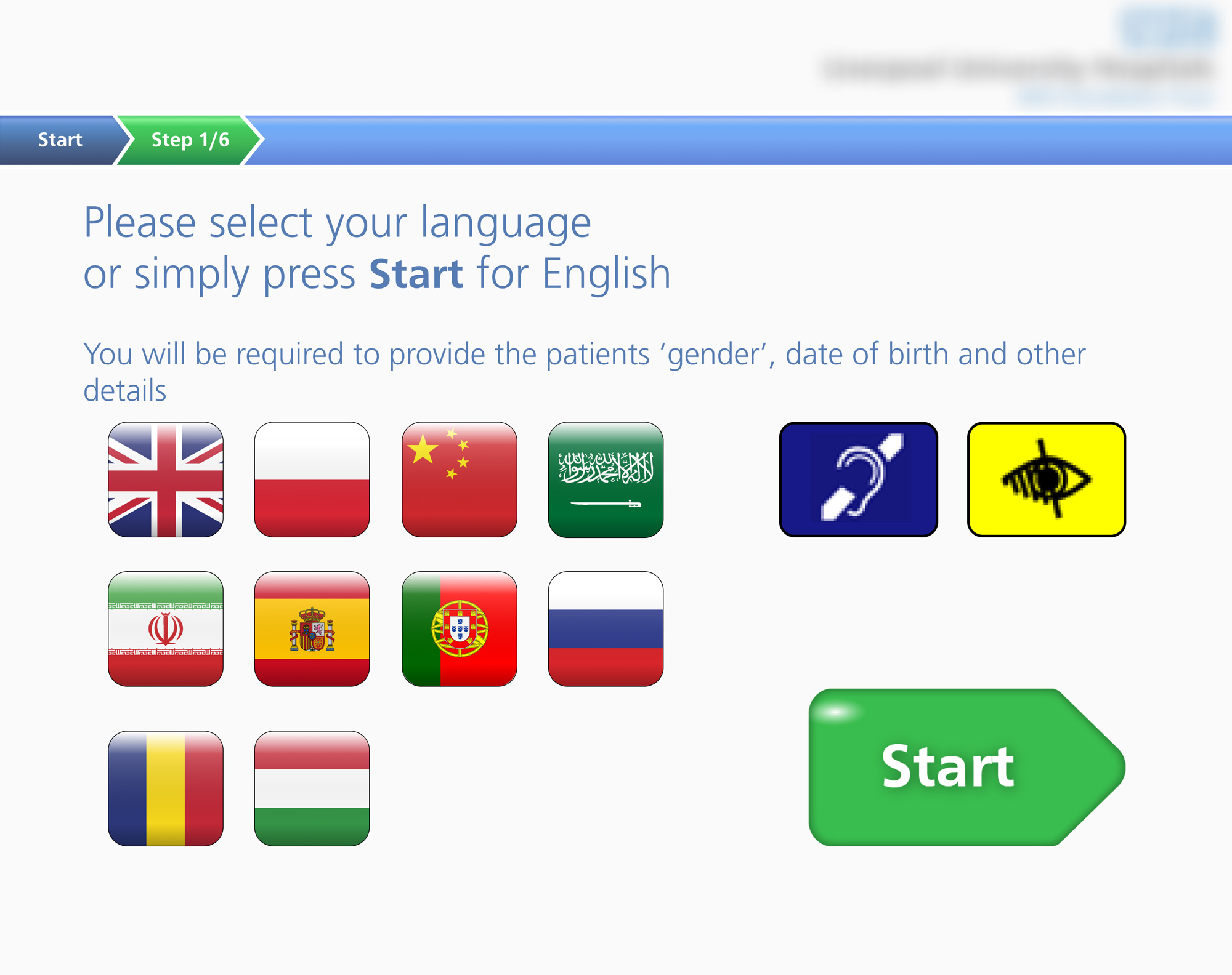
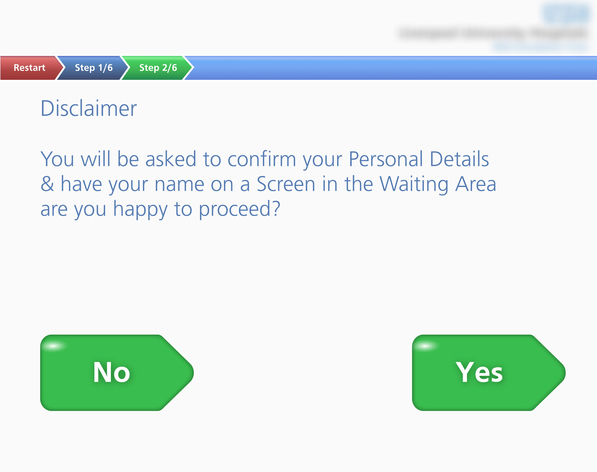
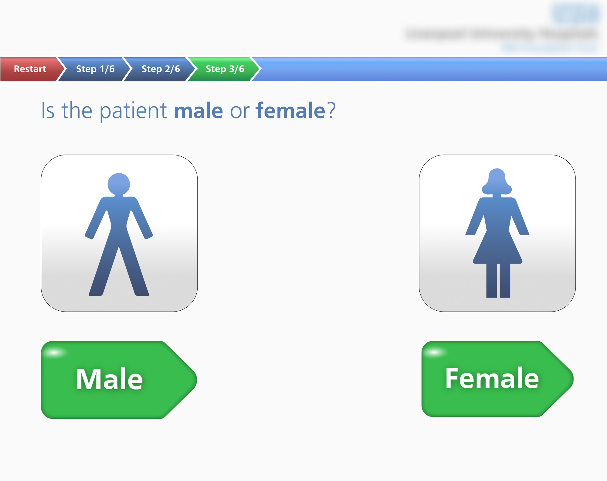
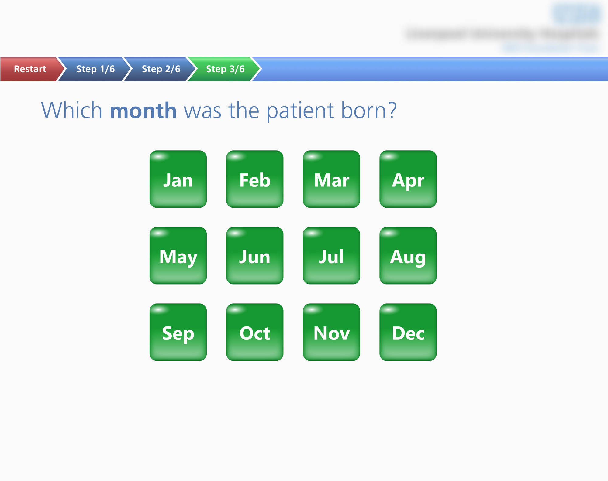
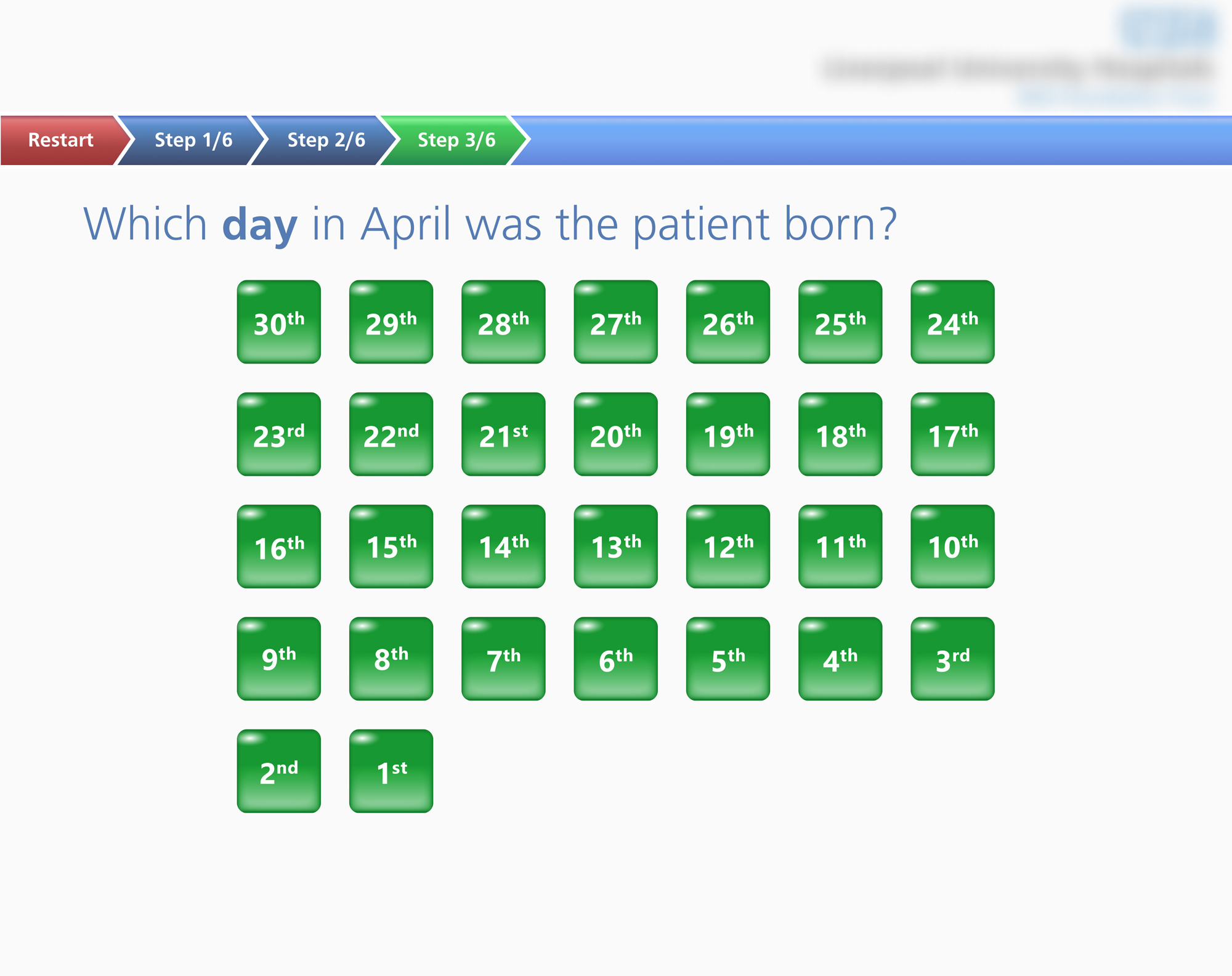
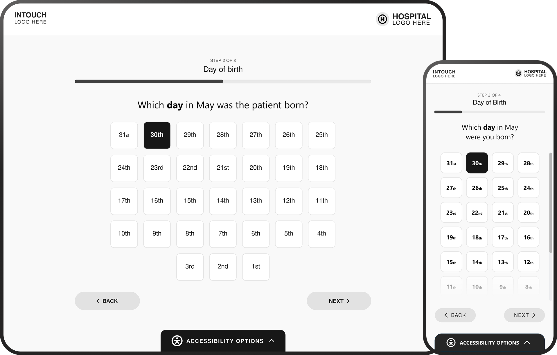
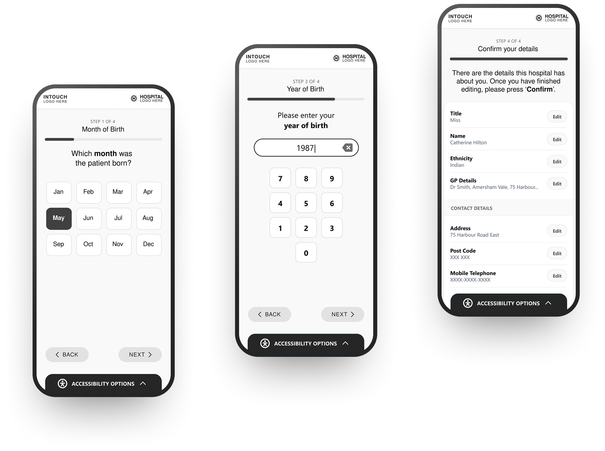
The following screens illustrate critical steps in the kiosk check-in journey, where patients are required to input and confirm personal details under time pressure. As these patterns are consistent throughout the experience, they provide a strong basis for evaluating systemic usability issues. The audit revealed key opportunities to reduce cognitive load, streamline data entry, and improve clarity of system feedback.
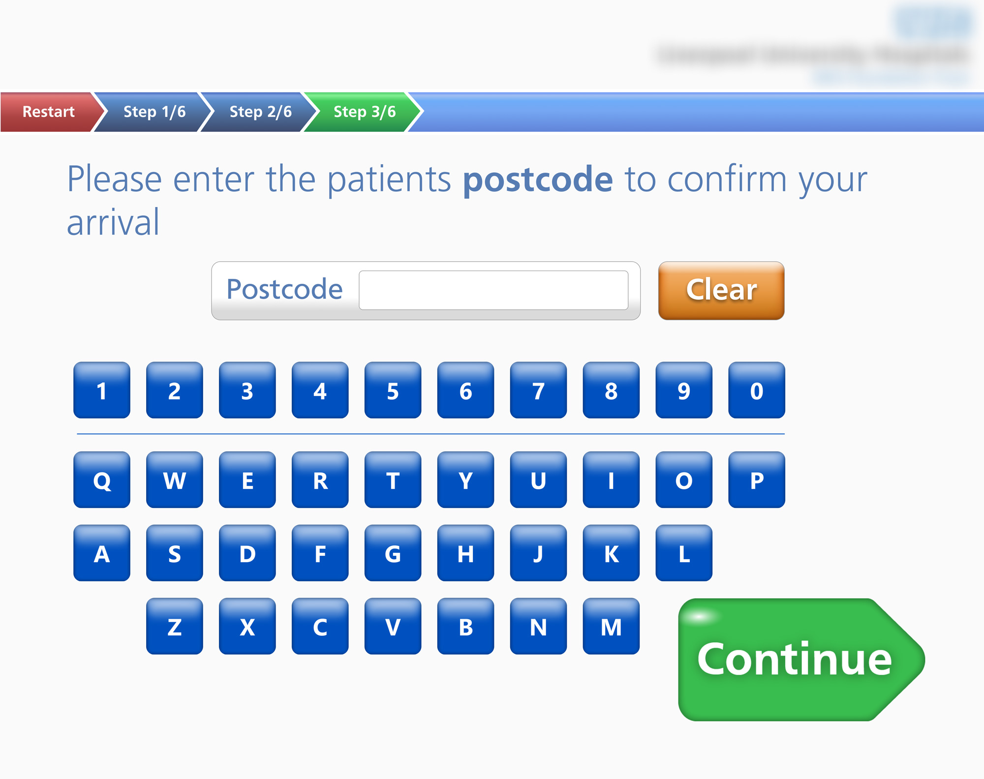
• No back button forces full restart on any error
• Wrong DOB selection auto-advances with no undo
• Year of birth not captured, limiting patient identification
• No review screen before submitting patient details
• No error recovery if patient record is not found
• No visual confirmation when buttons are tapped
• Progress steps are numbered but not labelled
• No estimated completion time shown
• Binary gender with no inclusive or clinical framing
• Flags represent countries, not languages
• Day grid counts backwards (30 to 1)
• Inconsistent tone: "you" vs "the patient"
• No back button on any screen
• "Restart" is the only undo, resetting all progress
• Tapping "No" on disclaimer leads to a dead end
• No option to check in at reception instead
• Button styles vary across every screen
• Some screens auto-advance, others need "continue"
• Colour coding shifts between green and blue
• No confirmation before advancing on critical data
• Day grid shows all 30 days regardless of month
• Postcode field has no validation, backspace, or space
• Year of birth is never collected
• No summary or review screen before submission
• Selected month not shown on the day screen
• Small flags hard to distinguish without text labels
• No help button or staff assistance option
• No contextual hints on postcode format
• Accessibility icons present but support unclear
• No barcode or QR scan option for fast check-in
• No NHS number entry as an alternative identifier
• Fixed linear flow with no skip logic for returning patients
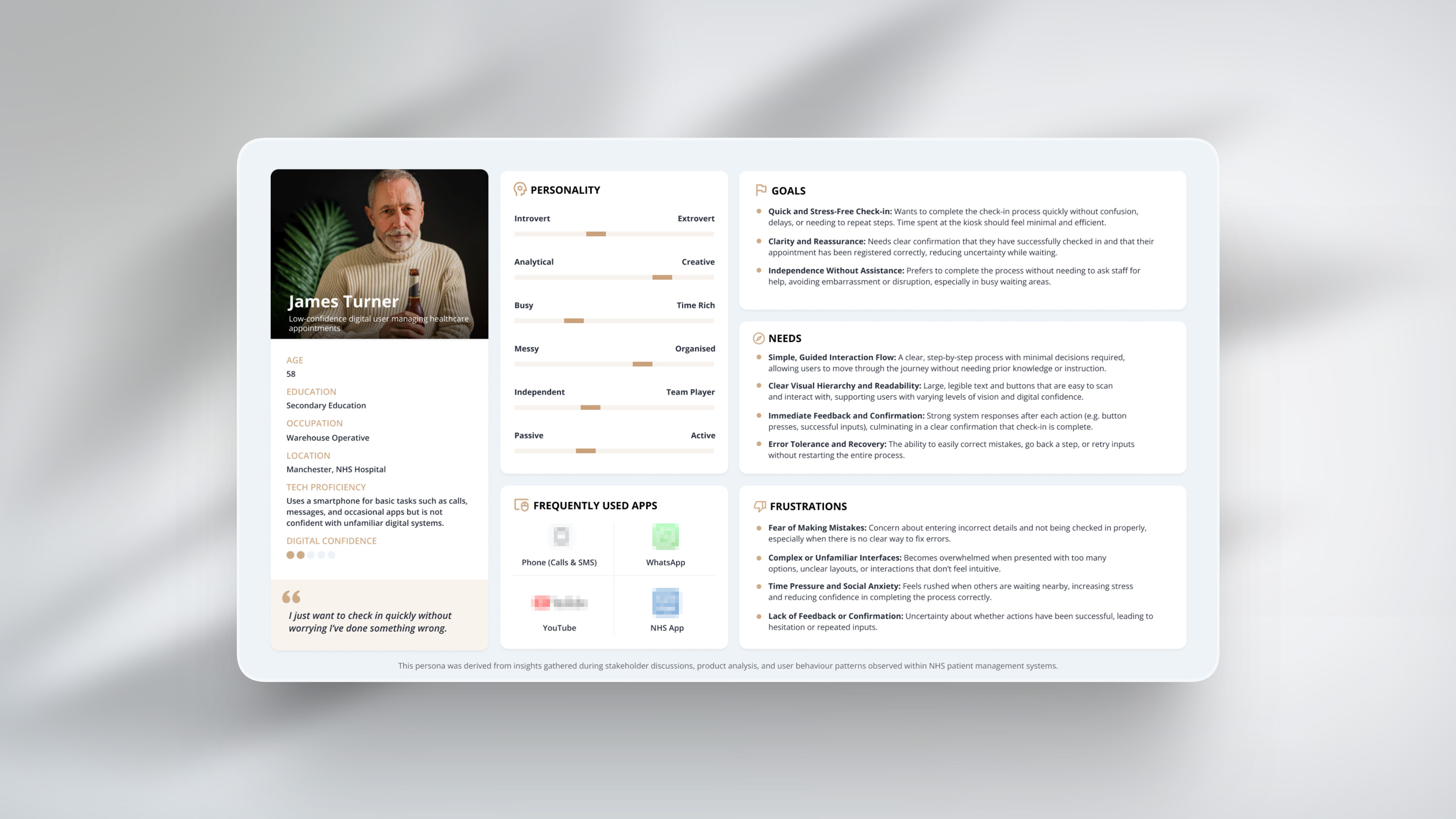
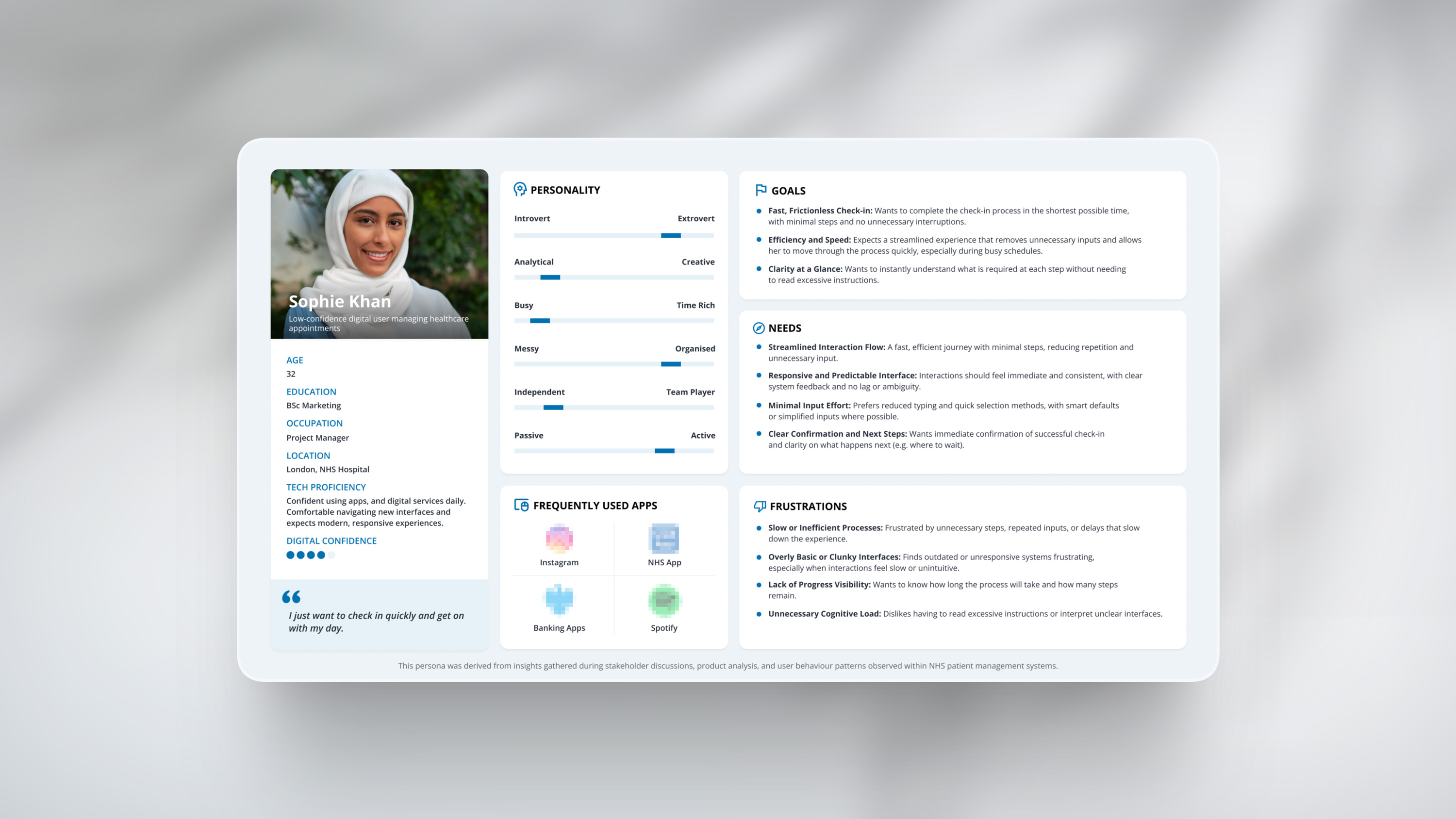
User Personas
& Journey Mapping
With the arrival experience in focus, a UX audit was conducted on the self check-in kiosk to evaluate how patients navigate check-in in real-world conditions.
Using Jakob Nielsen’s usability heuristics, the review explored how clearly the system communicates, how efficiently users can complete tasks, and how confidently they move through the process. The findings shaped user personas and journey maps, identifying key opportunities to reduce confusion, support different user needs, and improve the overall experience.
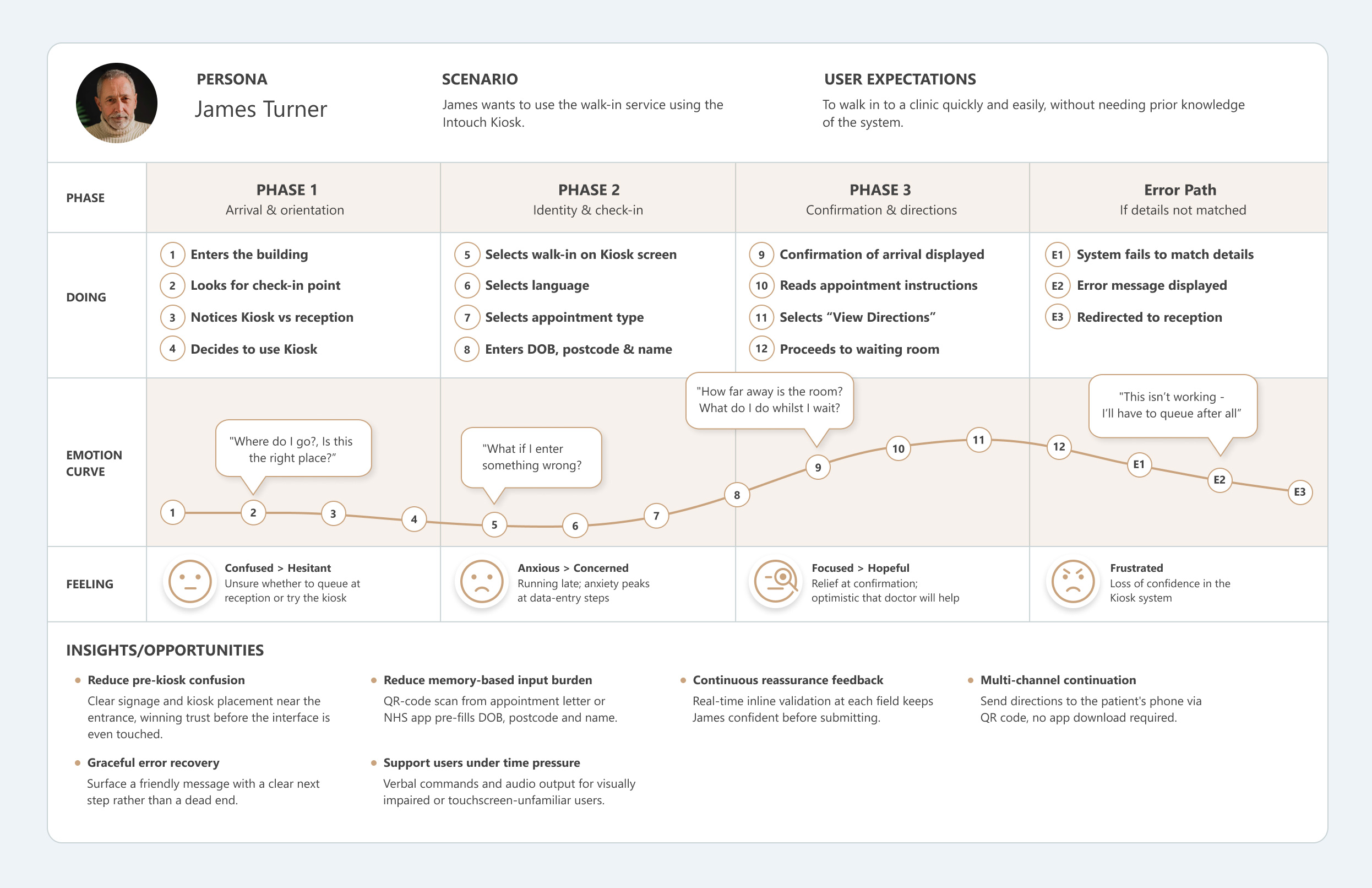
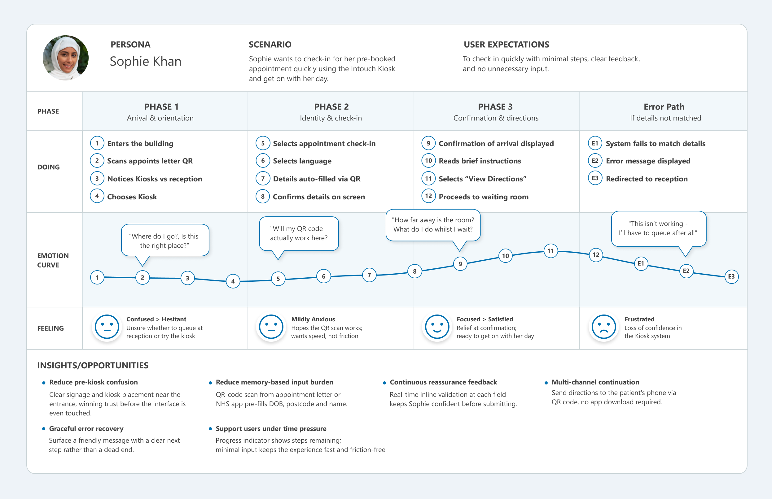
User Journey Mapping
To understand how patients actually experience the self check-in process, I mapped the end-to-end journey from the moment a patient enters the building to the point they're seated in the waiting room. This journey map is based on the heuristic evaluation findings and models a first-time kiosk user, someone unfamiliar with the system, potentially anxious, and navigating the flow without assistance.
The map tracks four dimensions across each phase: what the patient is doing, what they're feeling, their emotional arc, and where the experience breaks down. By plotting these together, we can see how usability issues compound, a confusing start screen creates hesitancy that carries into the data-entry steps, and a single input error with no back button escalates frustration into abandonment. The error path column captures what happens when the system fails to match a patient's details, a scenario the current UI handles poorly.
Contextual Inquiry
This project highlighted the importance of contextual inquiry within healthcare environments, where observing real patient and staff interactions can reveal usability challenges that screen recordings alone often miss. Factors such as queues forming behind hesitant users, moments of confusion requiring staff assistance, and the environmental pressures of noise, stress, and time all influence how patients engage with the interface. The video below illustrates a typical check-in interaction within the kiosk environment.
Accessibility Research
The evaluation of the kiosk interface identified several accessibility challenges impacting how patients perceive, understand, and complete the check-in process in real-world healthcare environments.
While the system enables patients to independently register their arrival, the interaction design does not consistently accommodate users with varying levels of digital confidence, cognitive ability, or physical accessibility needs. Environmental factors such as time pressure, public visibility, and noise further amplify usability issues, increasing the likelihood of hesitation, errors, and reliance on staff support.
The following insights summarise the key accessibility risks identified
and informed the design principles applied in the redesign.
Some interface elements lack sufficient contrast and hierarchy, making it difficult for users to quickly scan and interpret information. Text size, button prominence, and visual grouping do not consistently support users with reduced vision or those interacting under time pressure.
As a result, key actions and instructions may be overlooked or misunderstood.
The check-in process requires users to input personal information across multiple steps, often relying on memory (e.g. date of birth, postcode).
This fragmented approach increases cognitive effort, particularly for users with lower digital confidence or those feeling rushed. Without clear guidance or contextual support, users may hesitate, make errors, or abandon the process.
Touch targets, input methods, and interaction patterns are not always optimised for accessibility.
The reliance on on-screen keyboards and manual data entry can slow down interaction and introduce errors, particularly for users with motor impairments or limited familiarity with digital interfaces.
Inconsistent interaction behaviours across screens further reduce usability and confidence.
System feedback is not always clear or prominent enough to confirm successful actions.
Users may be uncertain whether inputs have been correctly registered or whether they have successfully checked in.
This lack of reassurance can lead to repeated actions, hesitation,
or the need to seek assistance from staff.
Kiosk Wireframing
Building on the UX audit and its findings, the need for a more consistent and scalable visual framework became evident and so a structured brand system was created to support clearer UI design decisions and more a cohesive implementation. Although this framework was only partially defined during the project, it has been further developed here to demonstrate how the system could be fully articulated and applied at scale.
Disclaimer: This work is a conceptual redesign created for portfolio purposes based on publicly observable interaction patterns. All branding, UI elements, and flows have been simplified or altered to avoid disclosure of proprietary systems or confidential information
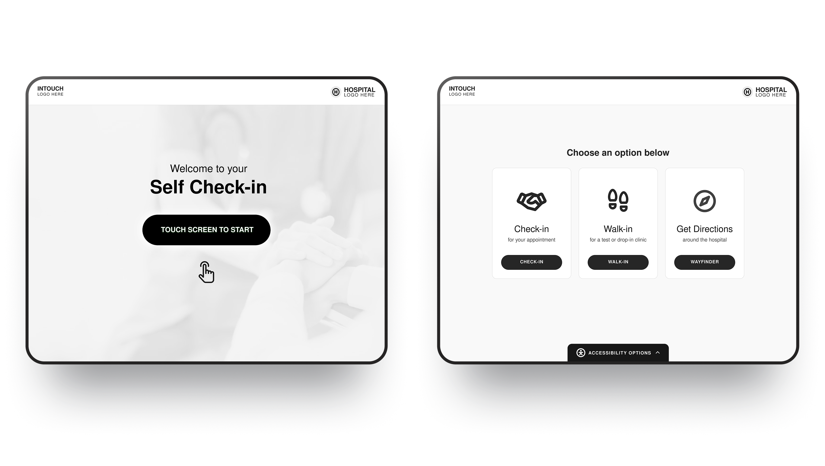
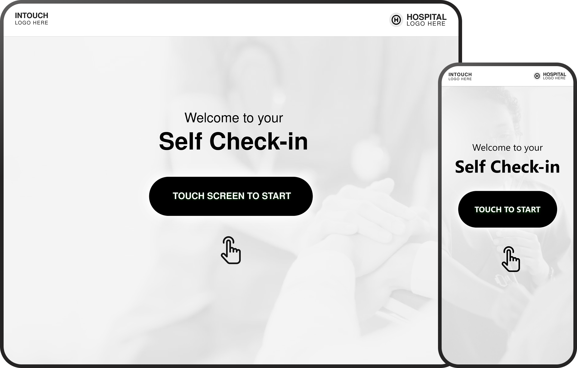
Welcome Screen

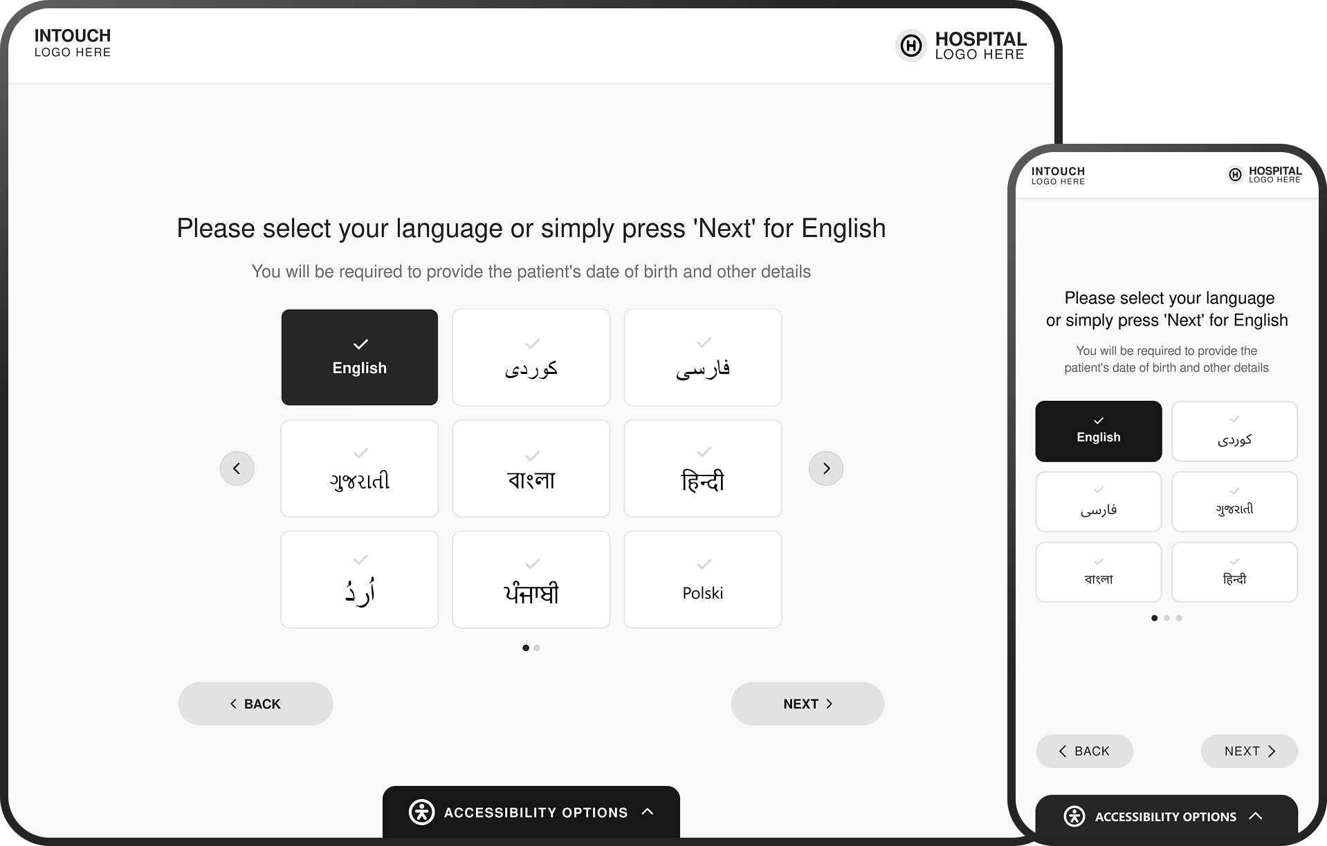
Language
Main Menu
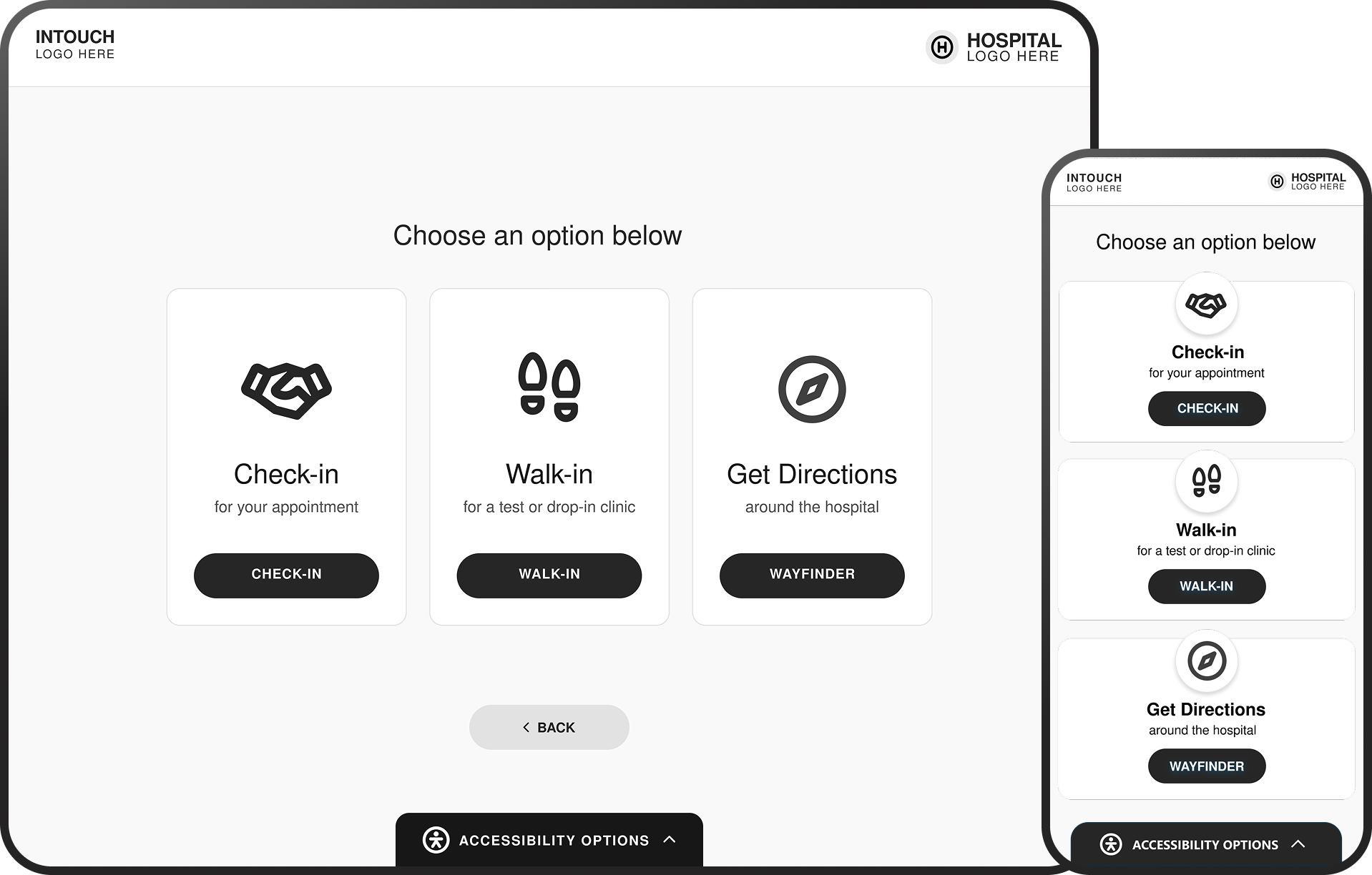
Check-in Menu
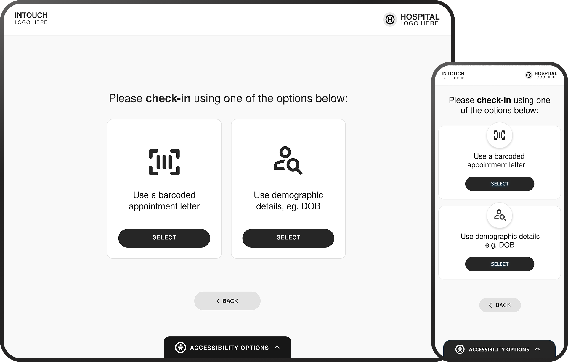
Patient Demographics
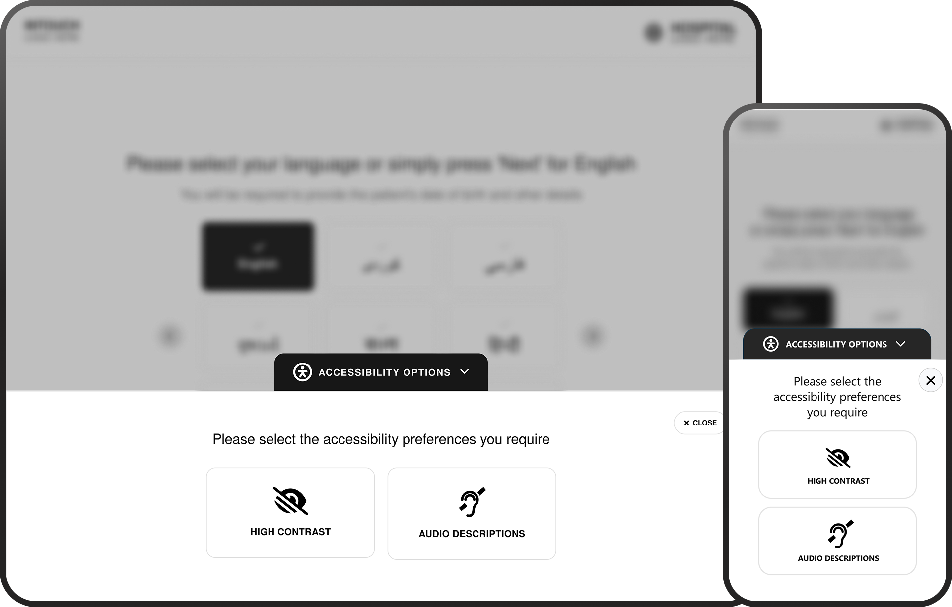
Accessibility Options
Design Impact Across
the Patient Journey
Simplified Patient Experience
• Removed competing actions and unclear entry points
• Simplified decision-making at each step of the journey
• Replaced text-heavy instructions with guided interactions
• Enabled faster onboarding at point of arrival
Improved Flow & Efficiency
• Streamlined check-in pathways and reduced unnecessary steps
• Improved recognition through consistent UI patterns
• Reduced hesitation during key decision points
• Supported smoother patient flow within clinical environments
Consistent & Scalable Interface
• Introduced reusable card-based interaction models
• Standardised hierarchy, spacing, and component behaviour
• Created a consistent experience across kiosk and mobile
• Established a foundation for scalable future enhancements
Error Prevention & Input Confidence
• Reduced risk of incorrect patient data entry
• Introduced clearer input states and feedback
• Simplified decision paths to prevent mis-selection
• Improved clarity of actions at each step
Cross-Platform Consistency
• Unified experience across kiosk and mobile interfaces
• Maintained consistent interaction patterns and behaviours
• Reduced learning curve between devices
Accessibility Considerations
• Introduced persistent access to accessibility options
• Reduced reliance on colour and icon-only interactions
• Improved contrast, readability,
and input clarity
• Supported a wider range of patient needs and abilities
Final Outcome
The redesigned kiosk check-in experience introduces a more structured, accessible, and intuitive interaction model, improving how patients engage with digital touch points at the point of arrival. By simplifying decision-making, reducing visual complexity, and introducing clearer guidance throughout the journey, the solution supports faster, more confident interactions. The experience is designed to accommodate a wide range of patient needs, ensuring accessibility is not treated as an add-on, but as a core part of the interaction.
The result is a more reliable and scalable check-in experience, one that reduces friction, improves efficiency within clinical environments, and better supports both patients and healthcare staff.
Outcome & Impact
The redesigned experience delivers measurable improvements
in usability, clarity, and interaction confidence:
• Reduced patient hesitation during key decision points
• Improved speed and efficiency of the check-in process
• Lower cognitive load through simplified interface patterns
• Increased accessibility for users with diverse needs and abilities
• Reduced reliance on staff assistance during check-in
By addressing both usability and accessibility challenges,
the solution contributes to smoother patient flow and a more consistent experience across clinical environments.
My Contribution
This project was completed while working as a Senior Designer at VitalHub UK, focusing on improving the usability and accessibility
of the kiosk check-in experience.
Key contributions included:
• UX audit and evaluation of the existing kiosk interface
• Identification of usability and accessibility issues using heuristic analysis
• Redesign of the end-to-end check-in journey and interaction flows
• Wireframing and prototyping of key screens and pathways
• Definition of interface patterns to support clarity, consistency, and scalability
• Integration of accessibility considerations into core interaction design
Design Learnings
This project reinforced the importance of designing for clarity and confidence, particularly in high-pressure healthcare environments where users may be unfamiliar, anxious, or time-constrained.
It highlighted how small interaction improvements, such as clearer hierarchy, better feedback, and guided progression can significantly impact usability and reduce errors in real-world scenarios. The work also emphasised that accessibility should be embedded from the outset, rather than treated as a secondary consideration.
Designing for a wider range of needs ultimately improves the experience for all users. More broadly, the project demonstrated the value of combining UX thinking with clear communication, ensuring that both the experience itself and its intended use are easily understood by patients, stakeholders, and clinical teams.


Ready to start
building?
Let's talk about your next project and how I can help.